EMBRACING OBJECTIVITY AND DIVERSITY
The home of community connection, where people have a sense of belonging, purpose and growth. Gaining back relevance through embracing our strengths, and shifting the narrative, to be known as the community innovator hub for inclusivity and connection. Supporting and leading the way of connection and conversation
CLIENT
CBAA
SECTOR
Radio & Communications
SERVICES
Brand strategy, tone of voice, visual identity, asset templates, brand shoot
Brand Strategyuberbrand conducted in-depth brand research and workshops, culminating in a brand proposition, architecture system and compelling brand story and identity. A clear proposition that speaks to the connection CBAA enables for a diverse community.
The opportunity to build and uplift the term ”community” and shift from being seen as ”amateur” to “excellence”, from “not mainstream, or cool” to ”a place for all”.
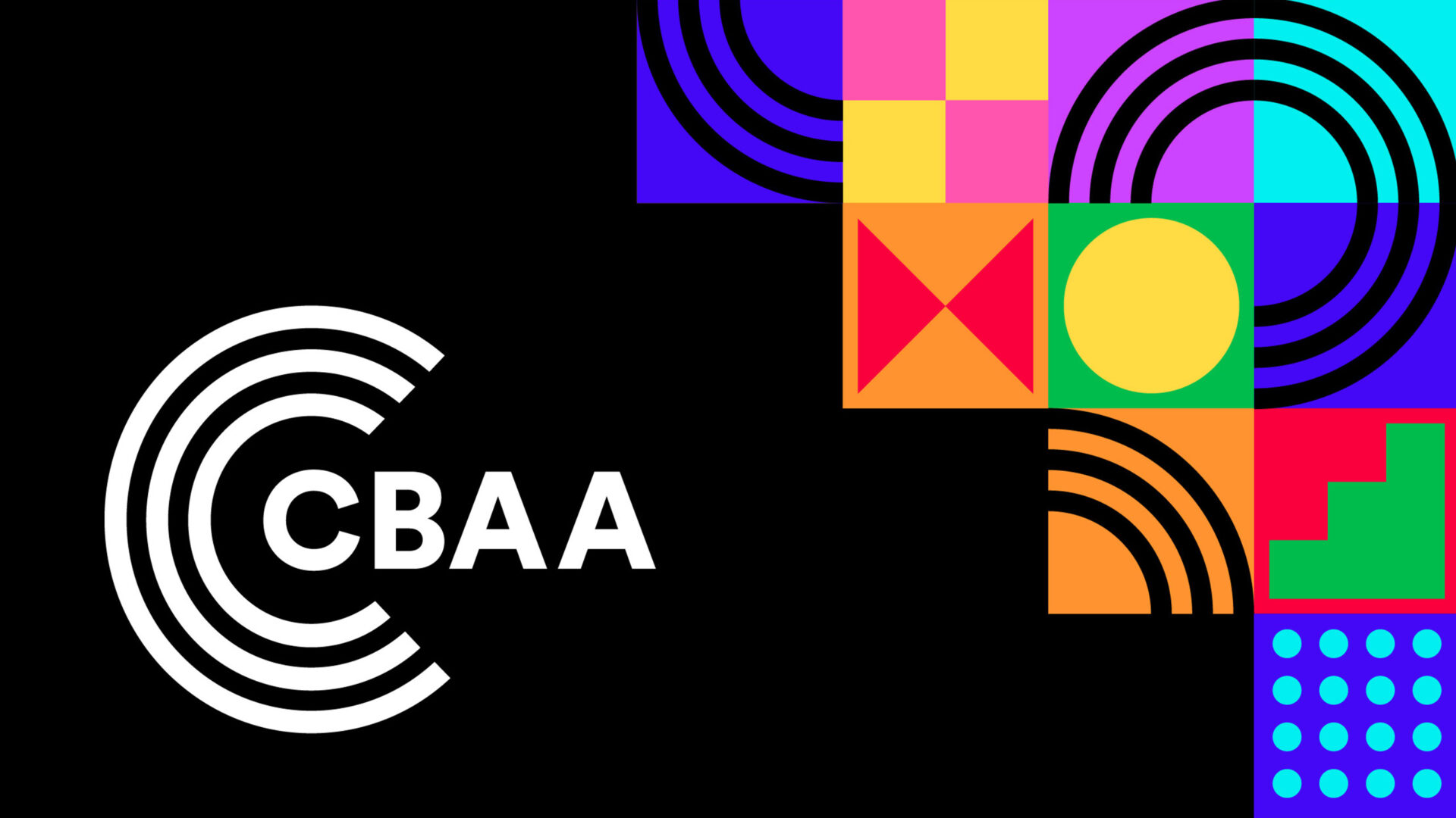
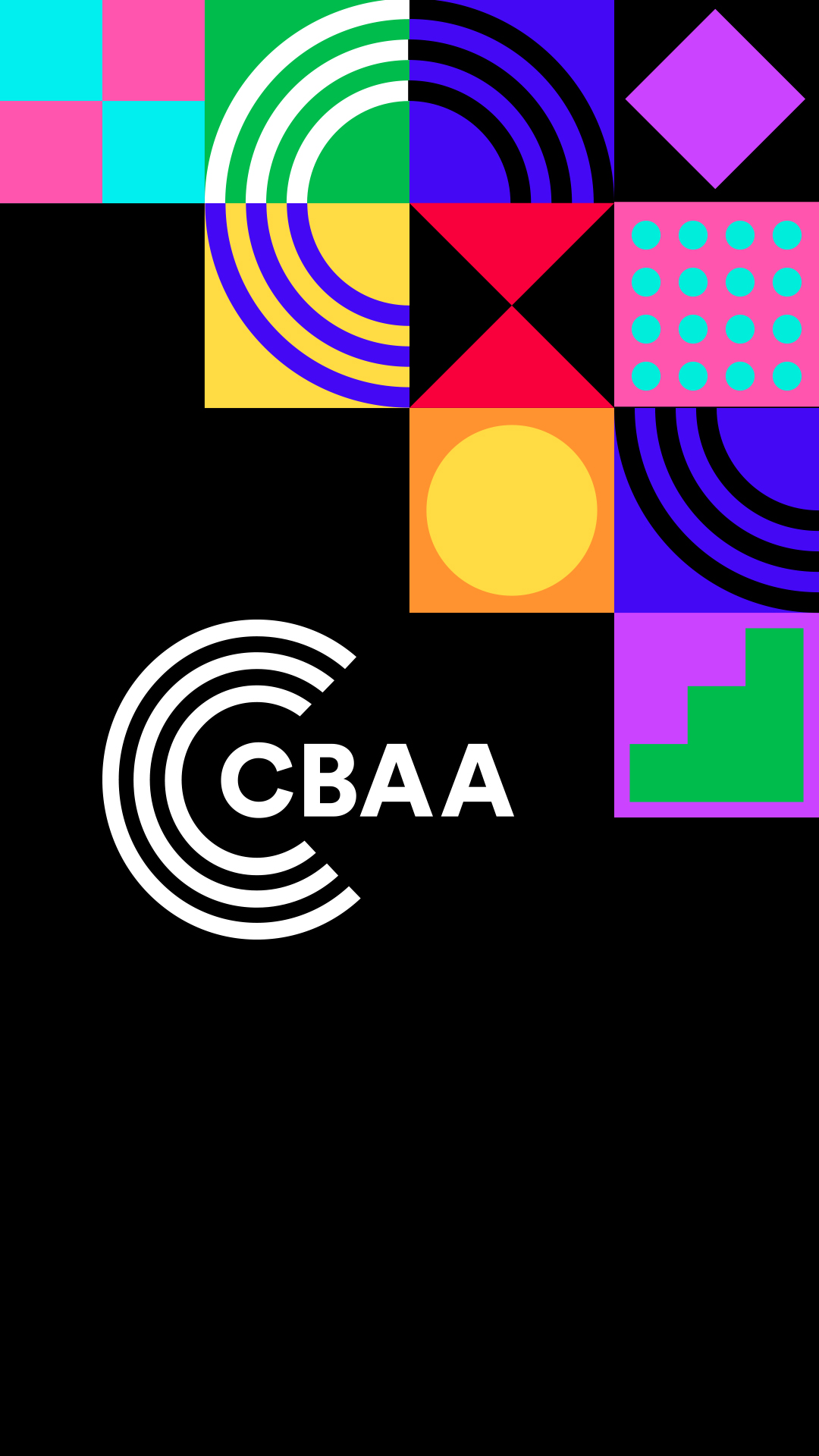
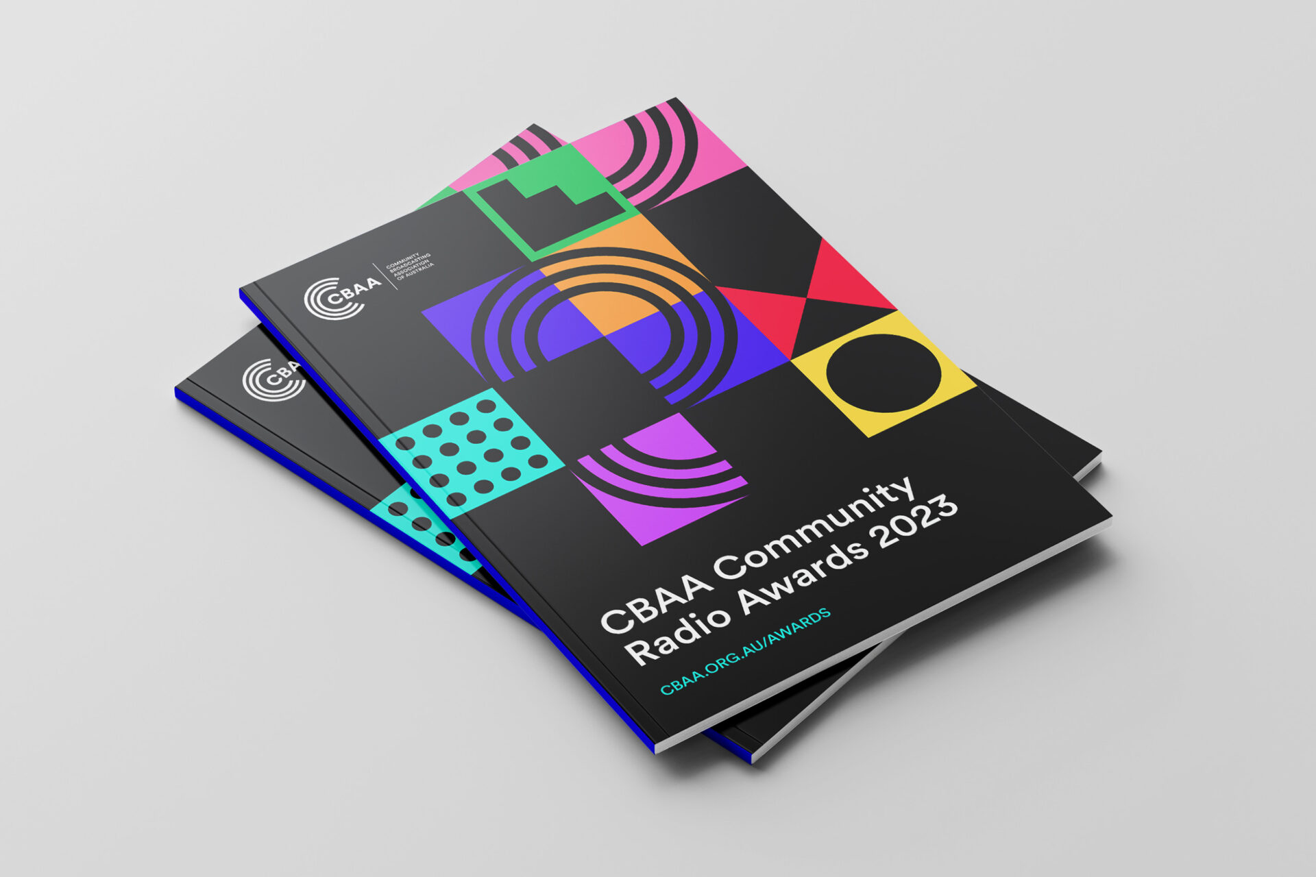
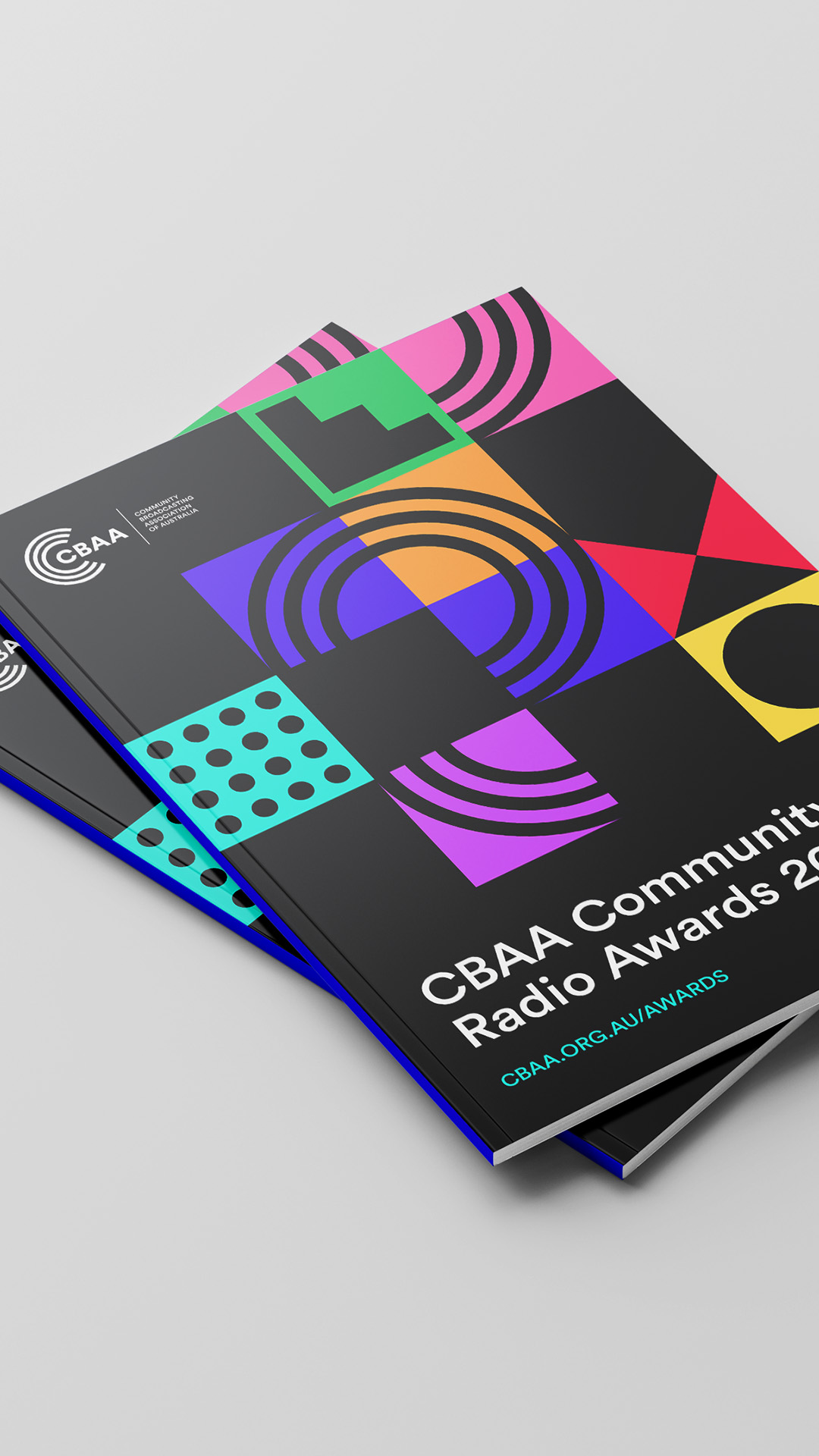
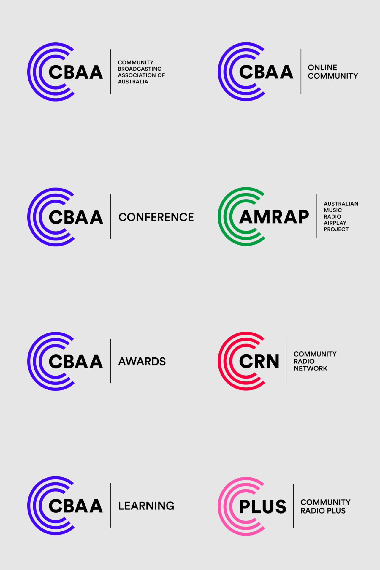
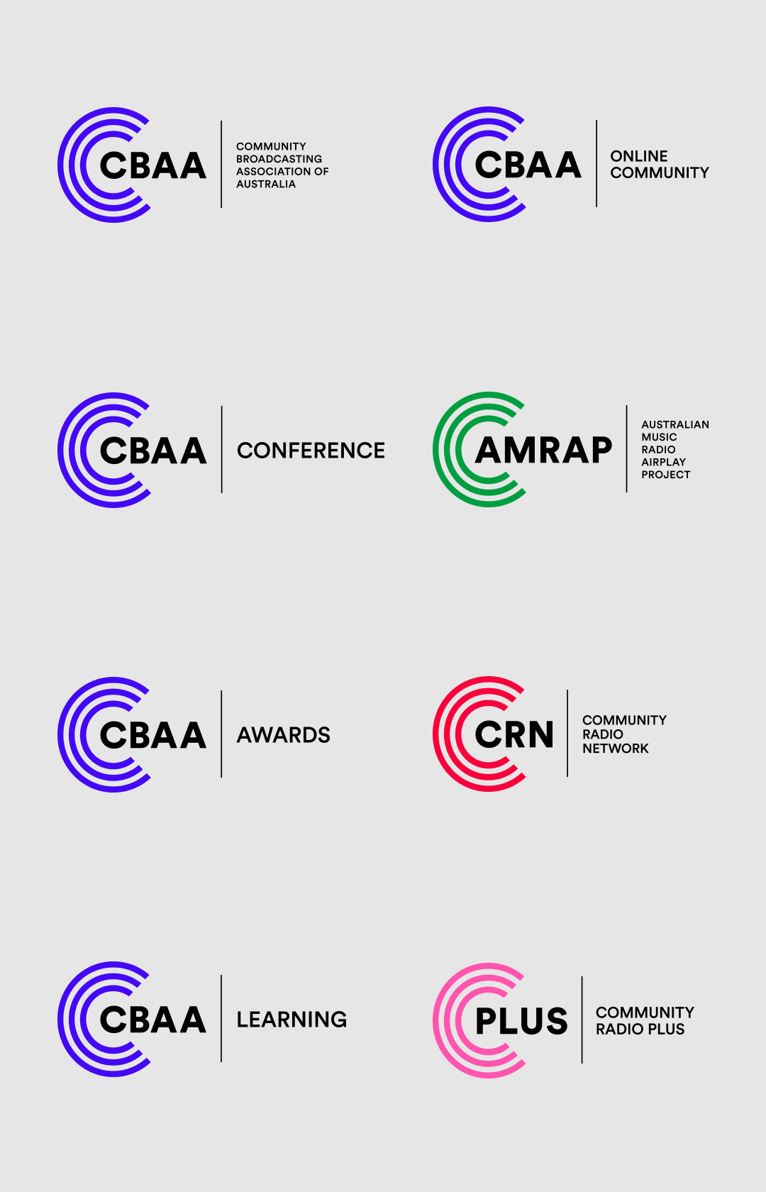
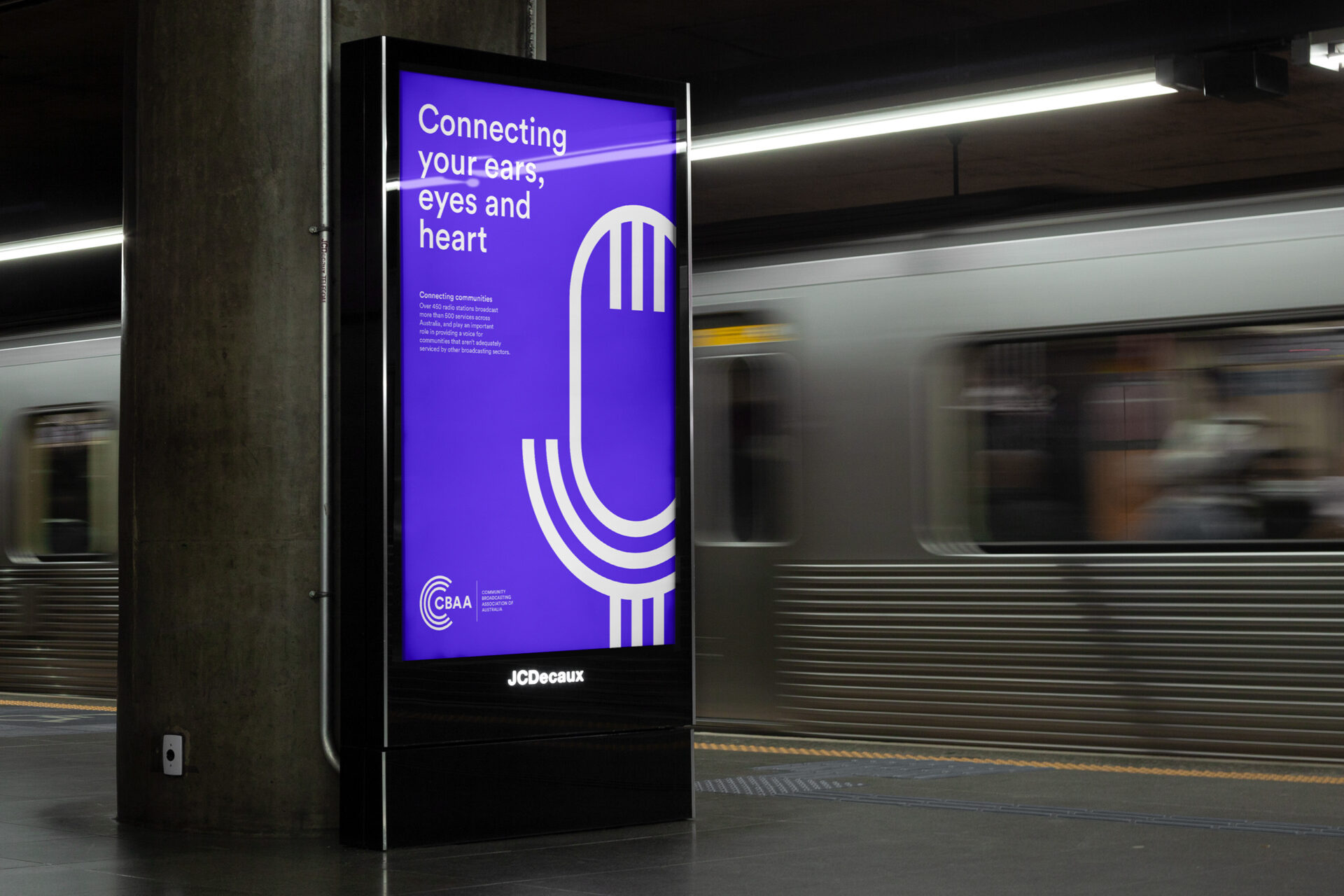
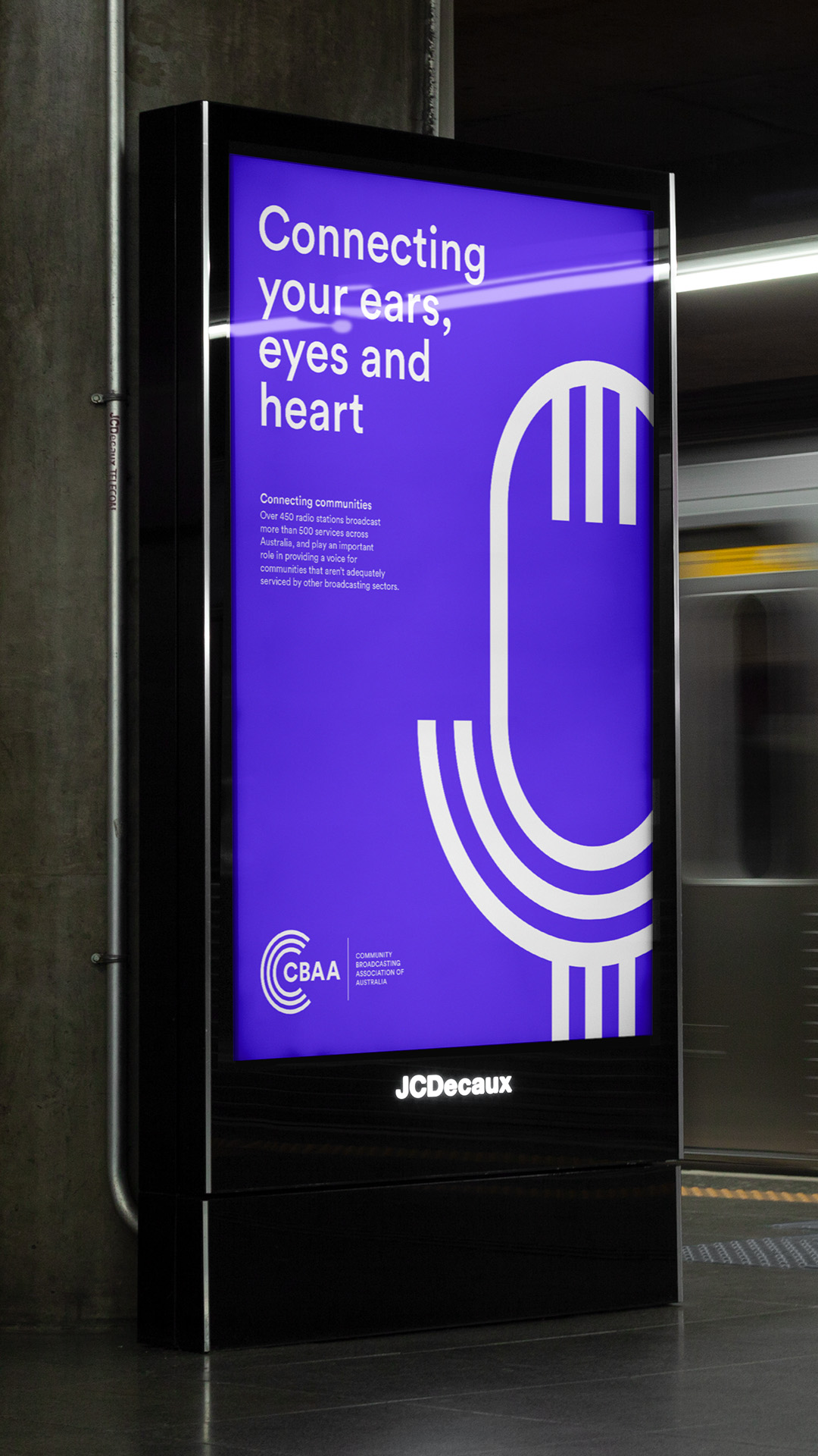
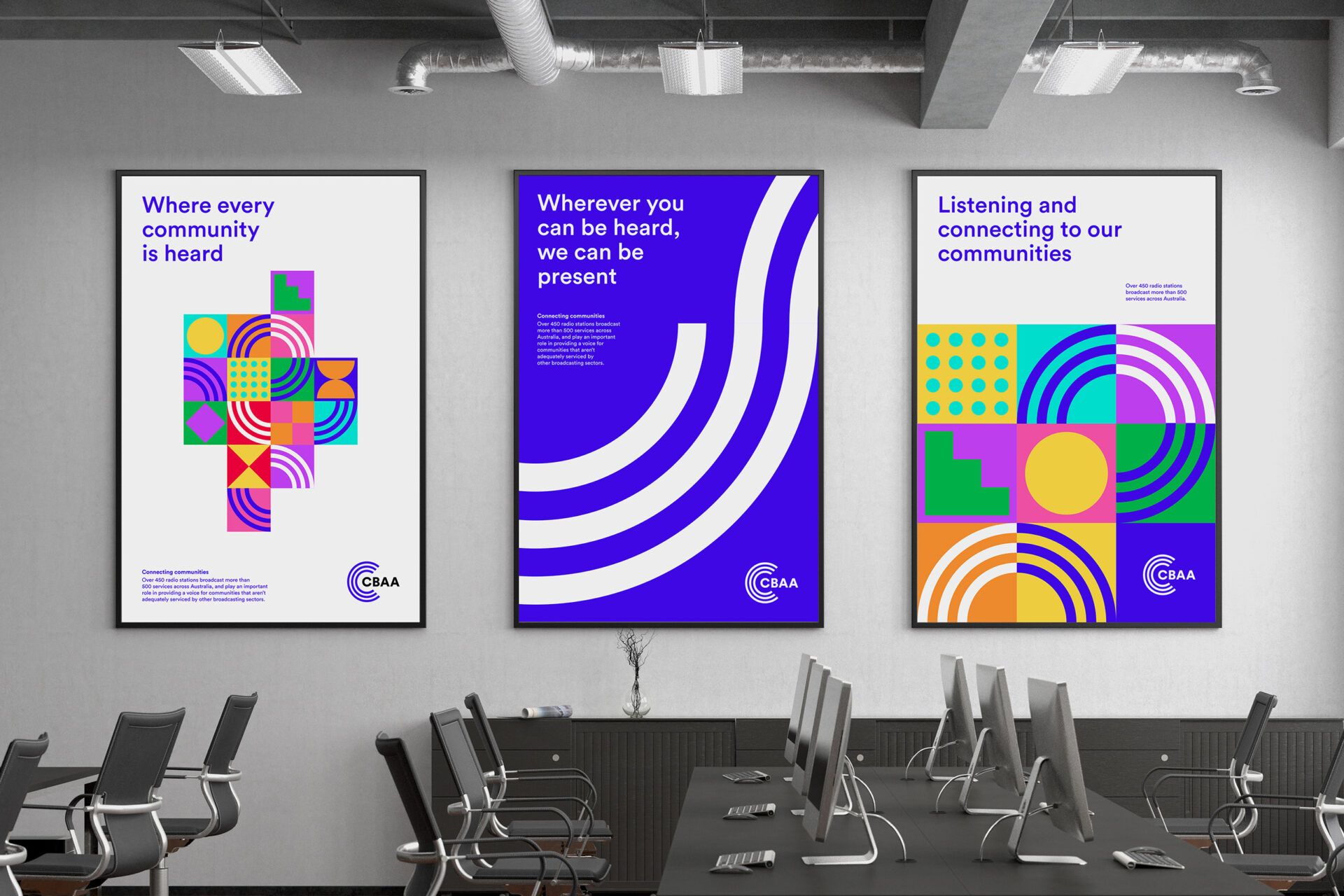
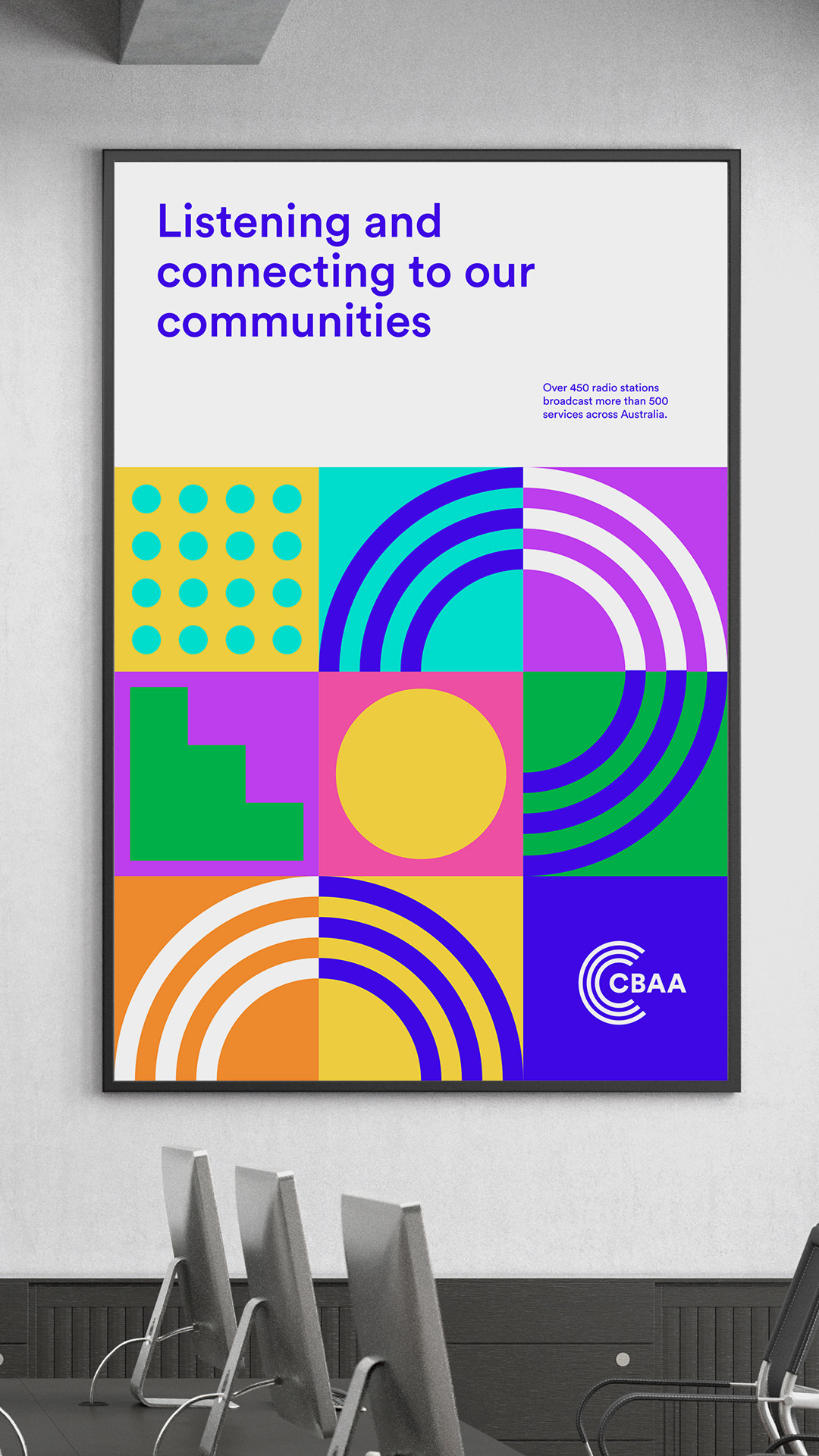
To bring alive the proposition of “connecting communities” , the team looked at the current brand identity system and product logo’s and developed a visual identity system, inspired by the idea of “sum of all parts”, looking at connective pieces that makes a whole. Inspired by CBAA audience and members and the inclusive and connective environment CBAA plays.
CBAA provides the building the blocks for others to connect, bringing pieces that work together. Helping to bring people, products and services together – no matter colour, shape, size or form. That in the end, it connects and becomes whole – forming a beautiful image.
The ResultsThe direction inspired a more vibrant CBAA colour palette, bolder colours and puzzle pieces, each representing a different service/product CBAA deliver to. Showcasing the strength and power of it together or siloed. This also inspired the CBAA blue to be enhanced to a more vibrant blue and bring more symmetry to the current C’s in the monogram.
A verbal identity and messaging matrix was created to articulate CBAA proposition across it’s audiences as well as an audio lockup that could be used as a sign off on the air. “CBAA, The community broadcasting association of Australia. Helping communities stay connected every moment of the day. That’s CBAA. “
Let us know how we can help with your next brand or communications challenge
Let us know how we can help with your next brand or communications challenge
Quick Links
Address
Level 7, Suite C,
140 William Street
Woolloomooloo NSW
2011 Australia
Contact
info@uberbrand.com.au
02 9368 0000
uberbrand ©2024