Strategy
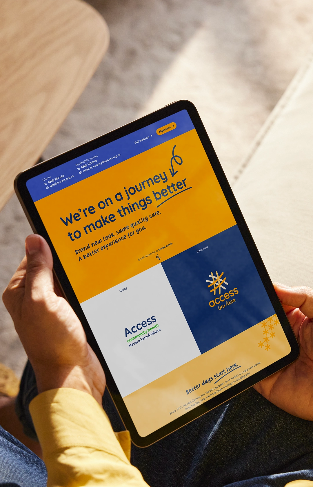
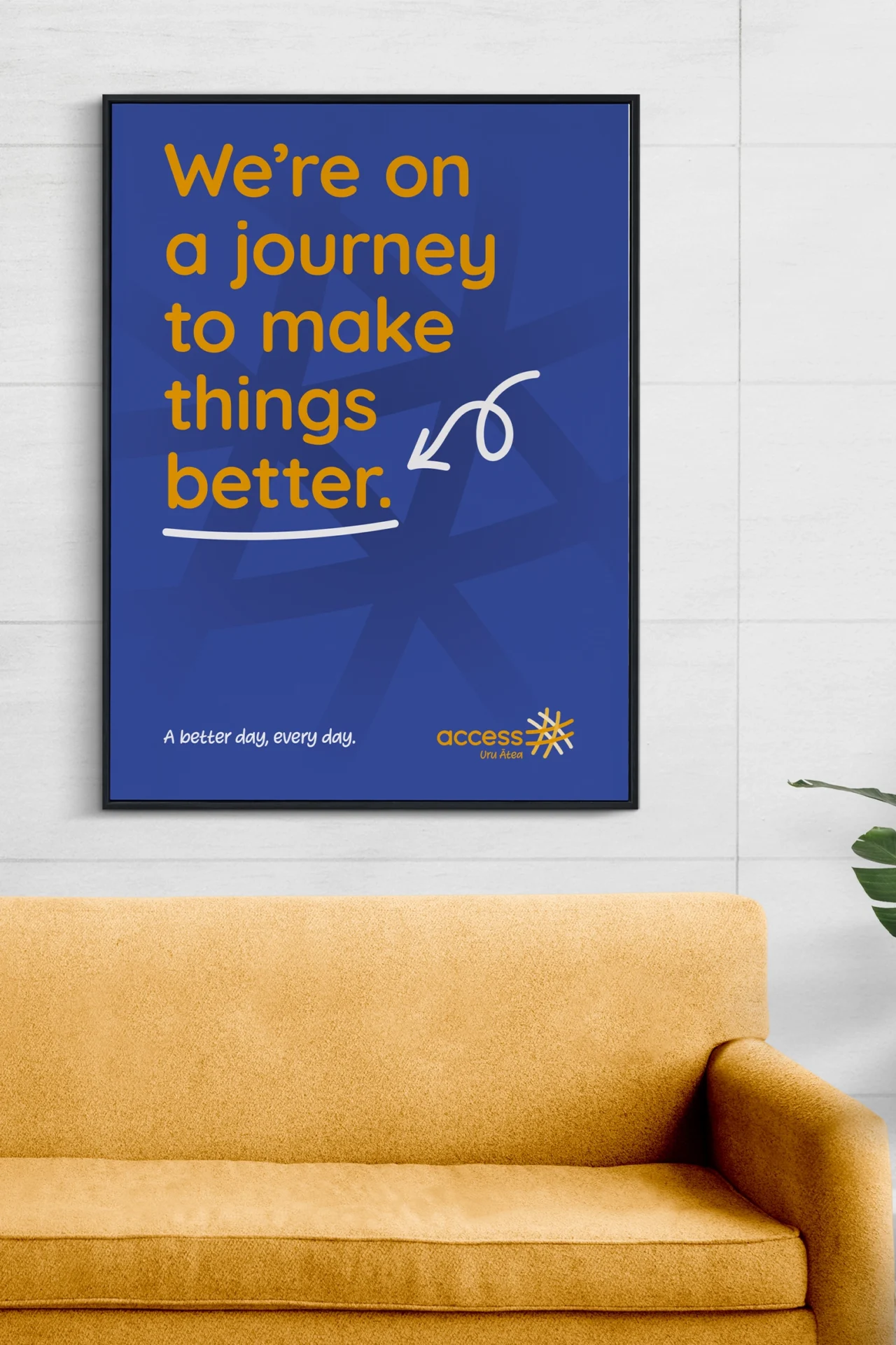
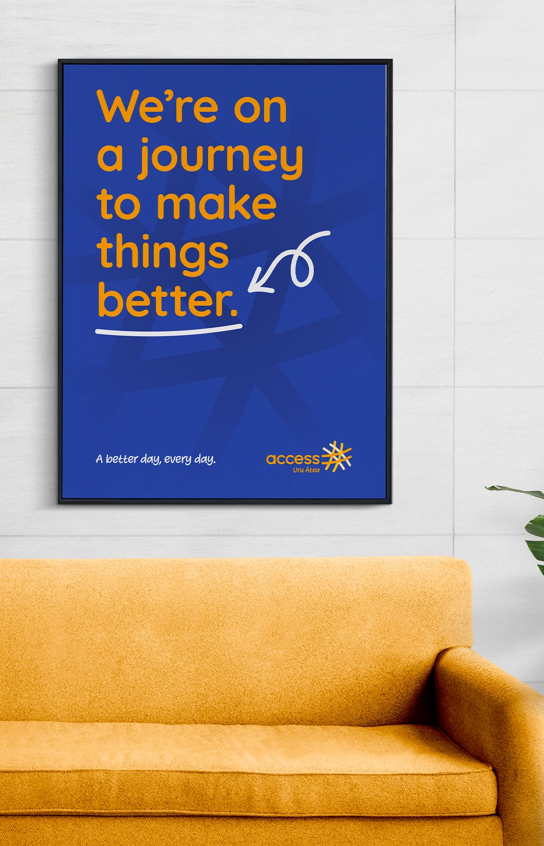
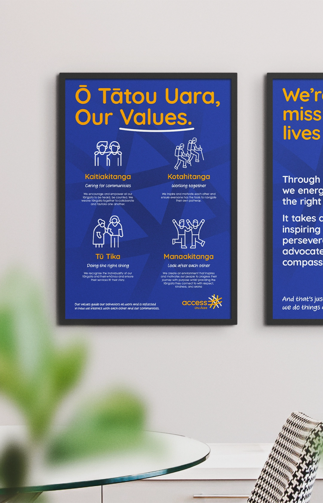
A new strategy was required to drive distinctiveness in the market around ACH’s holistic and connective approach to wellbeing. Following extensive ACH employee and customer reviews, an opportunity was identified to shift the brand to “beyond just care”. A proposition was devised around providing access to what you need, when you need it, and defined as “The right people around you for a better day, every day.”
Visual
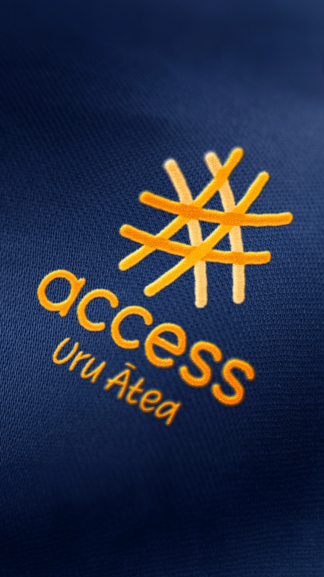
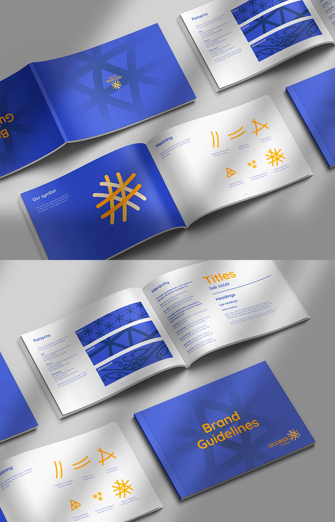
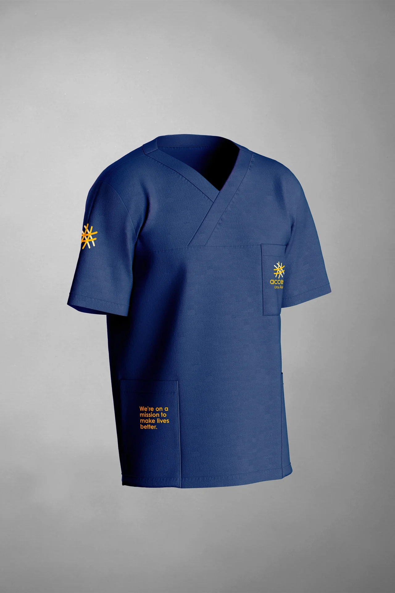
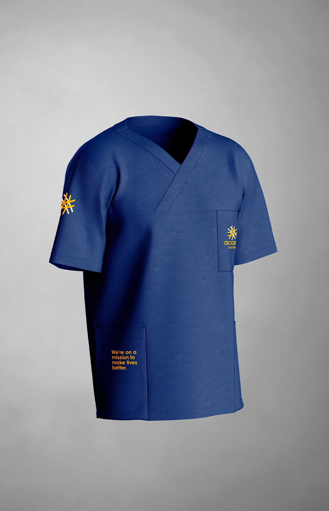
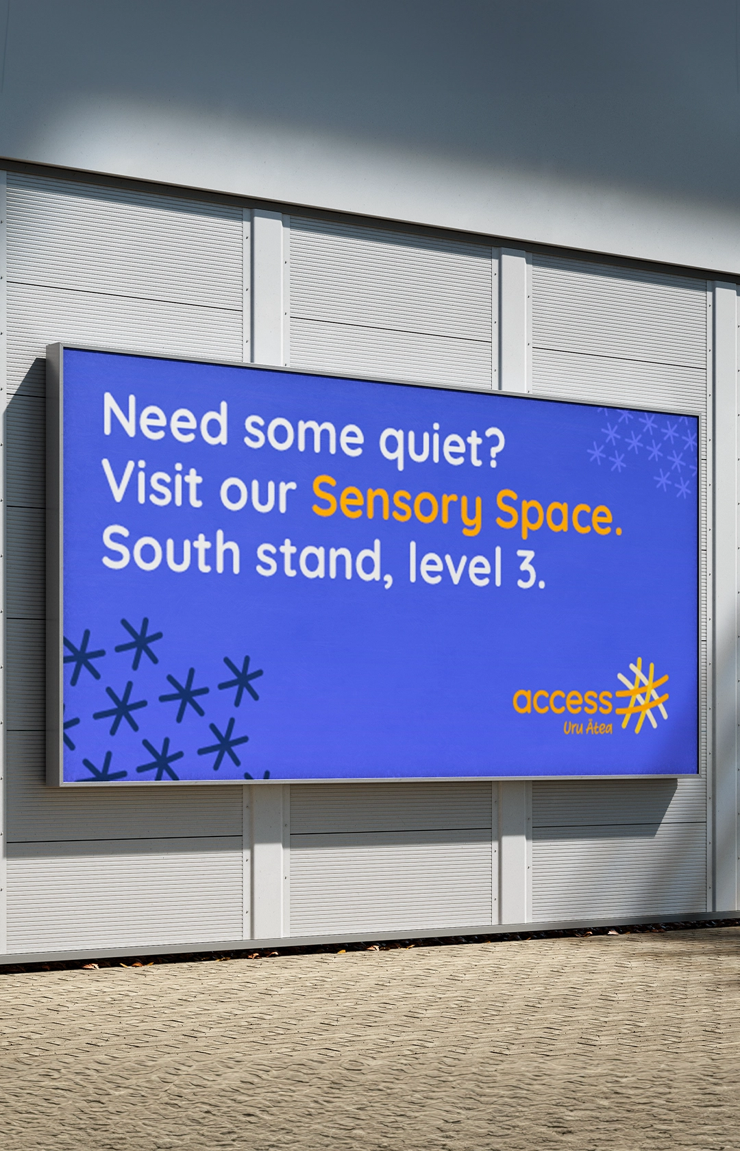
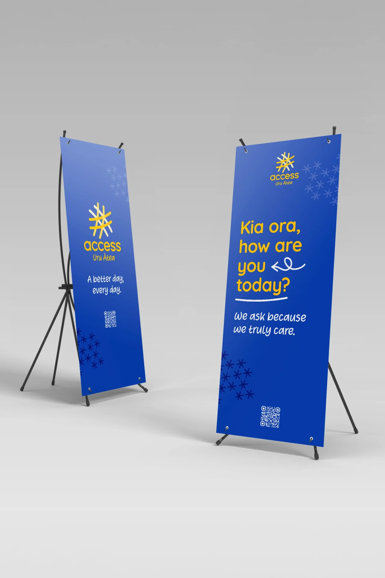
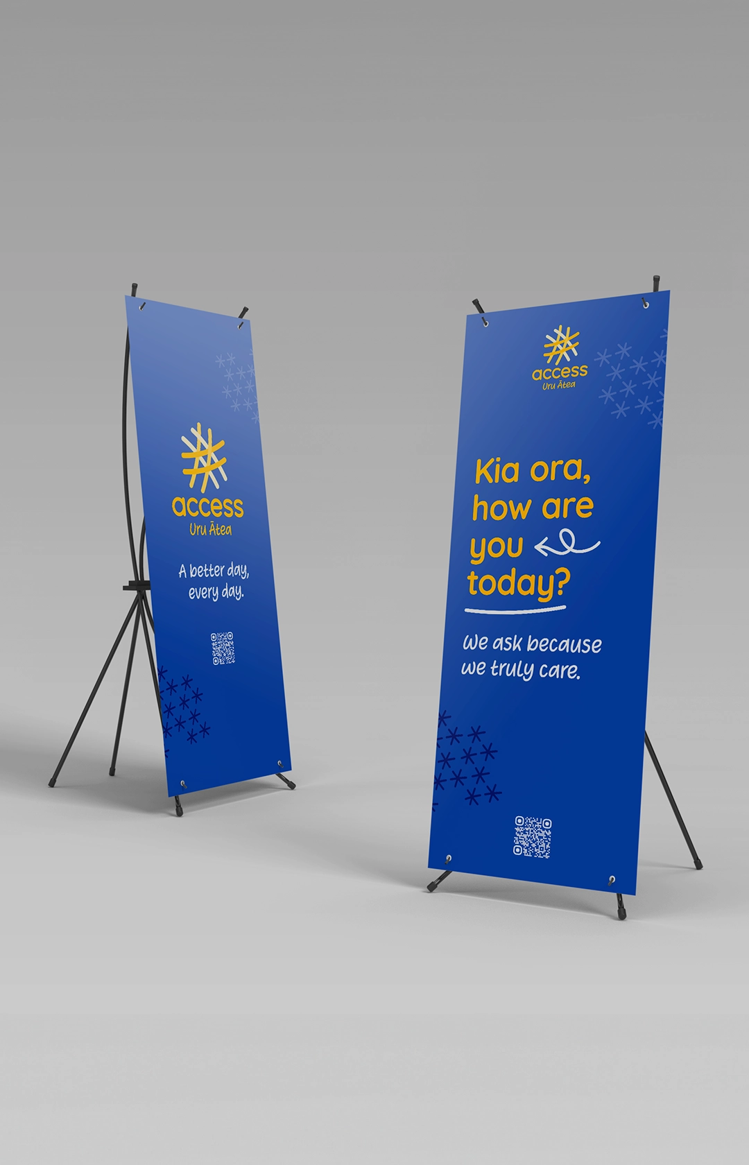
We were tasked to create a recognisable visual identity that remained true to Māori culture, but in a unique and standout way. With a brand essence defined as “energy”, and codes of authenticity, connectedness and humanity, we took our visual inspiration from the collective energy of the stars in the night sky, “together shining brighter”.
The logo was the evolution of a star, with a starting point of a traditional flax weave for the symbol, and a custom symmetrical wordmark. Colours include energetic orange and calming blue, paired with hand-drawn, expressive graphics. Careful consideration was taken to ensure visual accessibility across our diverse audience needs.
Verbal Identity
“How are you today? We ask because we care. We listen because we want to support you in a meaningful way.” A verbal identity and messaging matrix was created to communicate the ACH proposition across audiences. Careful attention was given to ensure the organic incorporation of Māori language and terminology.