Brand Strategy
Extensive research, including internal and external interviews, led to the development of a new brand proposition: ‘It’s as much your home as it is ours.’ This message emphasises the creation of an environment that gives people quality rental homes, at good value, with everything they need to live, dream and plan.
Naming
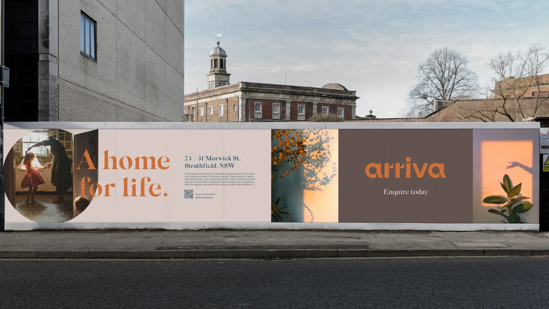
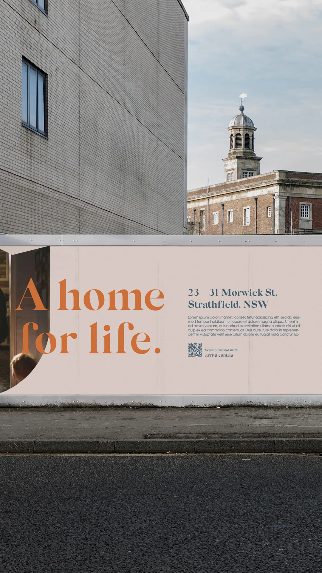
Names in this sector are often themed around convenient living or a community-driven approach. Instead, our chosen name, Arriva, encapsulates that feeling of having arrived after a long journey to somewhere comfortable and secure.
Verbal Identity
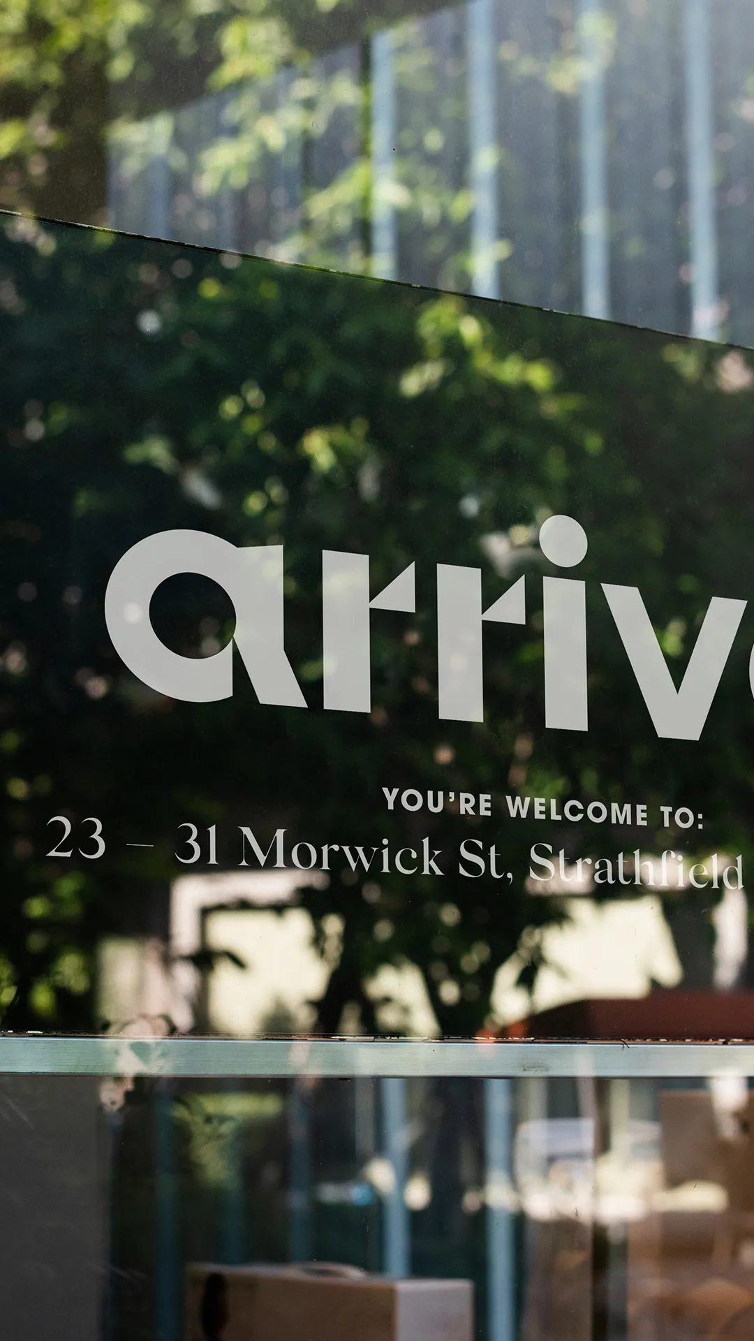
The brand sought to establish a trusted identity that integrates quality, care, and a more personal approach. The communication centres around the tagline “you’re welcome” – which works as both a statement of warm reception, and a sincere acknowledgment of the high standards renters can expect.
Design
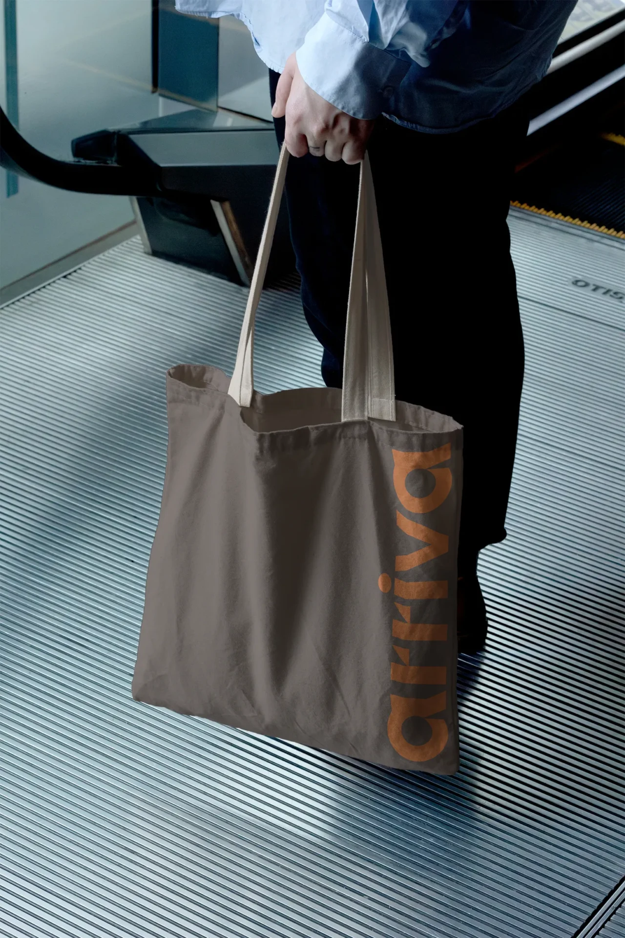
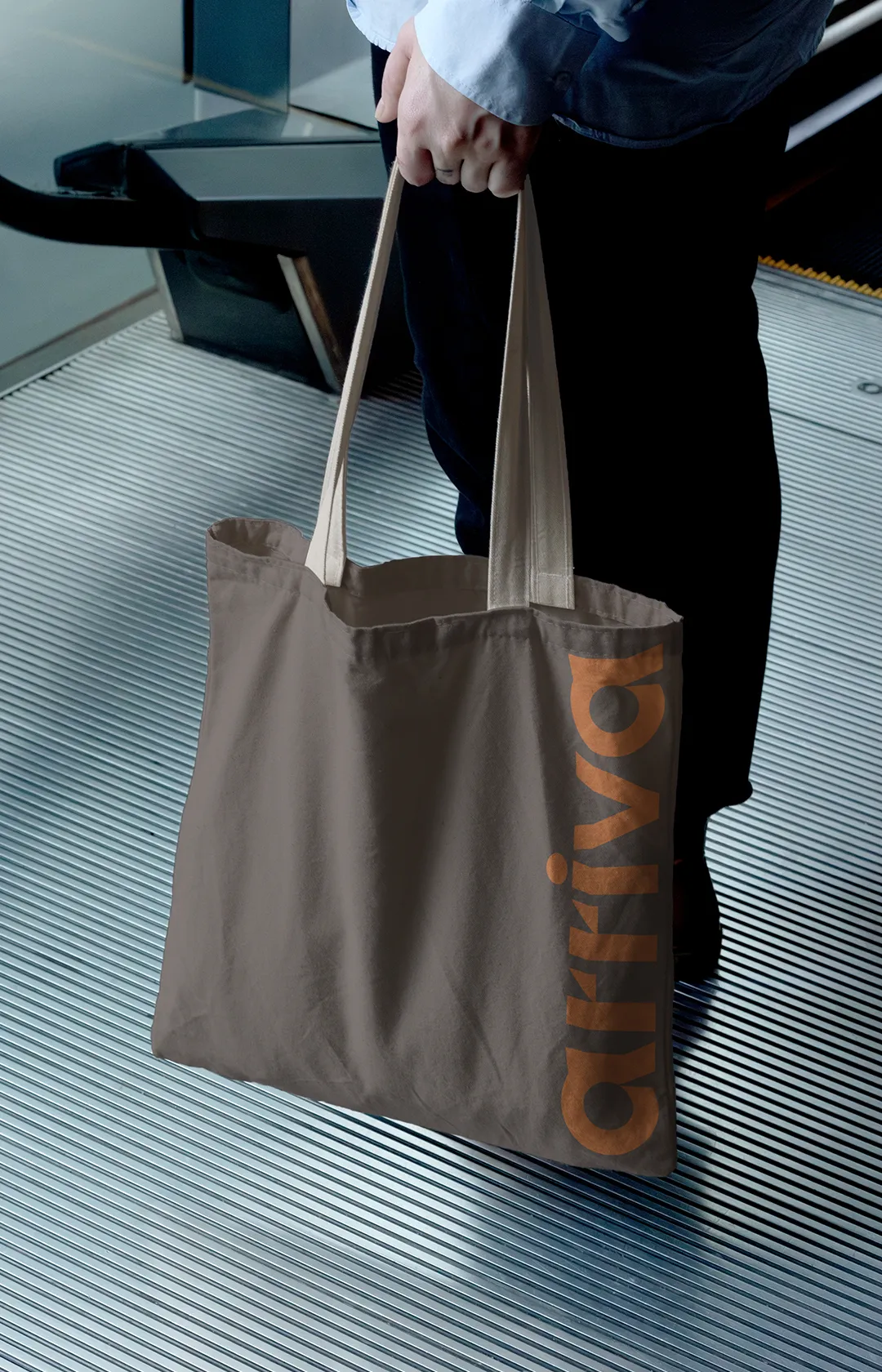
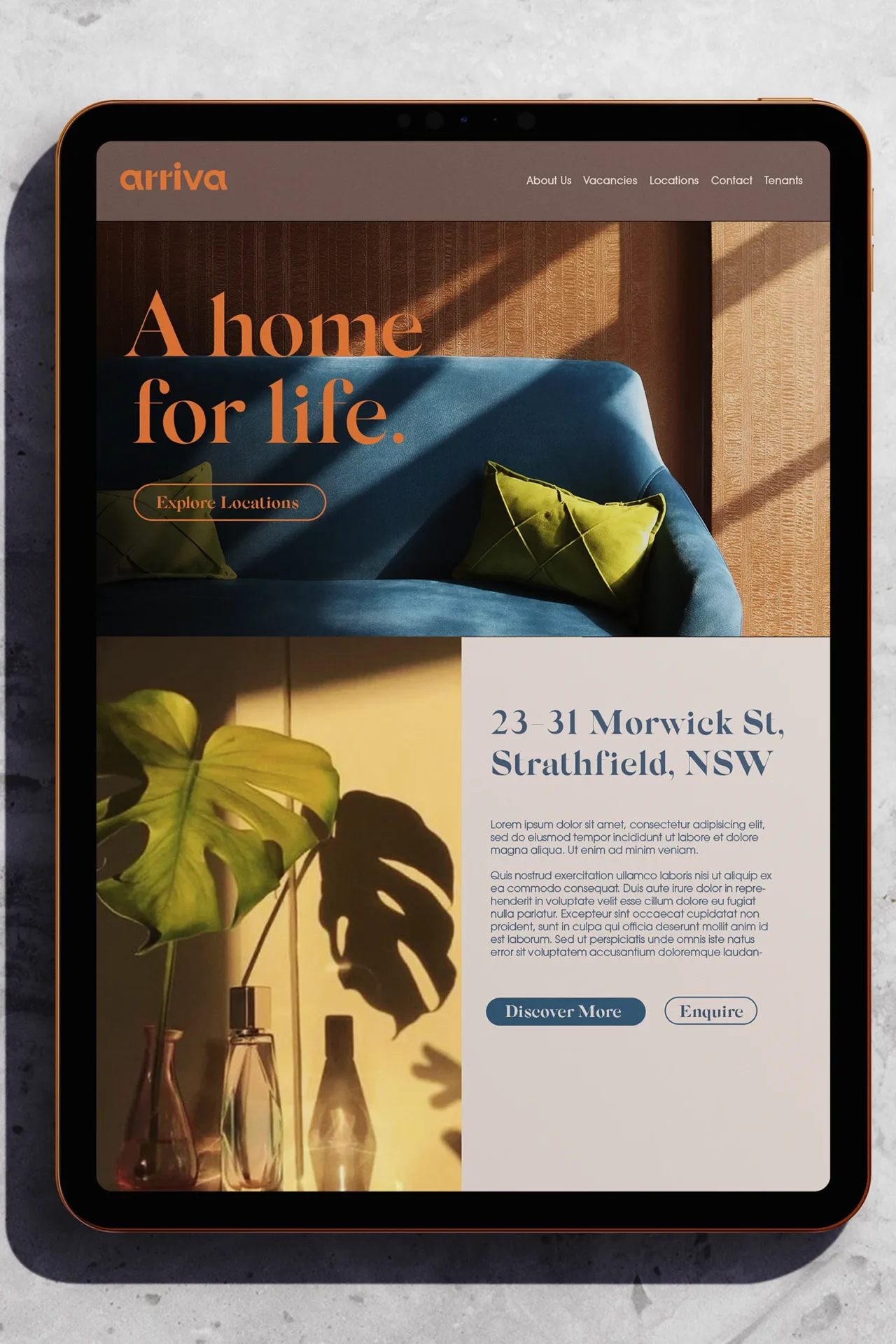
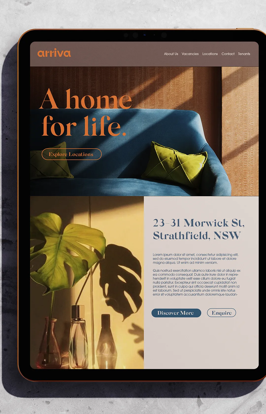
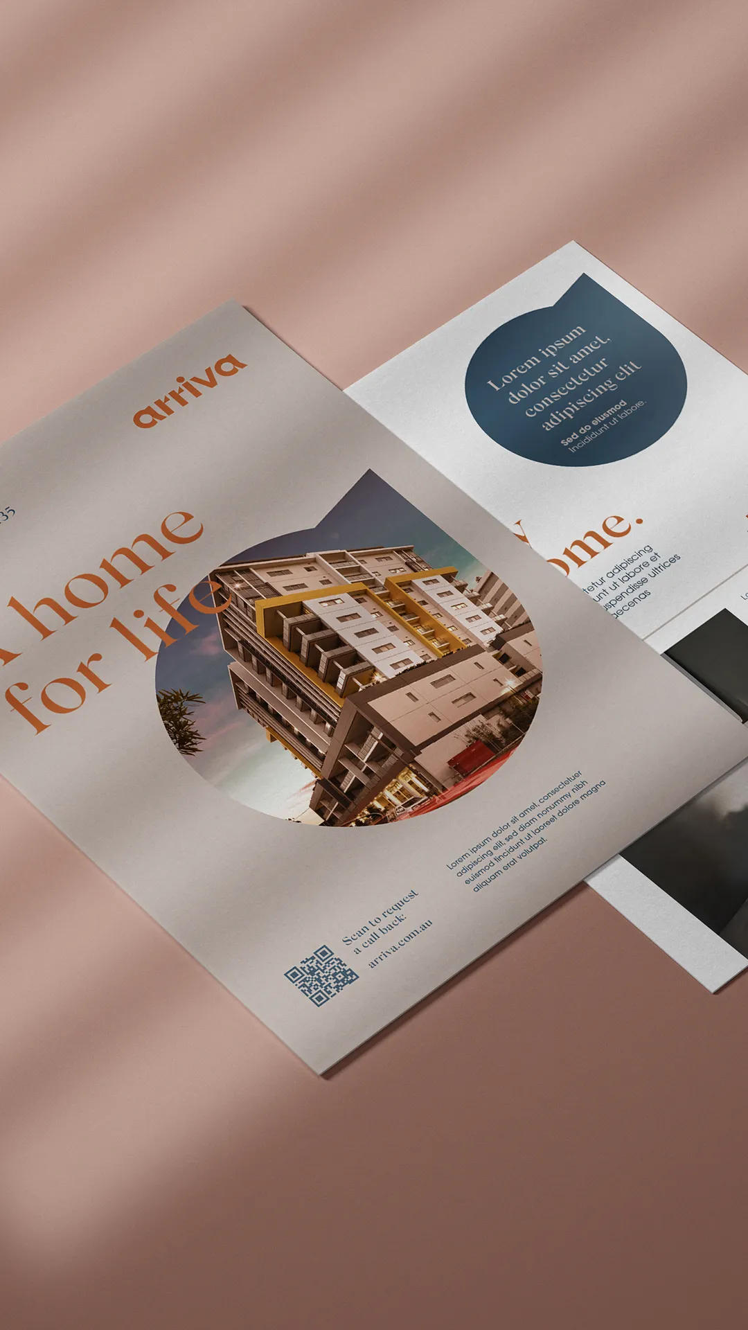
The Arriva logo represents balance, perfect proportions, and openness, reflecting the build space and residents of Arriva. The lowercase letters and circular forms project accessibility, approachability, and friendliness, offsetting the sharp angles and points that denote the brand’s commitment to detail and quality in their properties.
The typography balances organic letterforms to convey a human tone, with expressive curves showcasing depth and shadows. The clean and geometric sans-serif body copy emphasises the openness and ease of Arriva’s services.
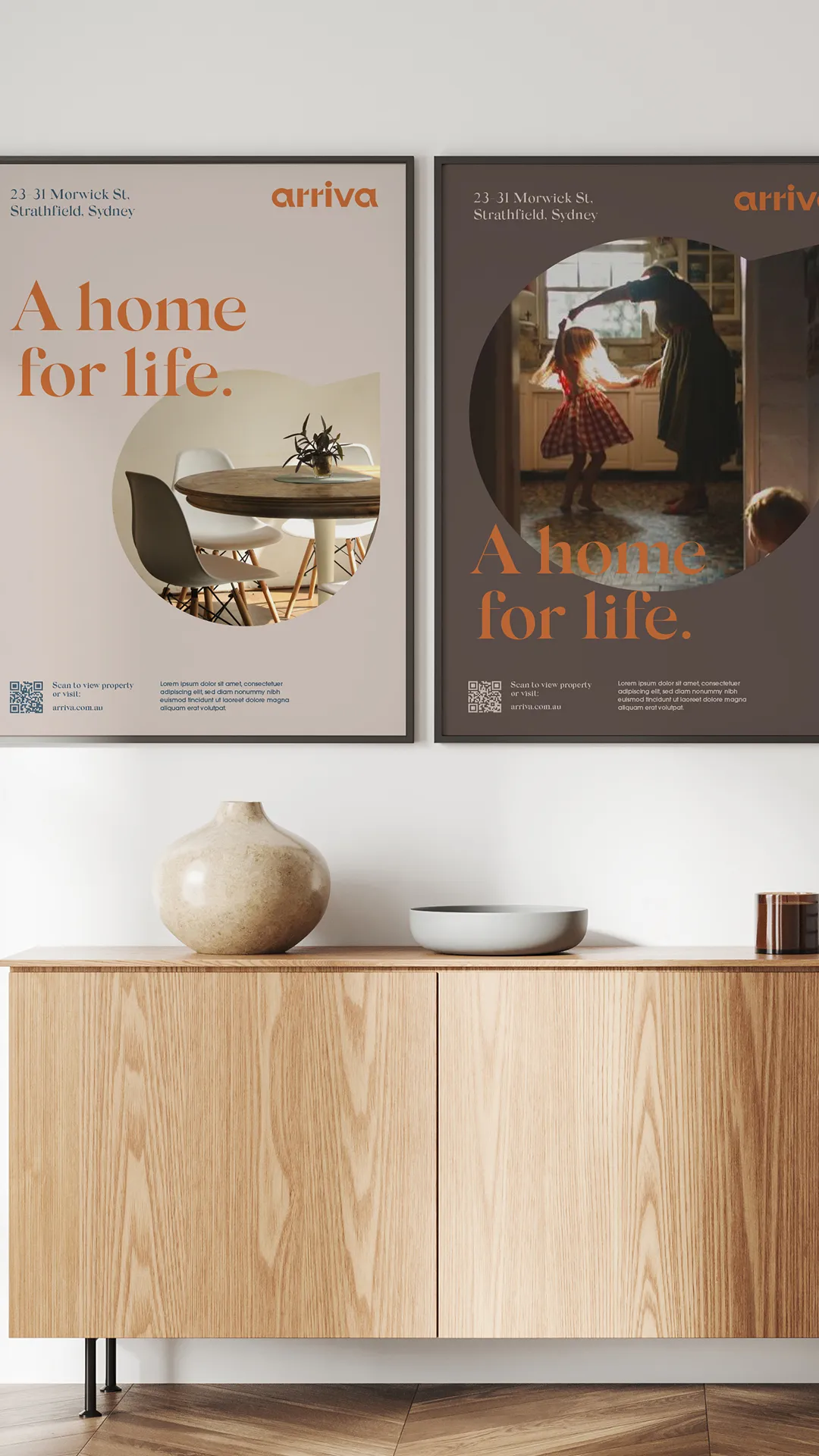
Imagery leverages the ‘golden hour’ – the magical time before sunrise or after sunset, accentuated by warm tones, high contrast, and directional shadows, creating a sense of calm, intimacy, and comfort. This warm and approachable style is further inspired by iconic Australian building materials such as red bricks, steel beams, and sail-coloured tiles, making audiences feel welcome and invited to experience comfort, ease, and security – the cornerstones of the Arriva offering.