
BRANDING TO SOLVE GLOBAL CHALLENGES
Calix came to uberbrand with an amazing portfolio of products undermined by a brand that didn’t do their work justice. This award-winning Australian company needed a face to match their important work making global industries more sustainable and environmentally friendly.
CLIENT
Calix
SECTOR
Technology
SERVICES
Brand Strategy, Visual Identity, Verbal Identity, Logo Design, Brand Identity
Brand StrategyBoth visually and verbally, it was quickly established that Calix were too product and technology focused in their communications. This made for a confusing and limited experience for their audience, trying to untangle what they do from a forest of dry information.
Where in the past it was easy to be bogged down in the granular details, Calix needed to adopt a more holistic approach. The major benefits of the brand needed to be given the spotlight, through a friendly and open style that their audience could understand and relate to. Driving the strategy to go from tech to human and from product to solutions.
Brand Identity
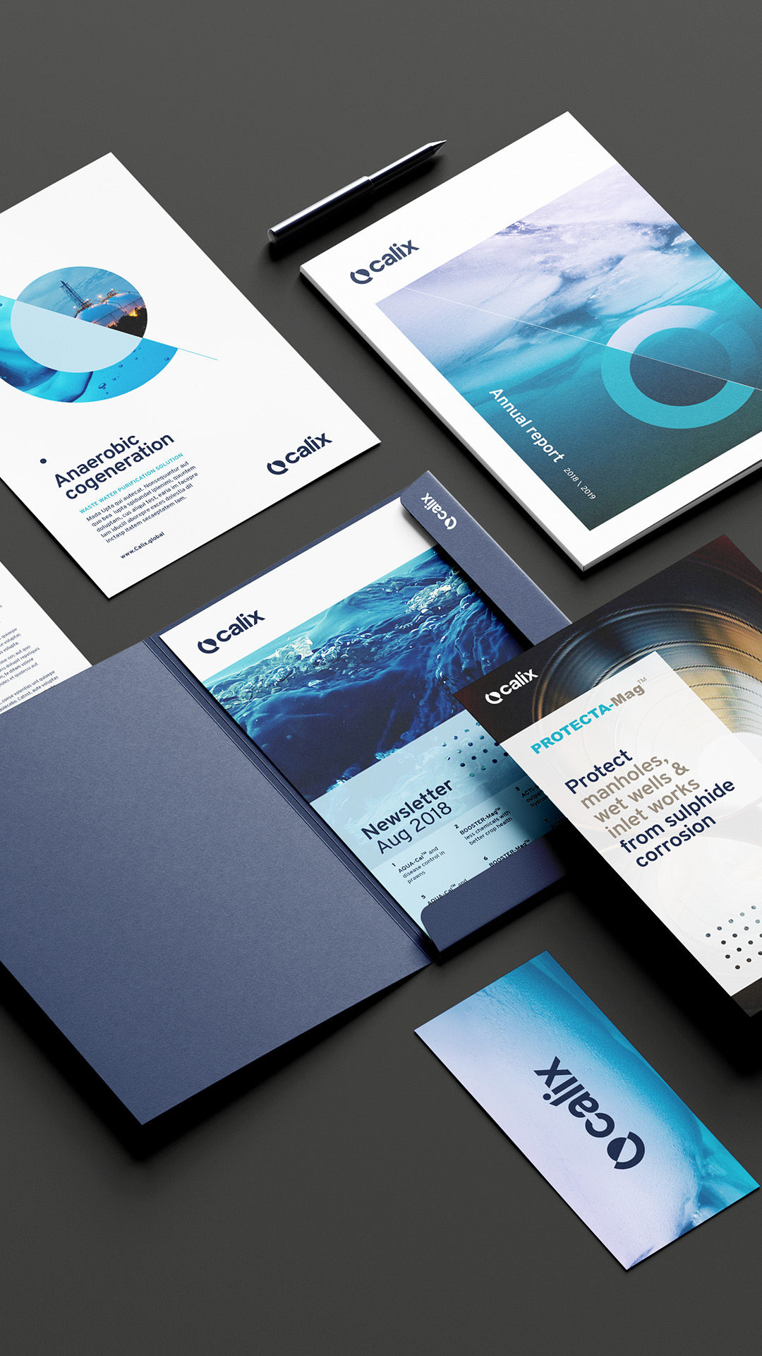
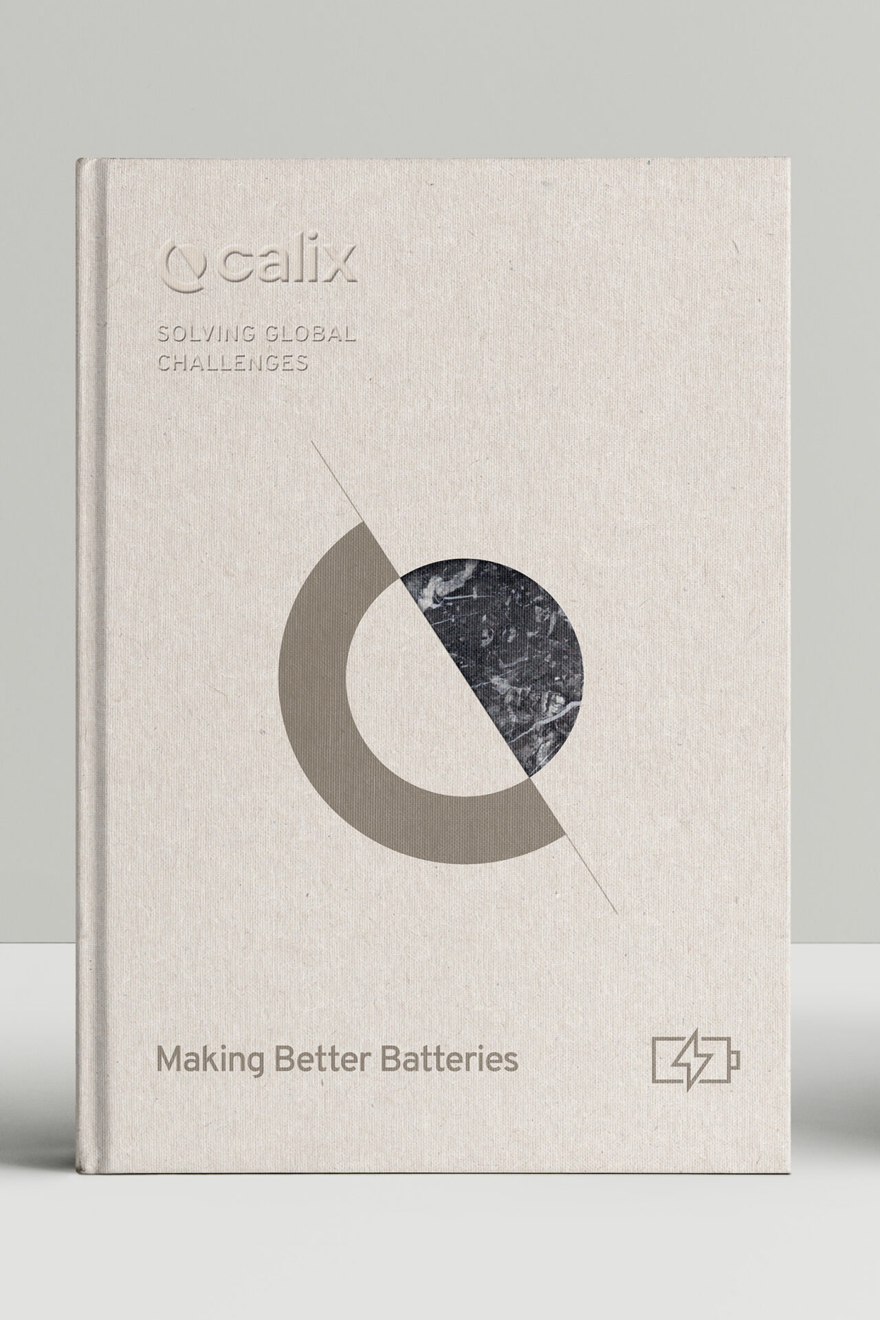
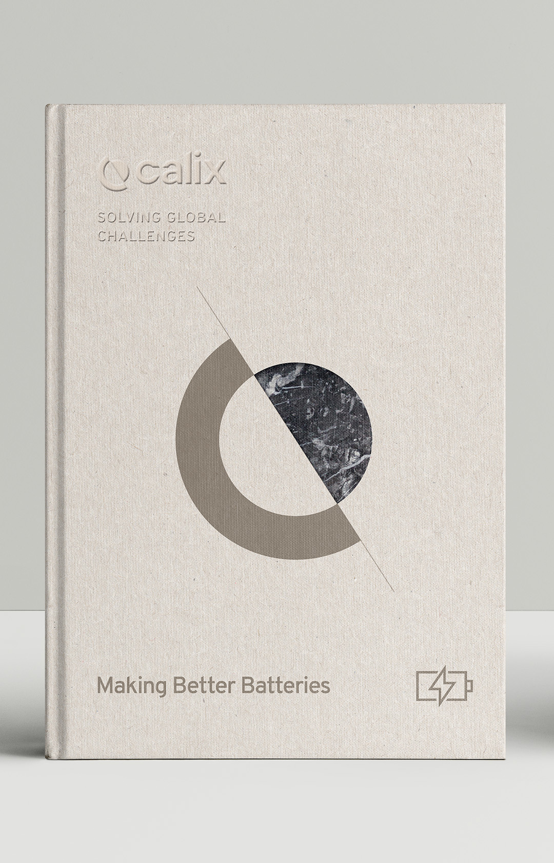
The new designs would make the revised brand more aspirational. A logo was developed to encapsulate Calix’s work towards a healthier, more balanced world, as well as their standing as global leaders in their field. This took the form of an abstract cross section of Earth, displaying crust and core.
This new logo then became the framework for a versatile device as our work moved into the overall visual identity. Earthy, natural tones became the basis for a colour palette to represent Calix products, overarching brand and the benefits they bring. These colours – as well as images selected following a unique new photography style – could be combined with the logo to create a striking communicative and creative effect across collateral.


Let us know how we can help with your next brand or communications challenge
Let us know how we can help with your next brand or communications challenge
"*" indicates required fields