A brand for a better tomorrow
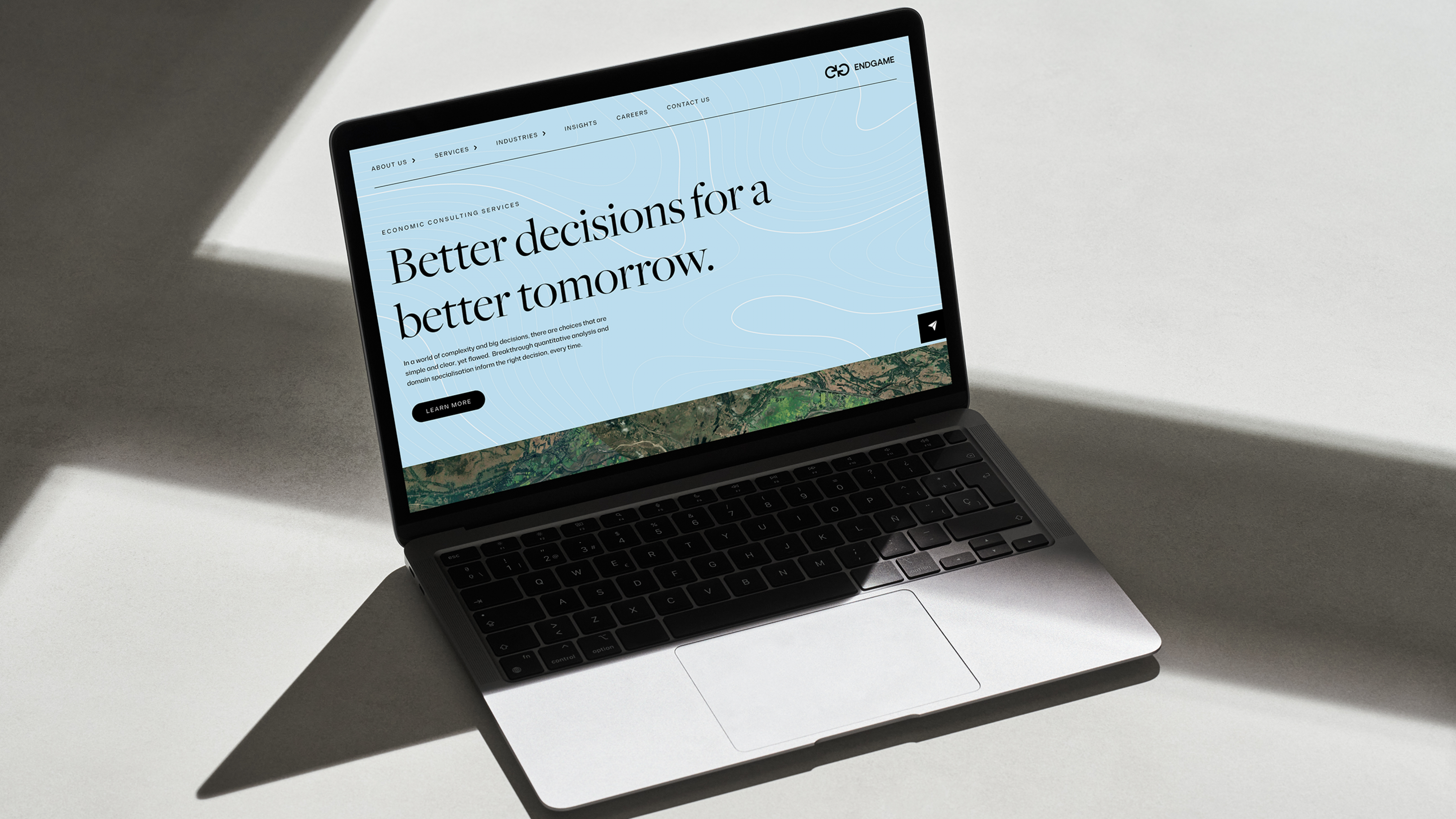
Founded as Endgame Economics, with a focus on providing mathematical modelling and economic advice in the energy sector, Endgame’s offerings have since evolved and grown. Our task was to elevate their positioning and brand identity in line with their high level of capabilities and market leadership, and expand their communication across new key sector audiences.
CLIENT
Endgame Economics
SECTOR
Mathematical modelling & economic advice
SERVICES
Brand Strategy, Naming, Verbal Identity, Logo Design, Visual Identity, Design
Name
First, we looked at their name, proposing the shift from Endgame Economics, to the more encompassing Endgame Analytics. This speaks more broadly to the breakthrough quantitative analysis and domain specialisation services the company provides.
Strategy
Endgame clients are the big thinkers and planners responsible for the high stakes decisions with the potential to effect massive commercial and community impact, with long term consequences. Through skill, experience and insight, Endgame has the capabilities to empower the big decision makers for a better tomorrow. The brand positioning revolved around to become synonymous as the one to turn to when the stakes are high and optimisation information is low by “Bringing confidence in the decision”.
Verbal Identity
From a brand story built around Endgame’s brand idea around their ability “see the big picture,” we shifted their language and tone to reflect the expertise and intellectual depth embodied that the brand embodies. By infusing their communication with philosophical insights, we emphasised clarity, authority, and thought leadership—key attributes that set the brand apart.
Logo
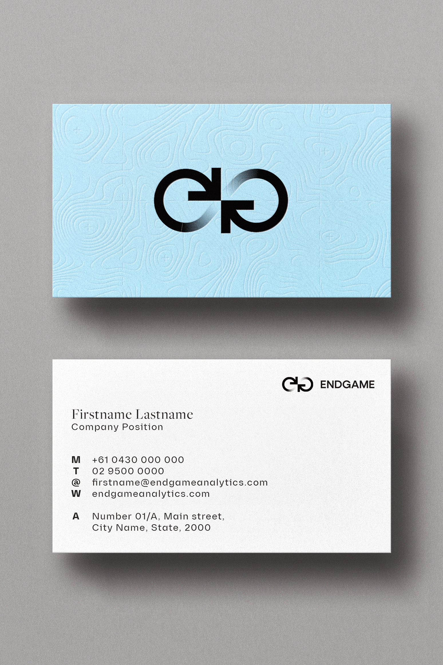
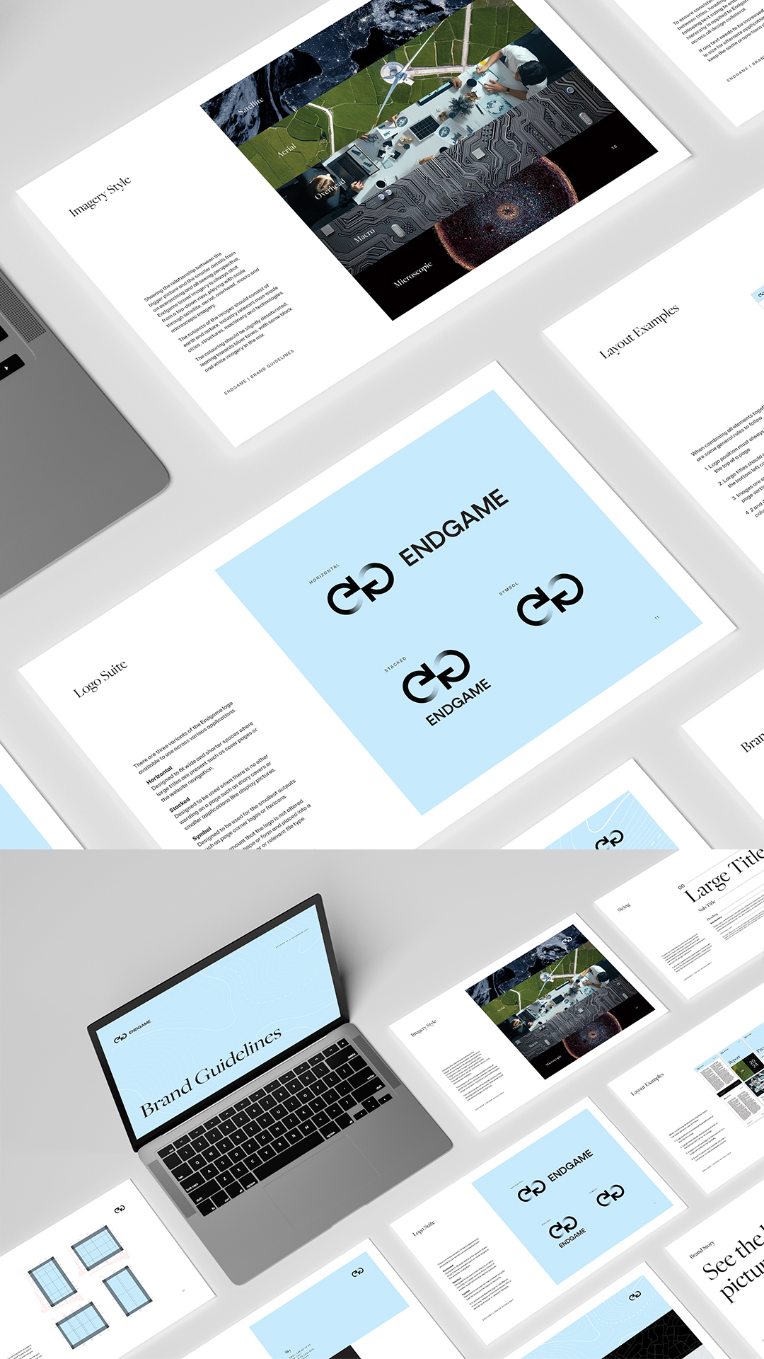
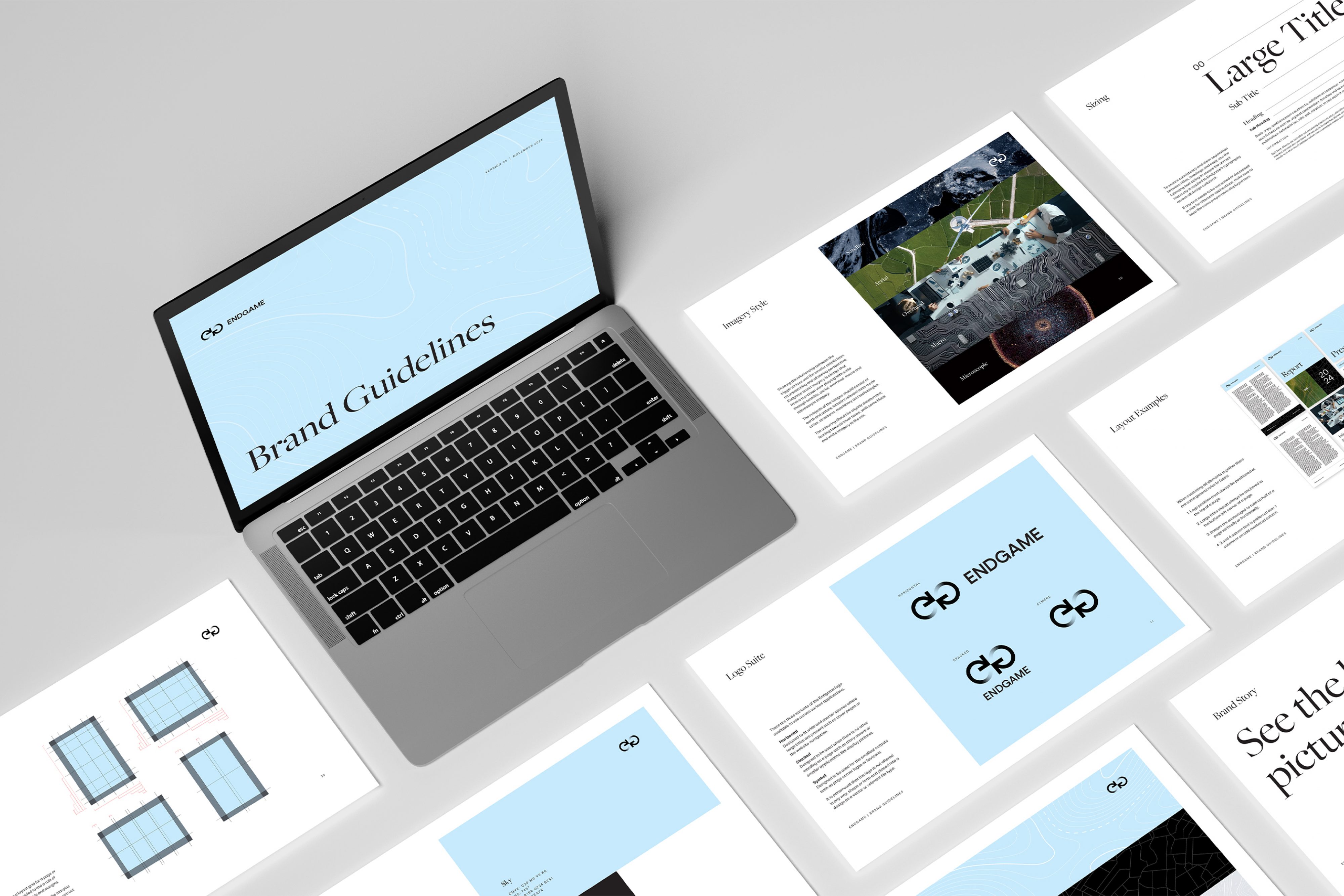
In a world of infinite decisions, Endgame ensures you find the best one, backed by quantitative analysis. We designed a new logo that incorporates the forms of the “E” and “G” to represent different perspectives, subtly creating an infinity symbol that reflects endless choices and possibilities. Simple and clean, the uppercase letterforms convey confidence, strength, and clarity.
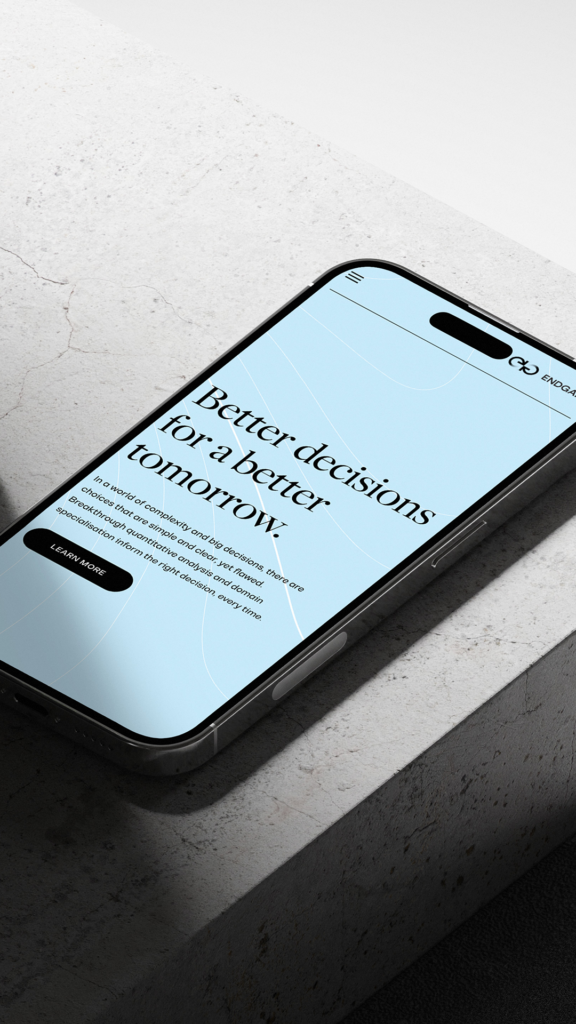
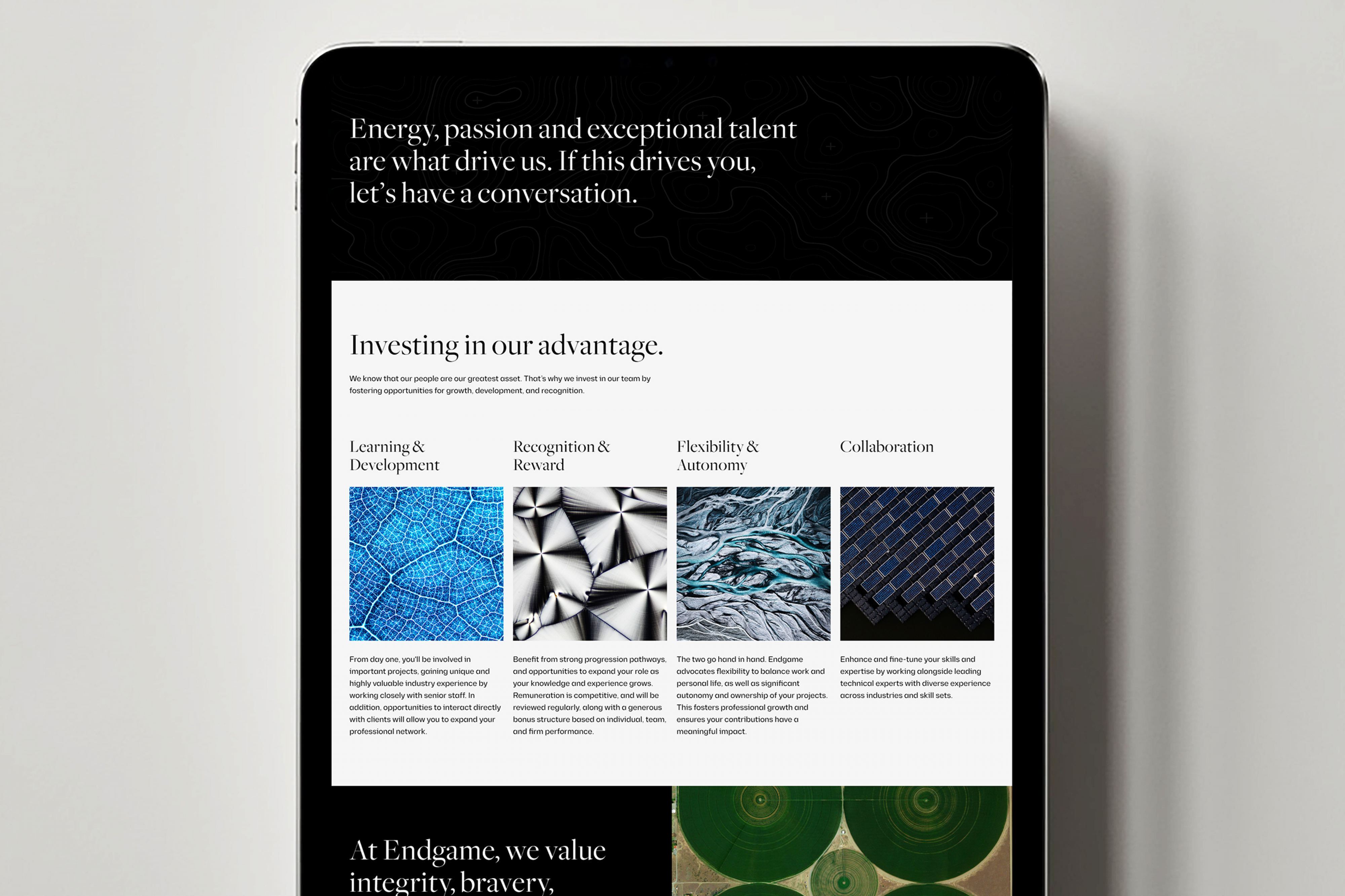
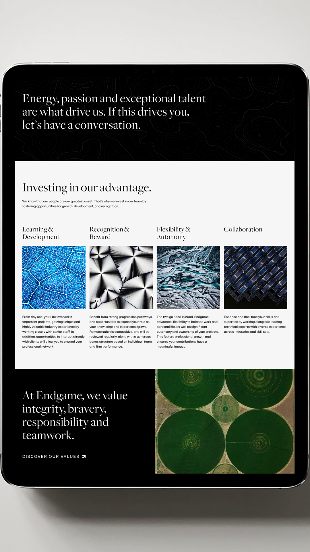
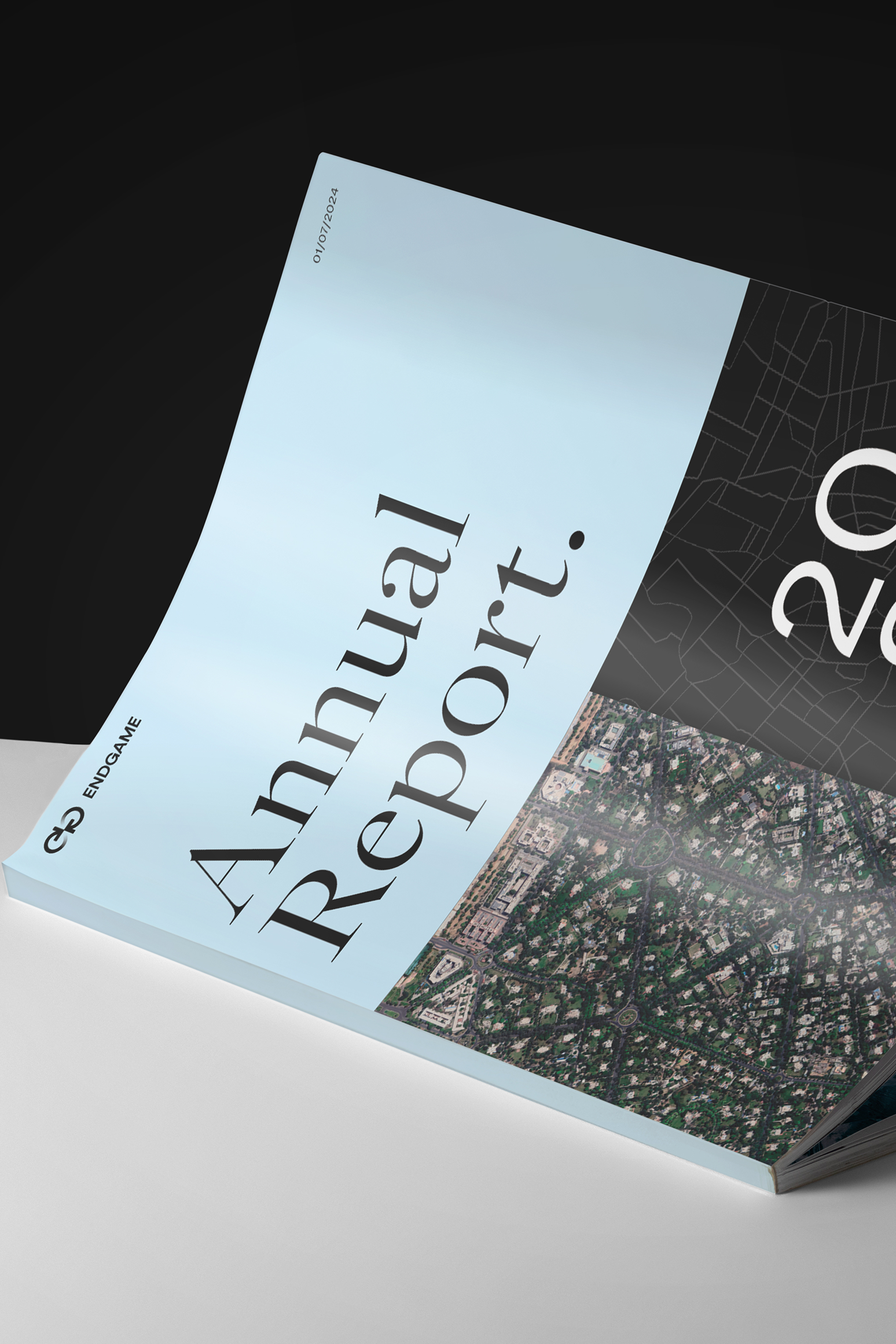
The new visual identity is anchored by an intellectual sky-blue hero colour, evoking trust, dependability, and a sense of security. Symbolising blue-sky thinking, it reflects the brand’s commitment to discovering innovative ideas and groundbreaking solutions. This primary colour is complemented by a supporting palette of black, white, and grey, which enhances its sophistication and confidence. To add depth and versatility, deeper shades of blue and grey have been introduced, enriching the palette with greater dimension and usability.
Let us know how we can help with your next brand or communications challenge
Let us know how we can help with your next brand or communications challenge
"*" indicates required fields