Brand Strategy
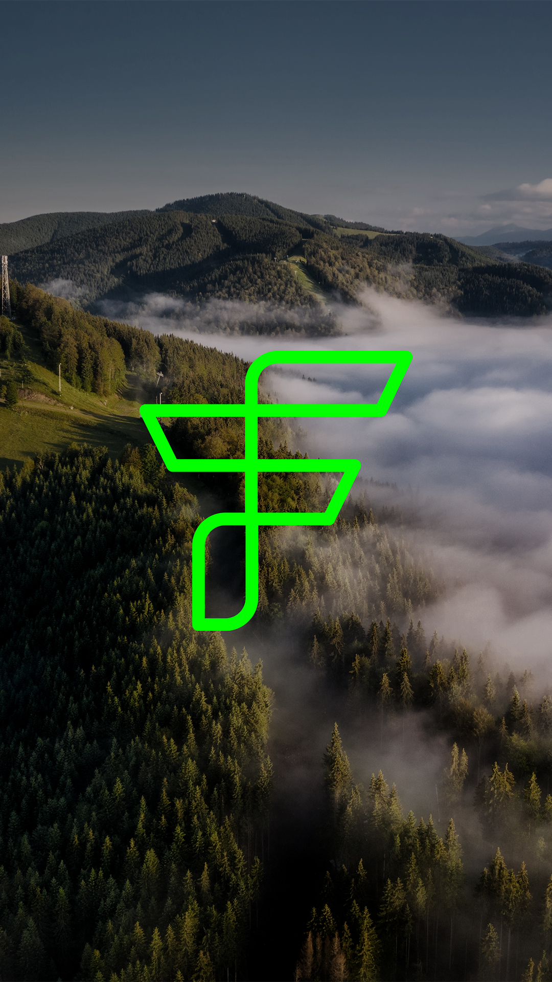
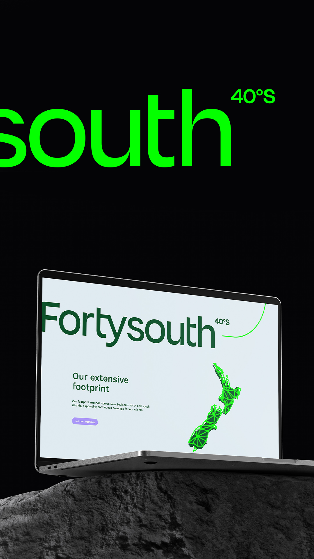
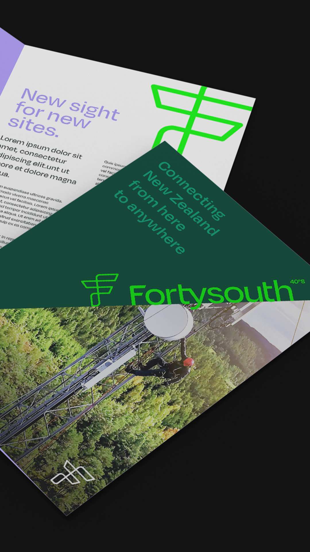
Positioning the brand as the foundation for continuous coverage for every New Zealander, we defined the brand promise as ‘from here to everywhere’. The name needed to be distinctly New Zealand and ‘Fortysouth’ was derived from the country’s longitudinal coordinates.
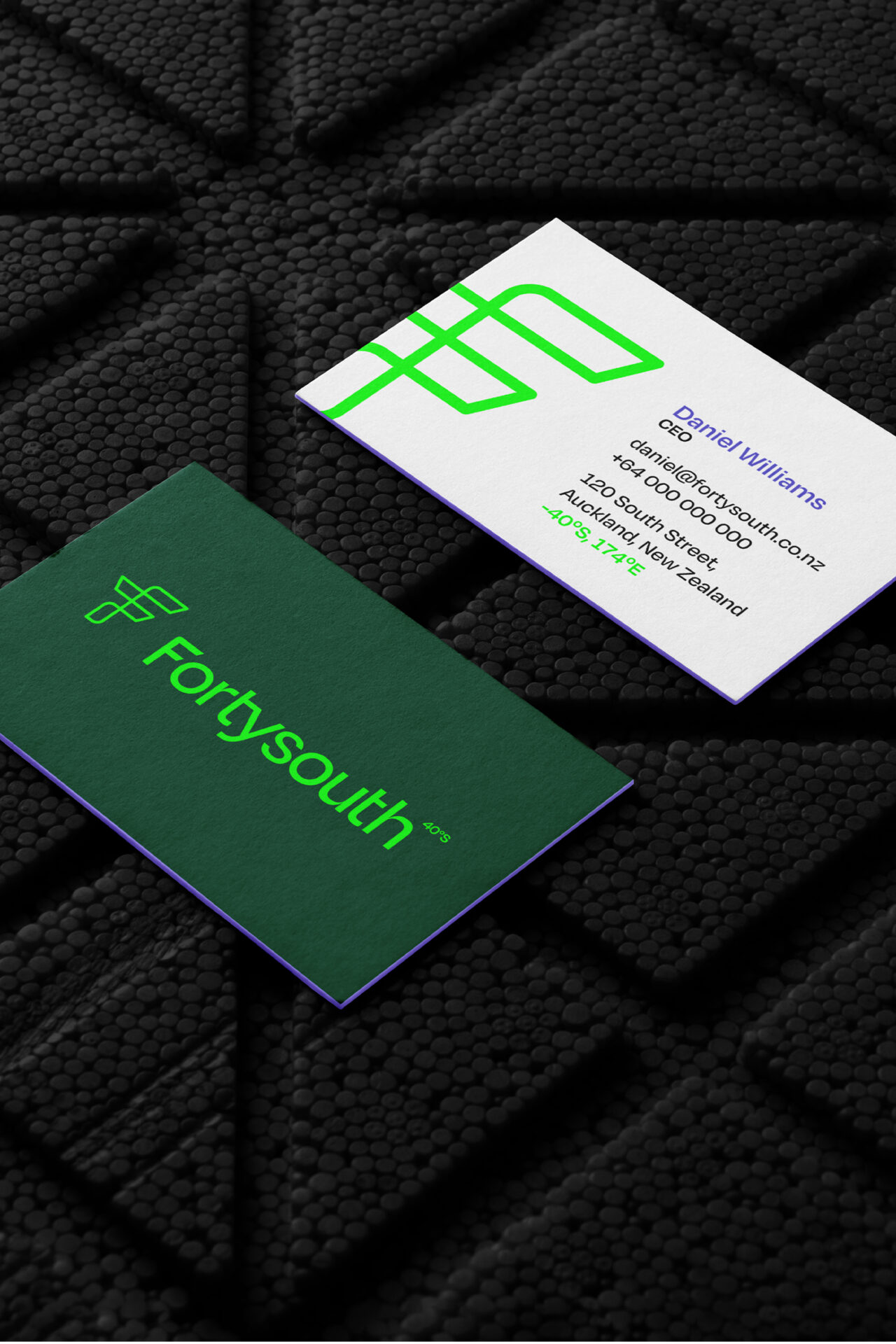
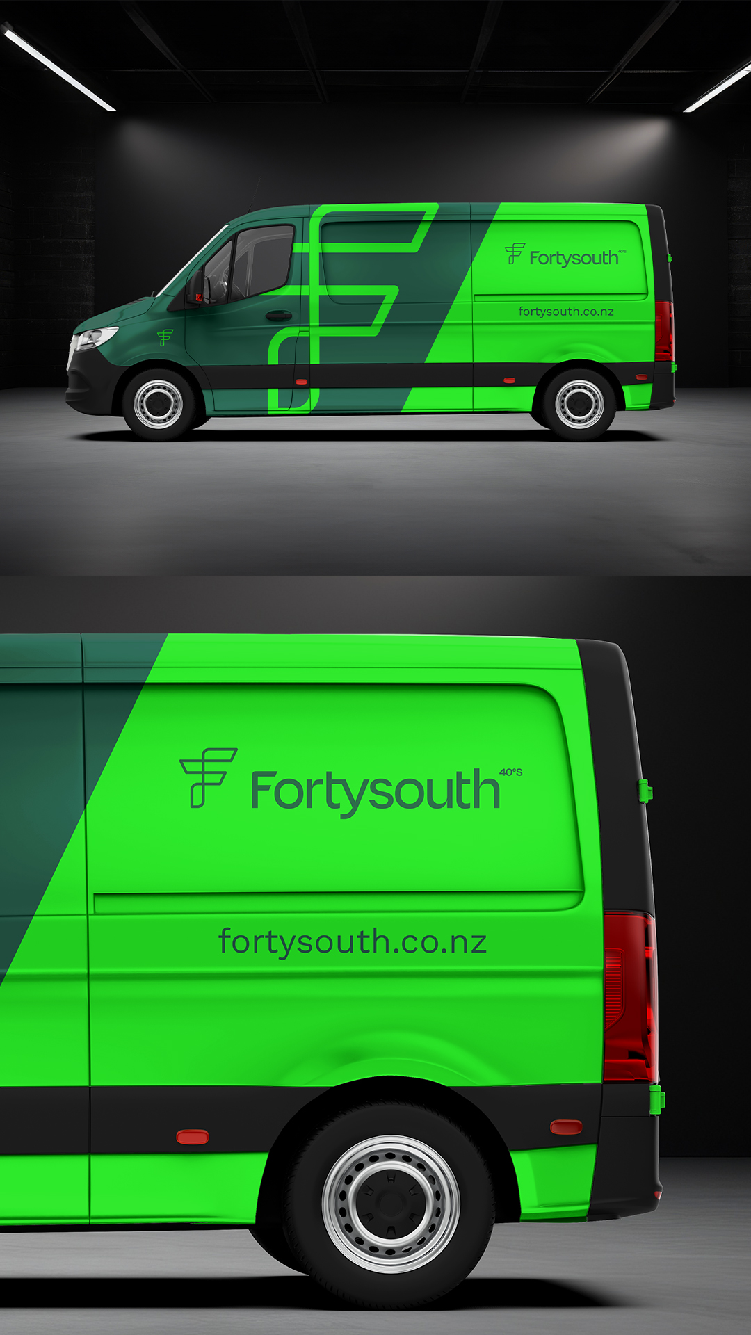
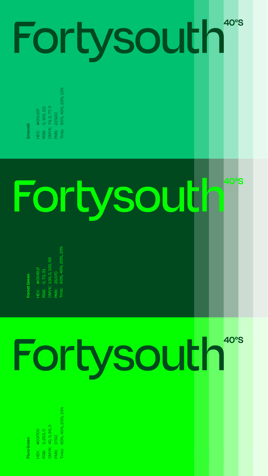
The logo signifies a bold new era in TowerCo. We built a design system around symbols that connect New Zealand’s digital ecosystem and will drive the industry forward. Through a combination of fluorescent and earthy green colours, we evoked a connection to the country’s verdant landscape.
The Results
We connected the brand to the place, for all audiences, by conveying its position in the world and its movement towards the future as articulated through our brand promise: from here to everywhere.