Insync’s investment strategy focuses on identifying tomorrow’s winners by understanding the drivers of sustainable growth in return on invested capital (ROIC). Through their unique triple-layer decision-making model, Insync invests in future-focused trends that combine strong growth potential with stability.
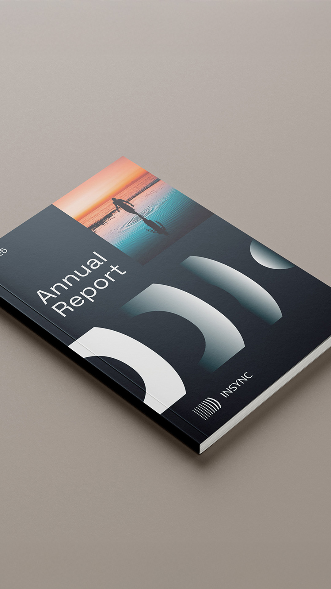
To reinforce its competitive edge, Insync’s unique investment approach is encapsulated in a clear, compelling strategic proposition and a new vision: Ready for tomorrow. This modern, differentiated strategy shapes its brand image, resonating across its website, sales materials, and business assets to effectively communicate its leadership and vision to investors.
As the expert navigating future opportunities, Insync’s verbal identity elevates and modernises its brand as the smart choice for investors. The language reflects a forward-thinking mindset, emphasising precision, insightful decision-making, and control over data – to hit the mark on the right investments at the right time.
The brand strives to resonate with a broad audience, including corporates, SMBs, and franchises, while reinforcing its vision of being “Ready for tomorrow” at every touch point. Insync’s tone of voice is bold, inspiring, and engaging, capturing the brand’s leadership in anticipating and capitalising on change.
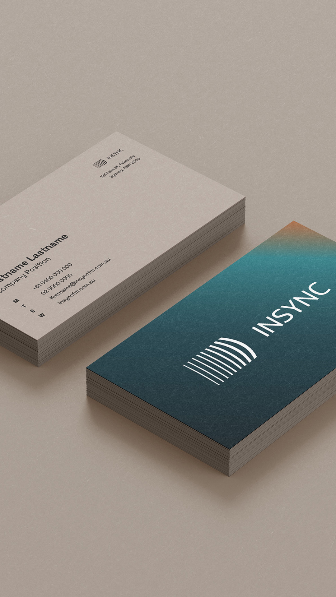
Insync’s visual identity embodies its commitment to navigating an unpredictable industry with forward-thinking precision. At its core is the ripple mark, symbolising momentum and progress, and serving as a distinct emblem for the brand.
The deep teal hero colour anchors the identity, while the “Afternoon Glow” gradient evokes a bold, golden hour presence. A balanced primary palette of black and white ensures clarity for text and backgrounds.
The imagery blends scale, perspective, and movement, complemented by contemporary photography that brings optimism and a human touch to an otherwise impersonal industry. The Space Grotesk typeface, chosen for its balanced, flexible form, underscores the brand’s modern, dynamic approach with strong, bold headlines.
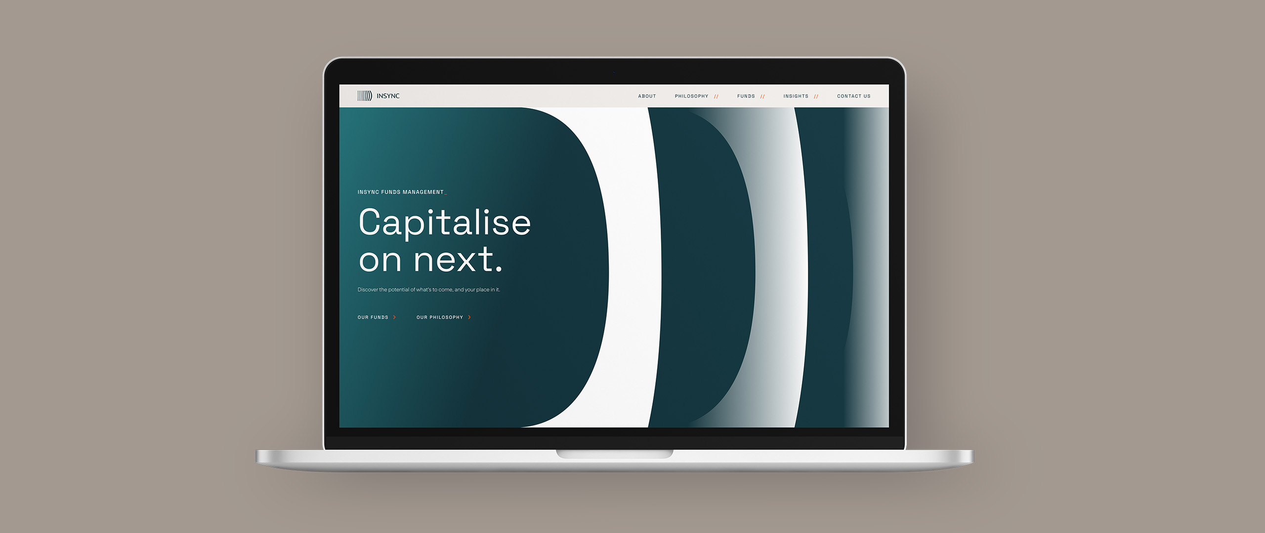
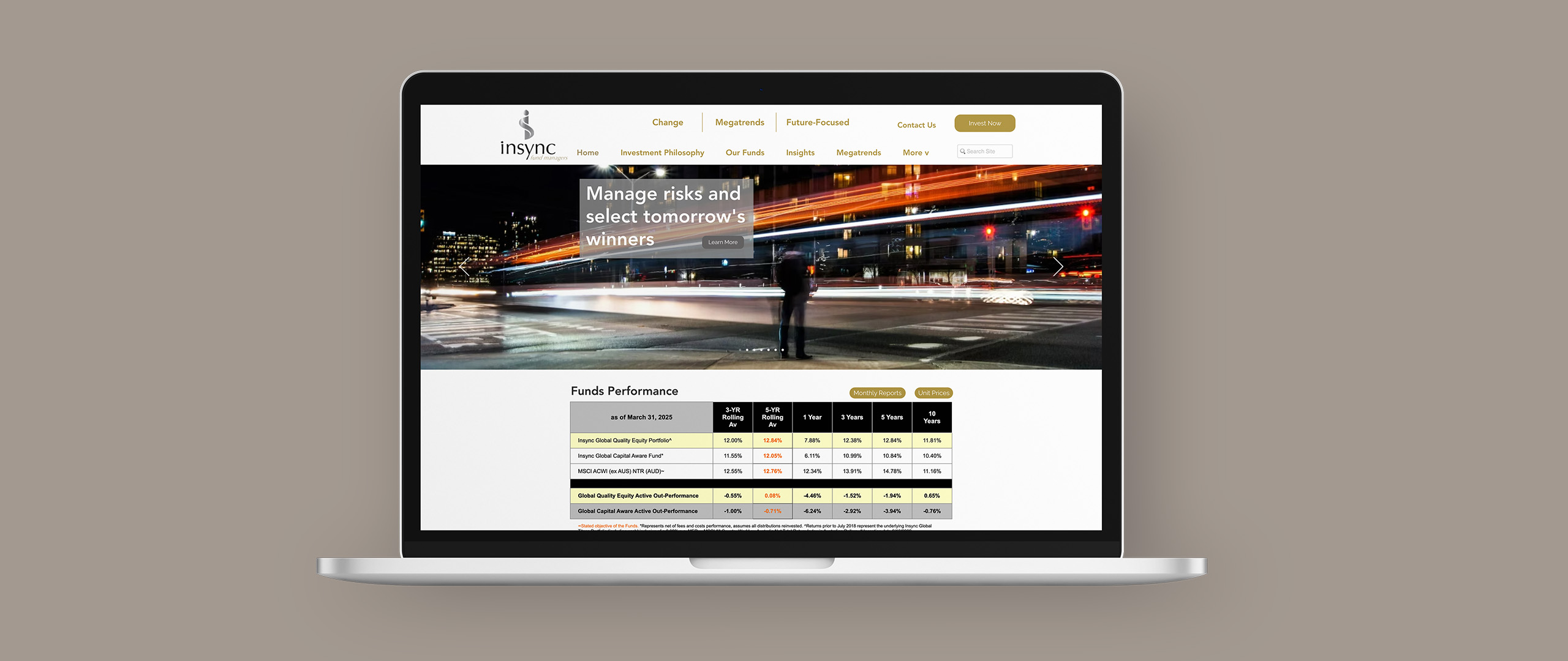
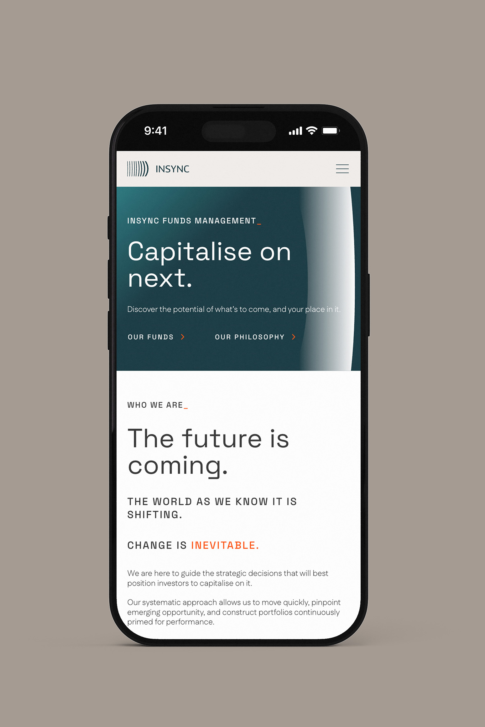
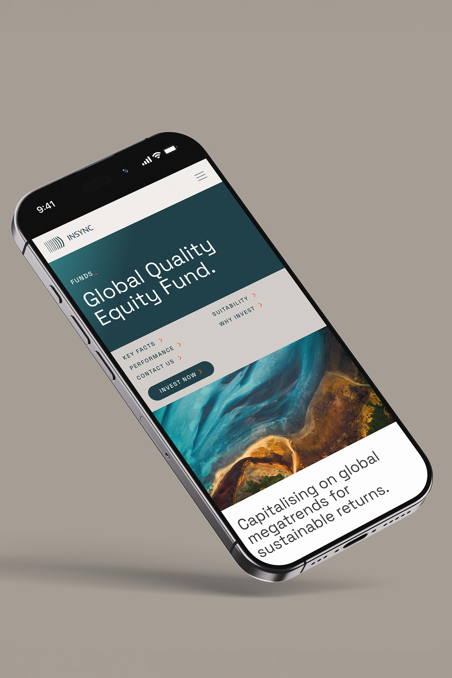
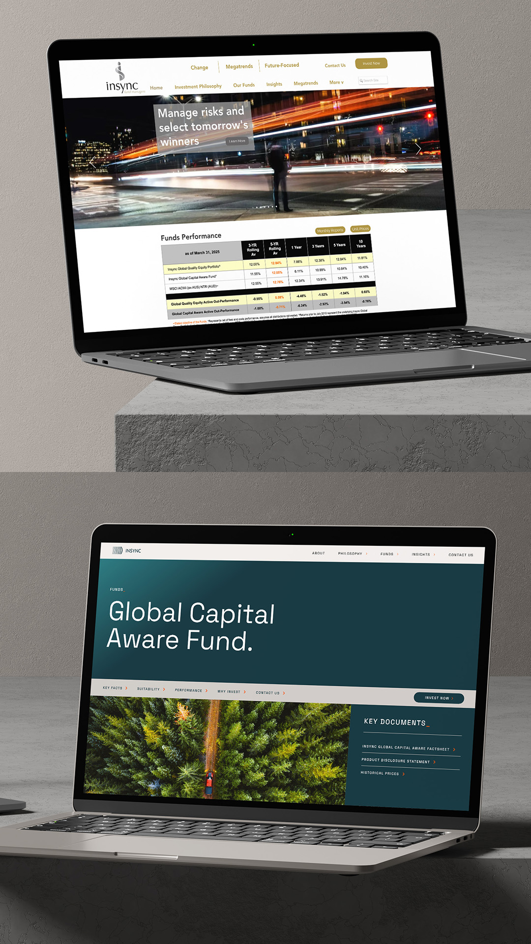
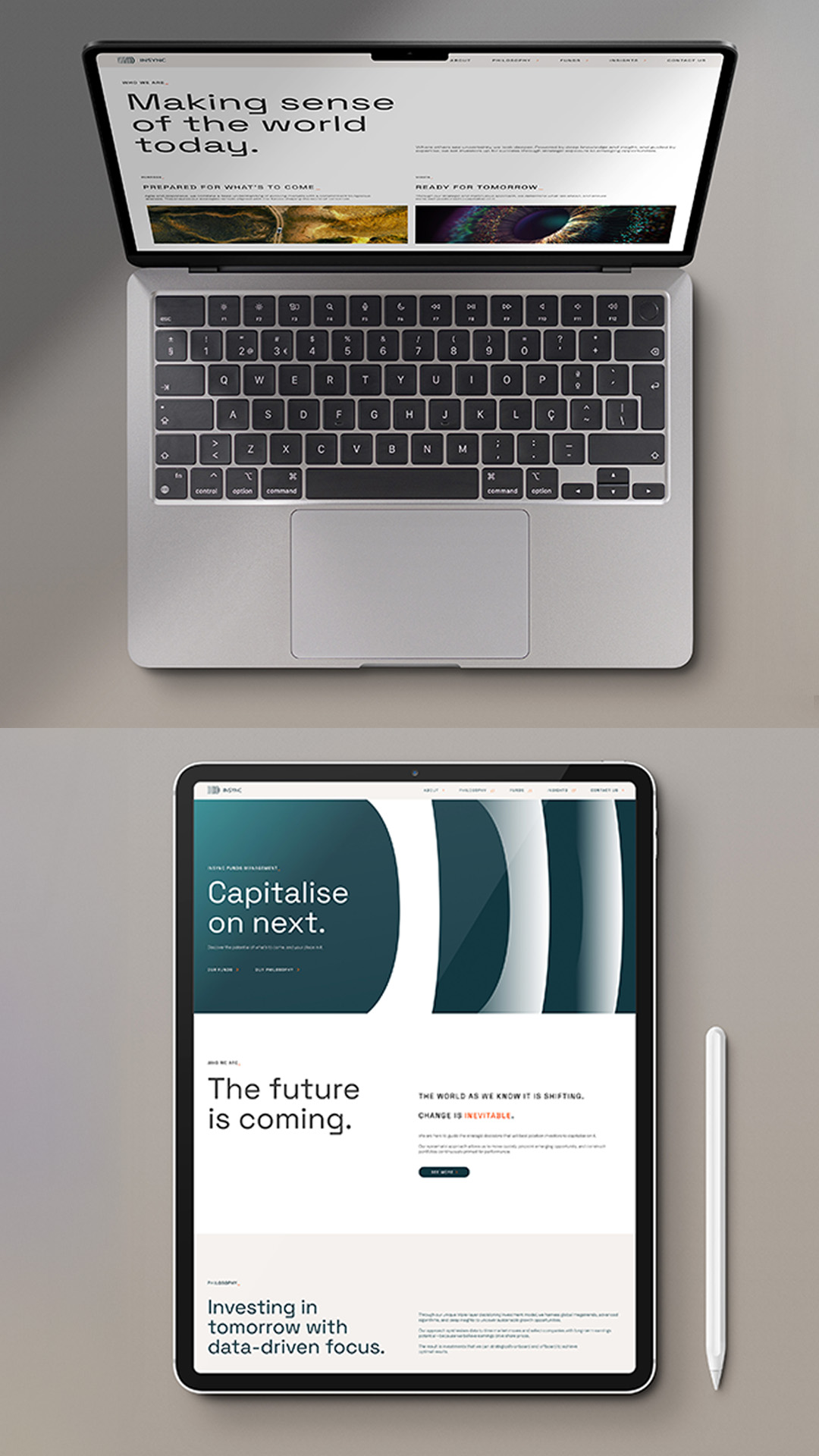
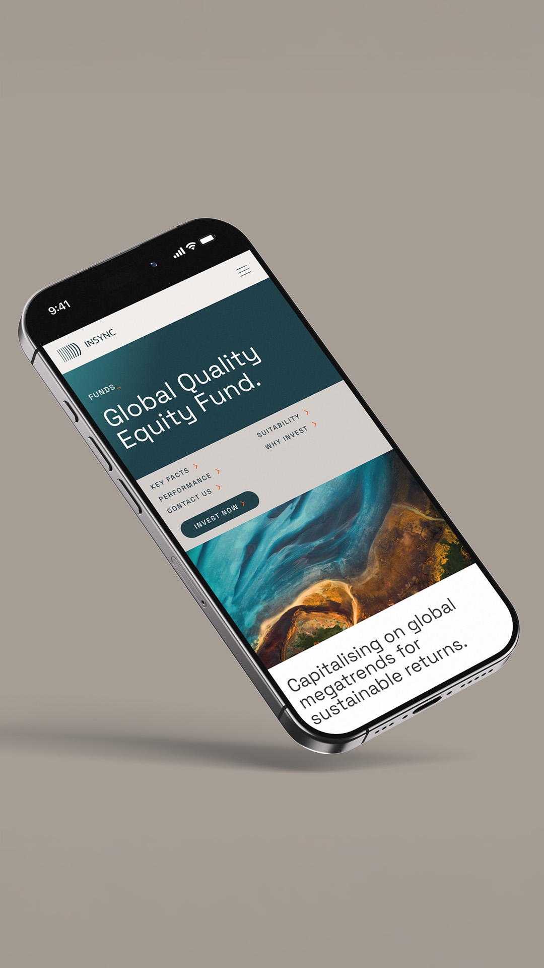
Website
We seamlessly unified Insync’s visual and verbal identities to create a cohesive website that communicates Insync’s forward-thinking approach with clarity and impact.
With intuitive navigation, bold design, and compelling content, the website effectively showcases Insync’s leadership in identifying future investment opportunities, engaging both current and potential investors.