Brand Strategy
Where the industry may lag, LJ Hooker strives for better. Extensive research and in-depth interviews nationally revealed a network that consistently steps up to deliver better experiences and outcomes. With their ambition and capabilities to operate at a higher level of competence, experience, and expertise, LJ Hooker fosters skilled and professional agents who confidently guide vendors through every step of the real estate journey. We devised a new brand proposition of “We do it better,” supported by values of consistency, transparency and professionalism.
Brand Idea
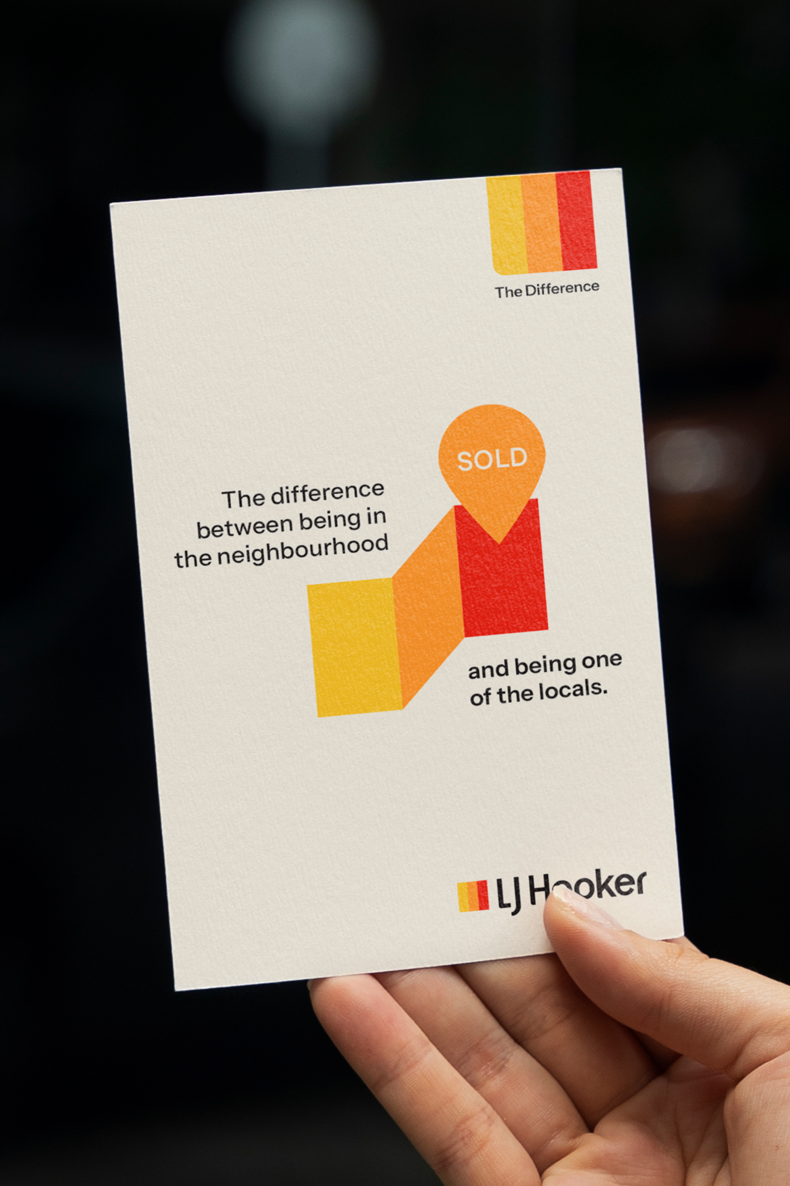
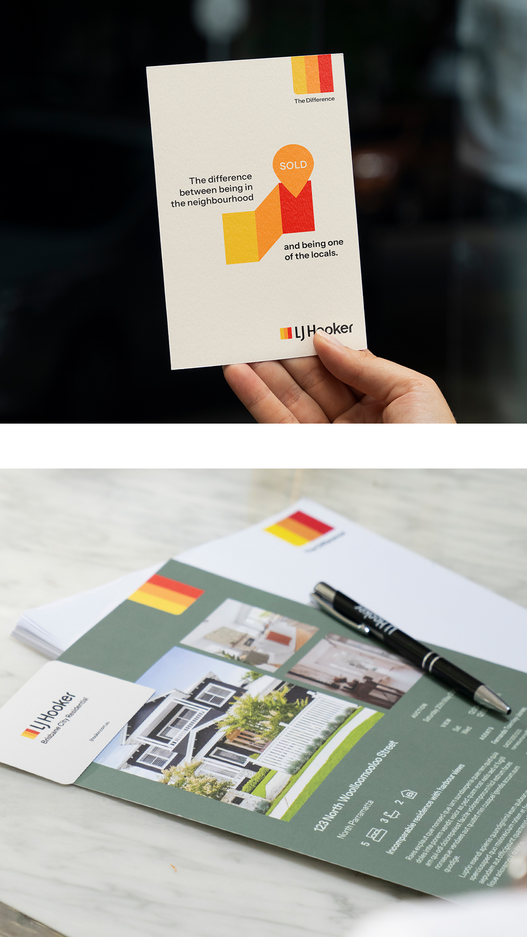
We conceived a brand idea to bring the brand proposition to life: ‘The Difference.’ This allows us to create points of differentiation and own the things we do well. Through the direct juxtaposition of the industry standard and the LJ Hooker way, we can easily verbalise our difference, elevating our position and enhancing consideration.
Verbal Identity
Leveraging our brand idea of “The Difference”, we crafted a brand story centred around the concept that ‘what makes us different, makes us better’. Using a confident, connected and authentic tone, we developed a tailored messaging matrix for each LJ Hooker offering and audience, providing a flexible resource to draw from as required.
Logo
Working with visual cues based on focus, competence and control, we applied subtle refinements to the LJ Hooker logo, while preserving its overall form and recognisability. Adjustments to enhance consistency across the letterforms included reducing curves and introducing square corners to project strength and confidence. Key updates include basing letter thickness on the width of the colour band, widening letters for a more substantial presence, and selectively incorporating rounded corners to balance modernity with a nod to the brand’s heritage. Refinements to spacing, proportions, and details, such as the ‘e,’ emphasise sophistication and care.
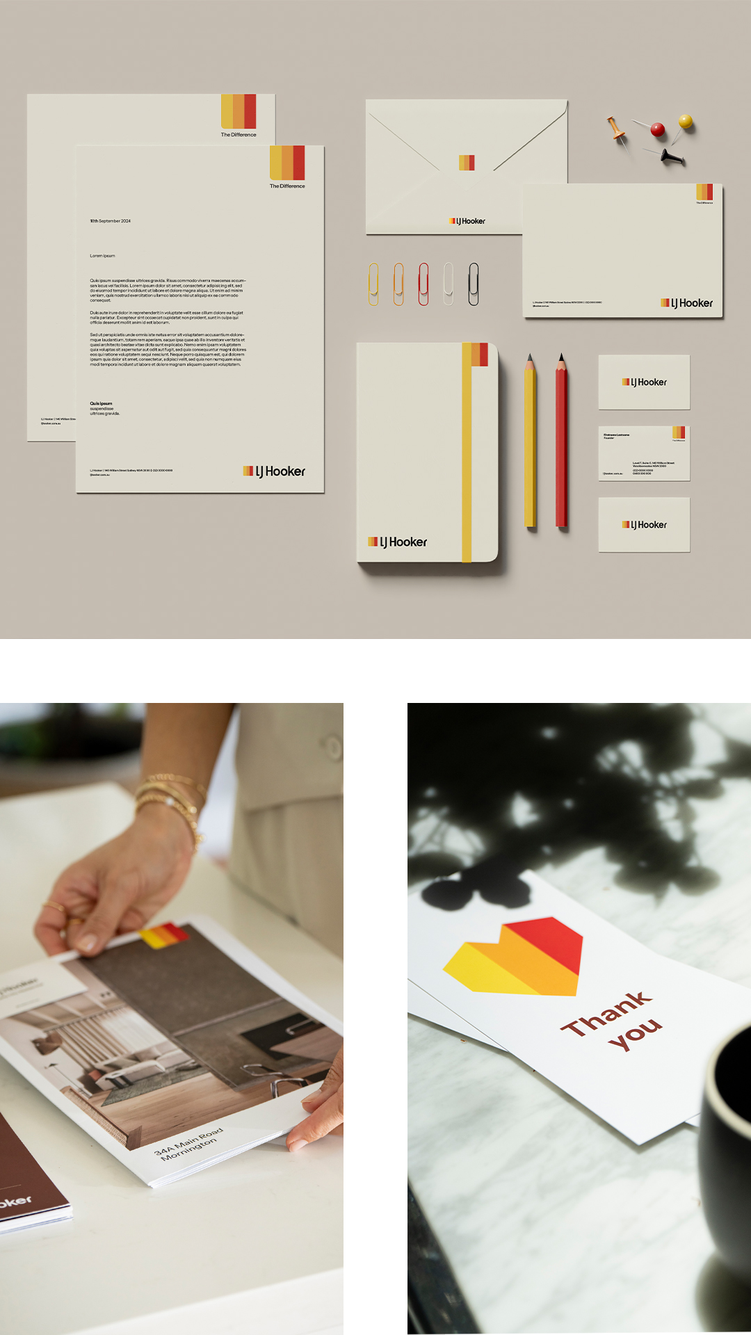
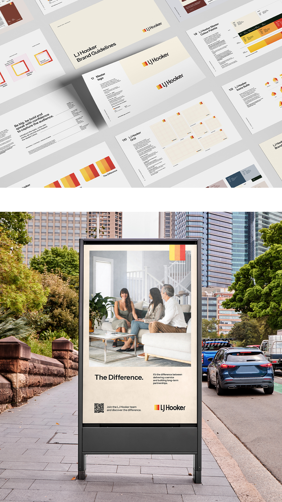
Visual Identity
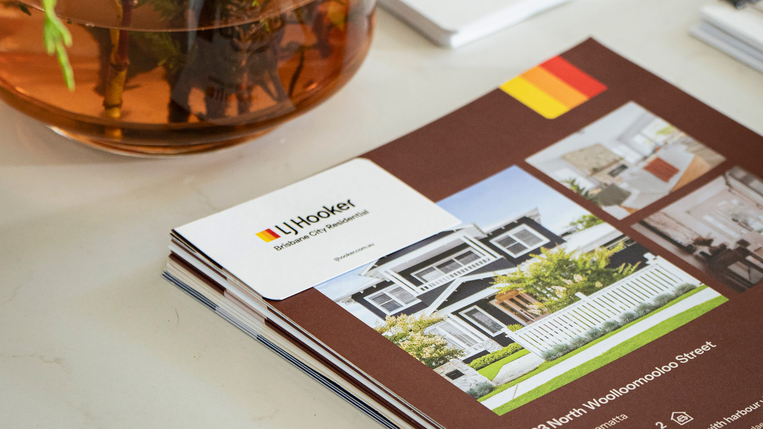
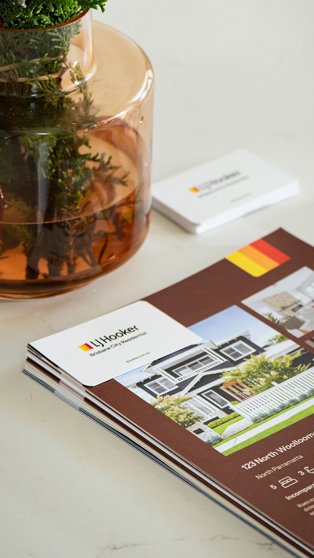
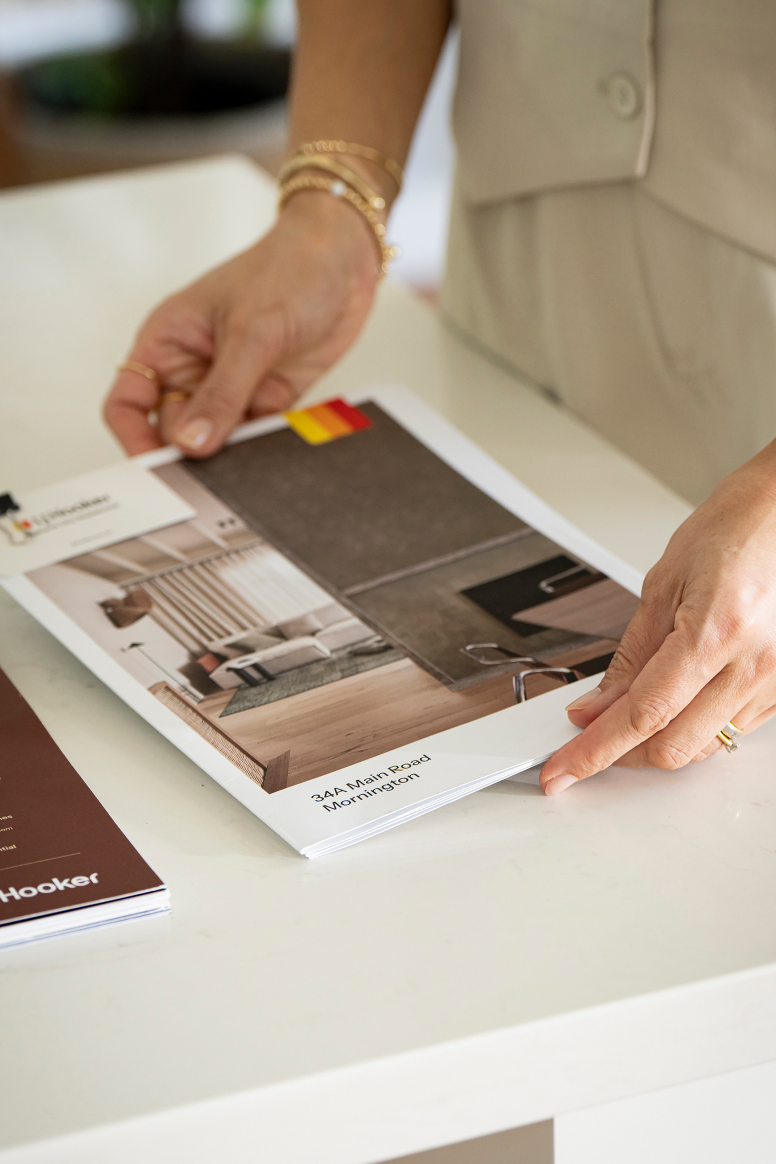
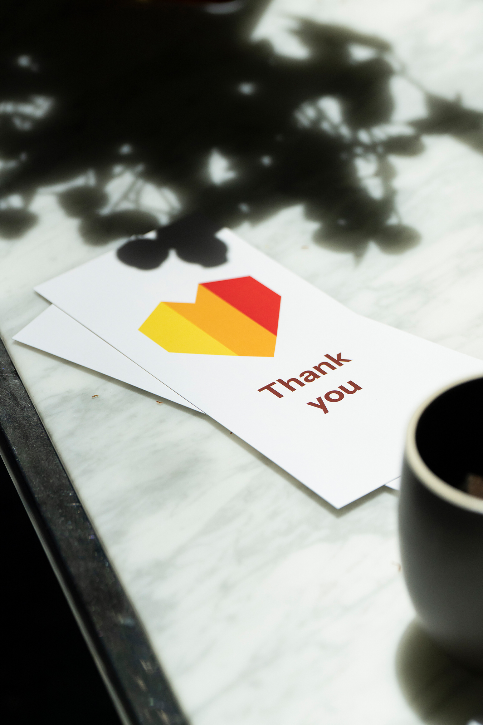
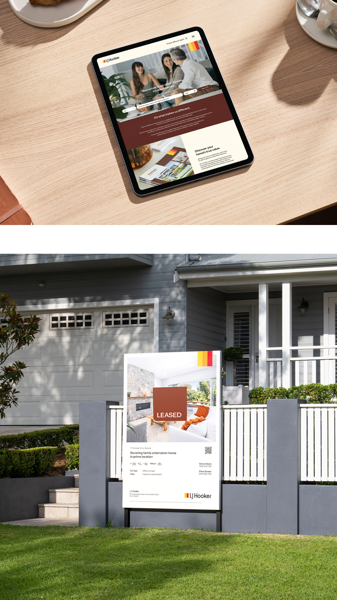
Refining LJ Hooker’s visual identity focused on the consistent use of its three hero colours, balancing them with contrasting hues to simplify and enhance the iconic flag. Inspired by Weston Wills’ storytelling photography, the brand highlights its people—agents, vendors, buyers, and partners—each with an inspiring and aspirational story.
The photographic style emphasizes authenticity, with soft lighting, detailed textures, and natural expressions. Interiors are captured from a first-person perspective to showcase both space and detail, while exteriors celebrate homes in warm, natural light, blending hard and soft textures.
To project confidence and leadership, the soft tone of the Poppins typeface was replaced with a neo-Grotesk-inspired typeface, combining gravitas with legibility. This new approach delivers messaging with clarity, substance, and authority, reinforcing LJ Hooker’s position as an industry leader.