For over 30 years, Pack & Send has built its logistics business on a foundation of human connection and personalised support, delivering tailored service and unmatched expertise. Our task was to craft a strategic vision, develop a compelling value proposition, and refresh their brand identity, including their visual and communication approach.
Pack & Send Logistics Services
Courier; Logistics
Strategy, Verbal Identity, Visual Identity, Logo Redesign
Brand Strategy
Extensive research, including internal and external interviews, revealed that the logistics industry is increasingly moving towards tech-enabled, self-service models. For businesses navigating unpredictable challenges and tight deadlines, the lack of accessible support often results in stress and frustration. Pack & Send’s commitment to a personal touch to remove that friction is what truly sets them apart. From these insights, we developed a brand proposition: “Logistics, the way it should be done.” This serves as a foundation to highlight Pack & Send’s personalised service, deep expertise, and dedicated support, and aligns with a new vision for the brand: “Everything taken care of.”
Verbal Identity
With deep expertise and unwavering commitment, Pack & Send meticulously protects clients’ interests, handling challenges with precision, flexibility, and care. We based the brand’s verbal identity around the guardian personality type, embodying a trusted, professional, and inspiring tone. The communication centres around the brand idea “And everything in between” – because getting something efficiently from point A to Z is about so much more than the A or the Z – it’s about everything that happens in between – which is exactly where Pack & Send excels.
Logo Design
The existing logo was made up of three parts: the ‘guardian’ symbol, the wordmark and the registered trademark. To refine the horizontal logo, we increased the height of the wordmark to align with the arm and leg of the guardian symbol, and slightly enhanced the line weights to better complement the symbol’s design. We amended the width of the trademark in line with the letterforms for consistency. Stacked versions of the logo were created to provide greater flexibility for different applications. We also developed guidelines for separating the symbol and wordmark in special cases, enabling the logo to adapt seamlessly to current and future needs.
Visual Identity
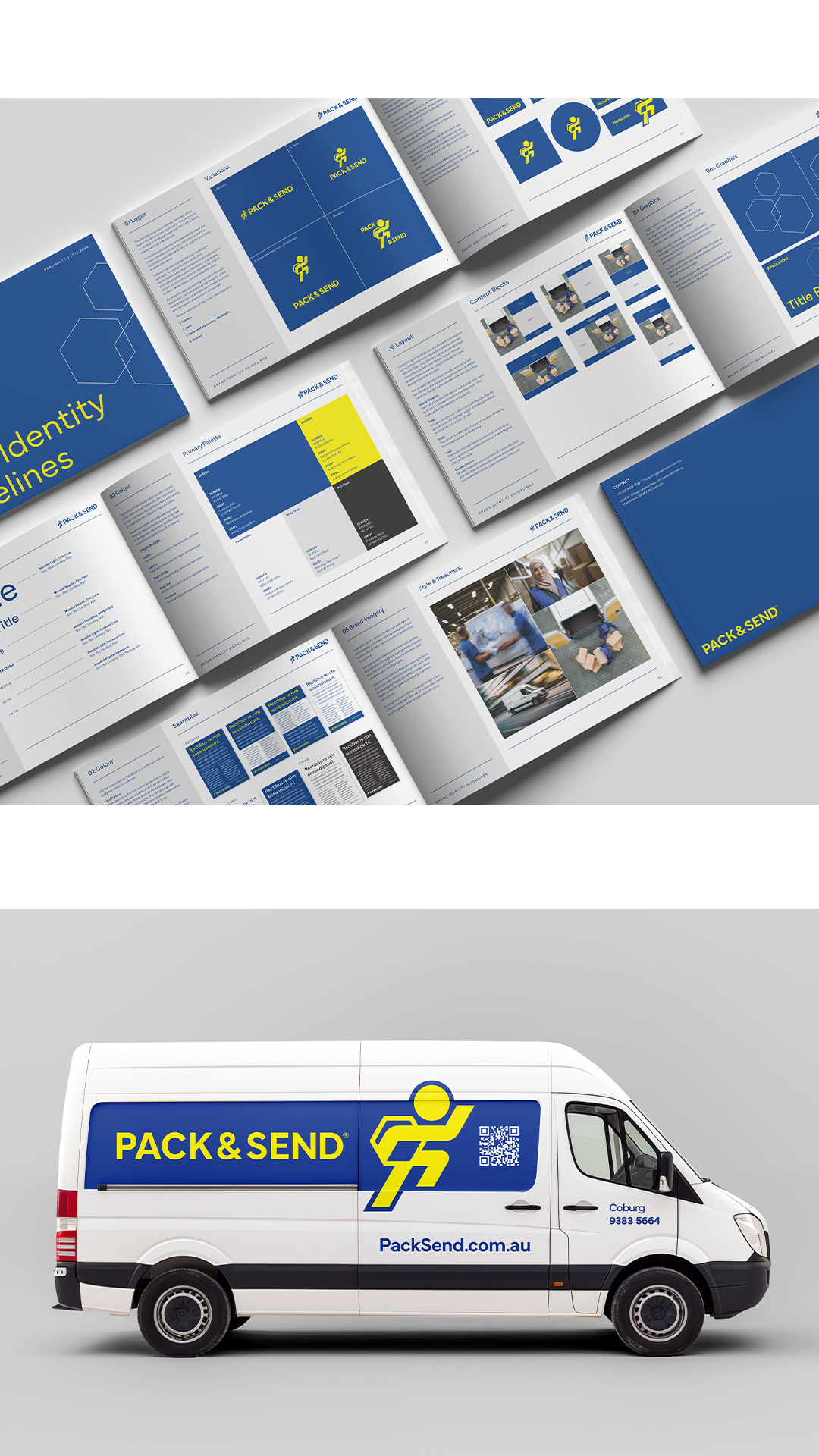
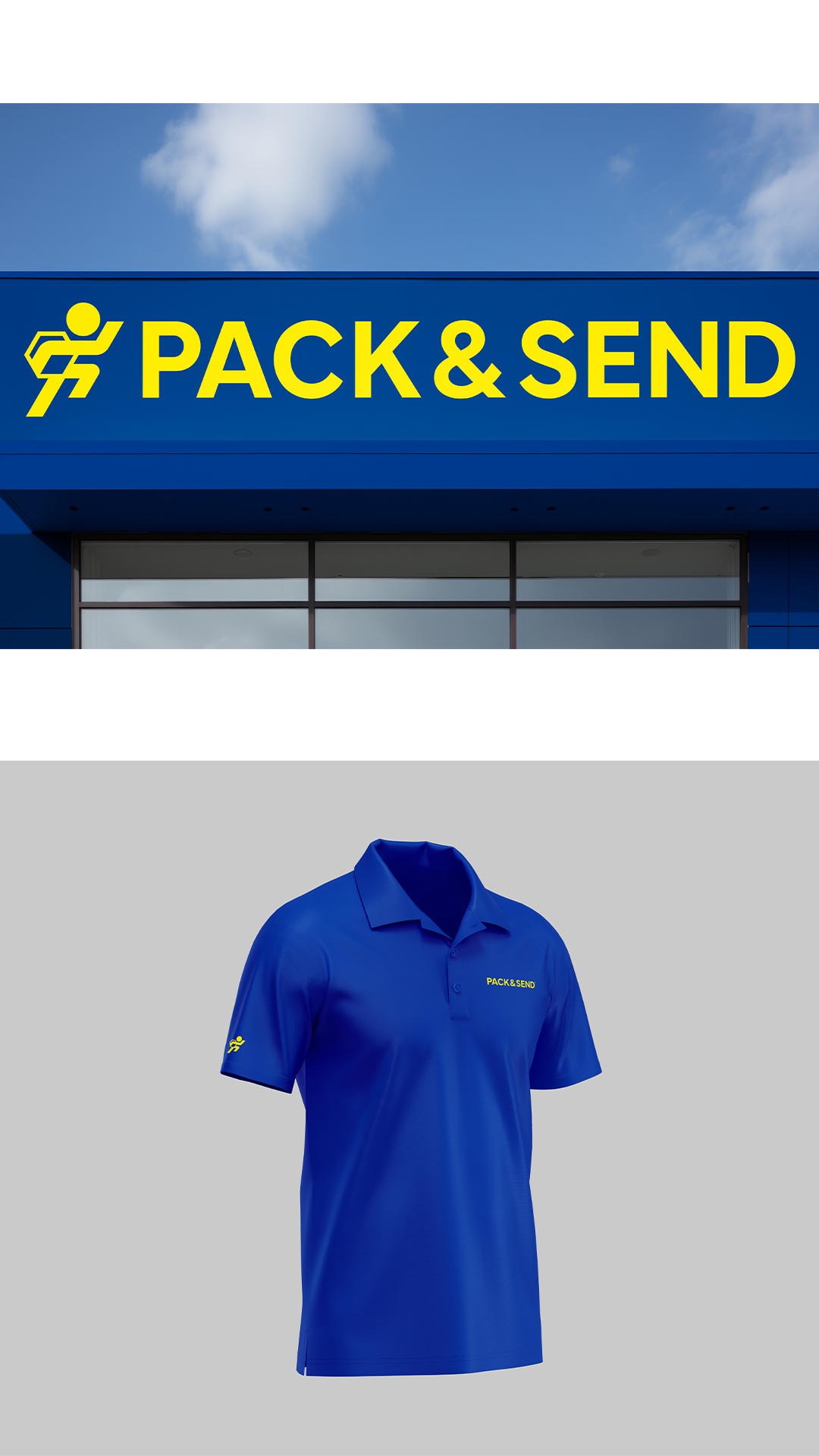
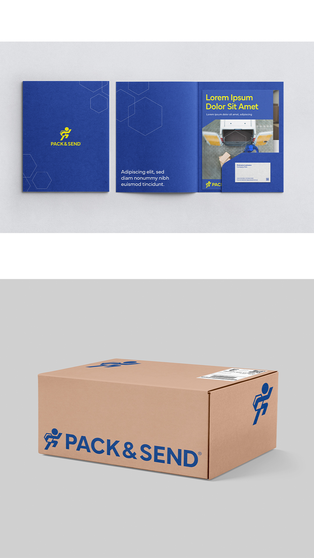
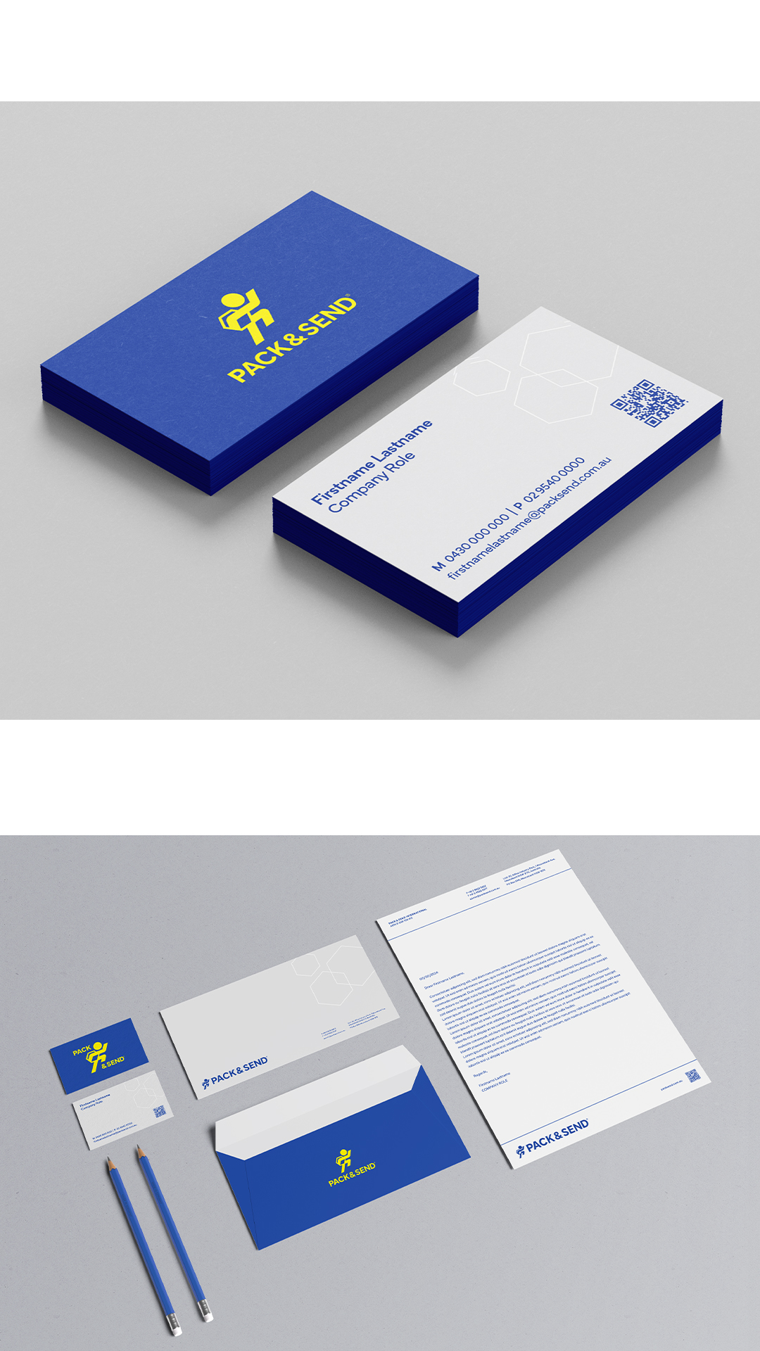
To transform Pack & Send’s brand design in alignment with the new strategy and vision, we focused on ensuring credibility and recognisability within the industry. The brand’s predominant colour, IndiGO, conveys depth and sophistication, while LemON adds a vibrant and energetic pop. Both colours are pure, ensuring maximum vibrancy in print. Grey, black, and white serve as the foundational palette to enhance practicality and usability.
The geometric typeface Mundial, with its extensive library of styles, meets the needs of an expanding brand both now and in the future. For graphic elements, we adopted a more detailed style of iconography with finer line work, reflecting the attention to detail that defines Pack & Send’s services.
A box grid system was developed to structure layouts, organizing headings, images, text, QR codes, and logos—both as a metaphor for perfect packing and as a practical tool for presenting information.
Imagery plays a vital role in the brand’s transformation, emphasizing authenticity and dynamism. Photographs of real staff and customers are engaging and warm, using a shallow depth of field to focus on people while minimising background distractions. Product shots should evoke speed and efficiency, employing motion blur to highlight movement and action. Together, these elements create a cohesive, impactful brand identity that resonates with both credibility and vibrancy.
"*" indicates required fields