TECH START UP INTO A WINNING BRAND
Payright approached uberbrand to help position the exciting tech start-up to truly compete in a growing industry dominated by big players. The buy-now-pay-later service needed to redefine themselves from the ground up.
CLIENT
Payright
SECTOR
Finance
SERVICES
Brand Strategy, Visual Identity, Logo Design, Verbal Identity, Communications, Brand Identity
Brand Strategy
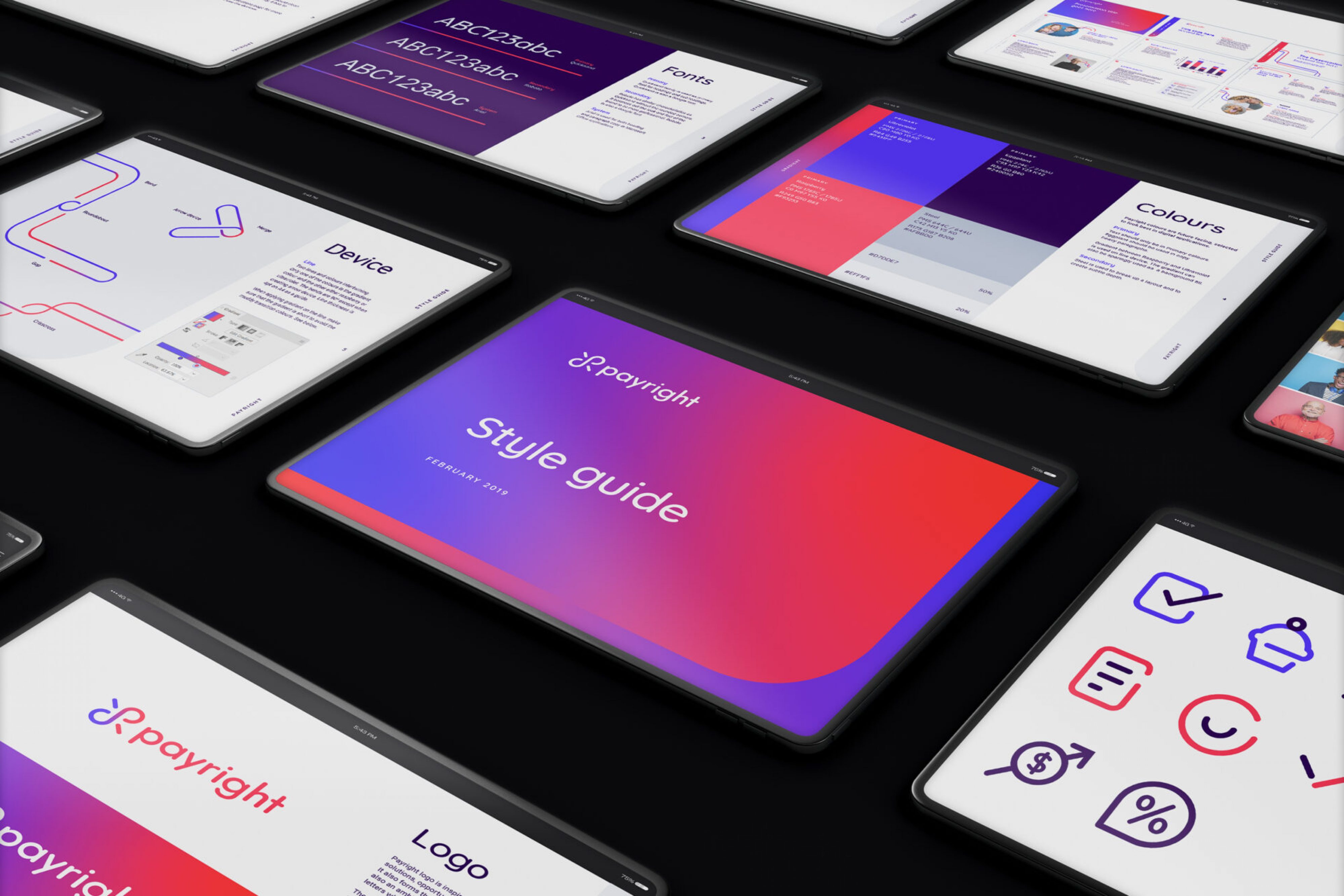
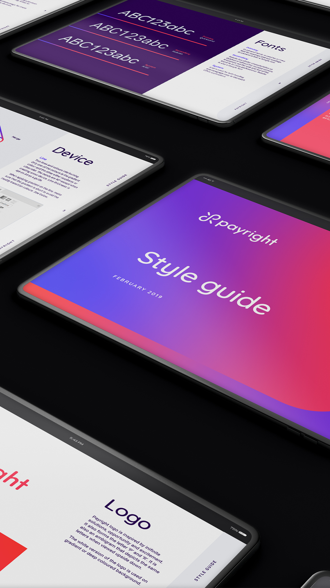
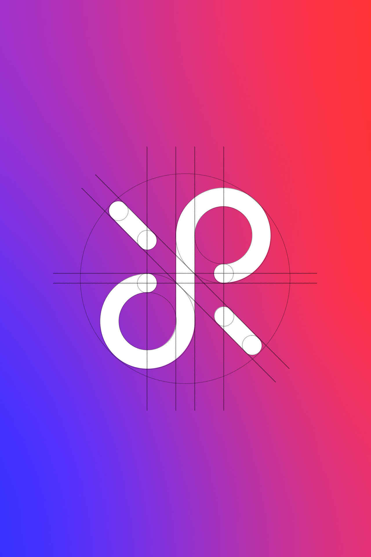
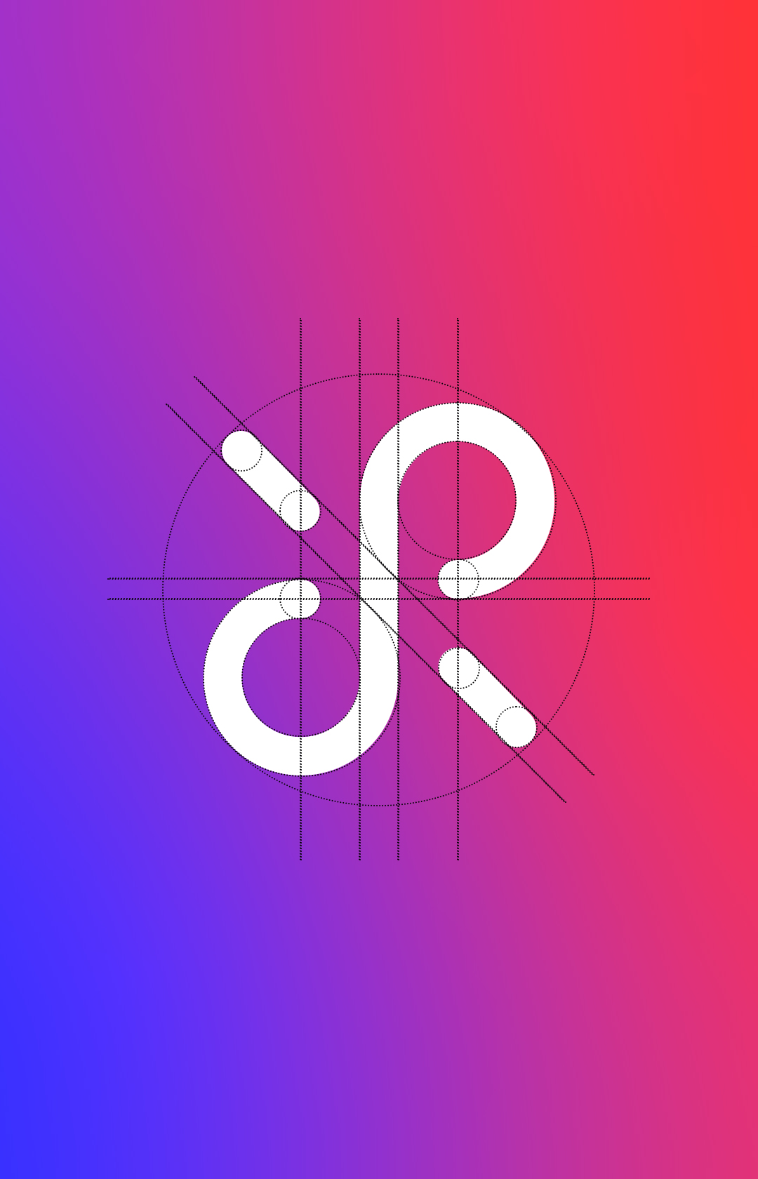
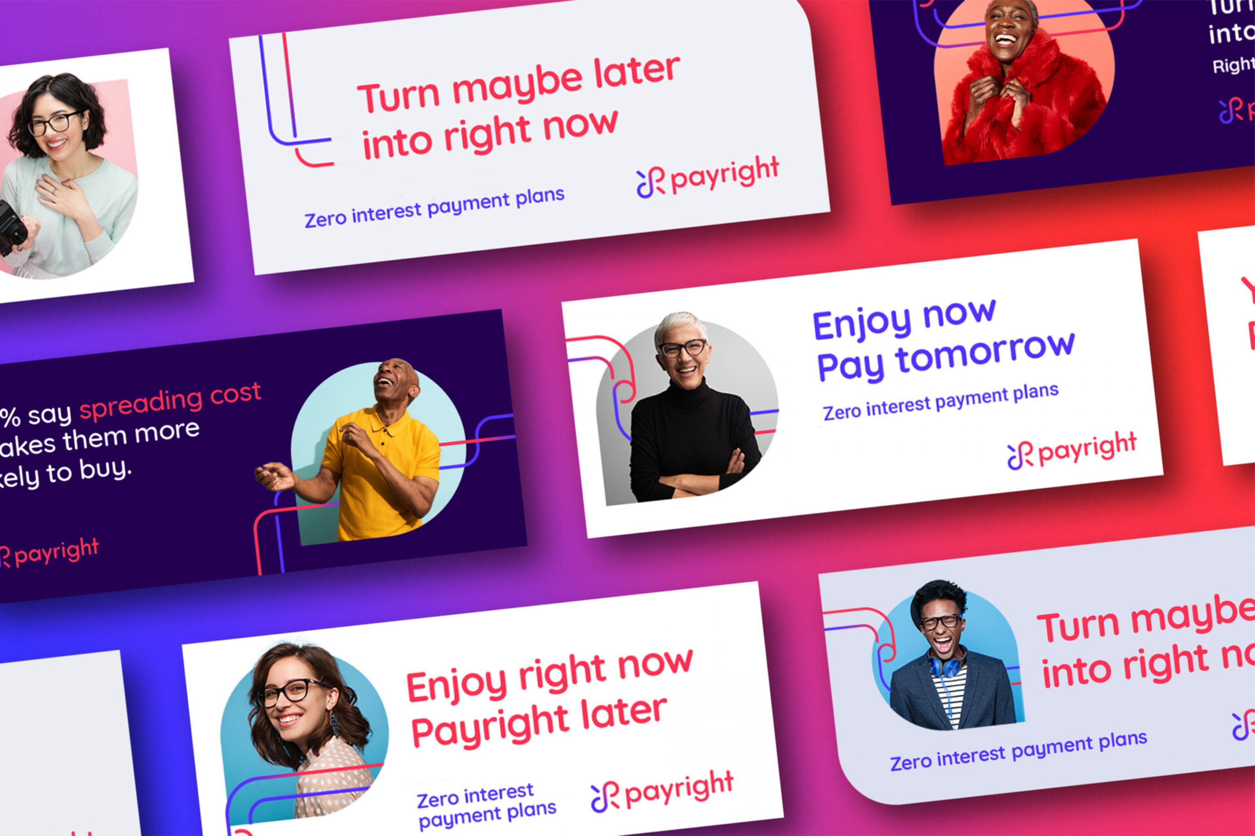
We translated this strategy into a friendly, open and approachable visual identity. A logo was created that encapsulated the flexibility and connectivity of Payright in bringing together businesses and consumers – and – consumers and their desired purchases.
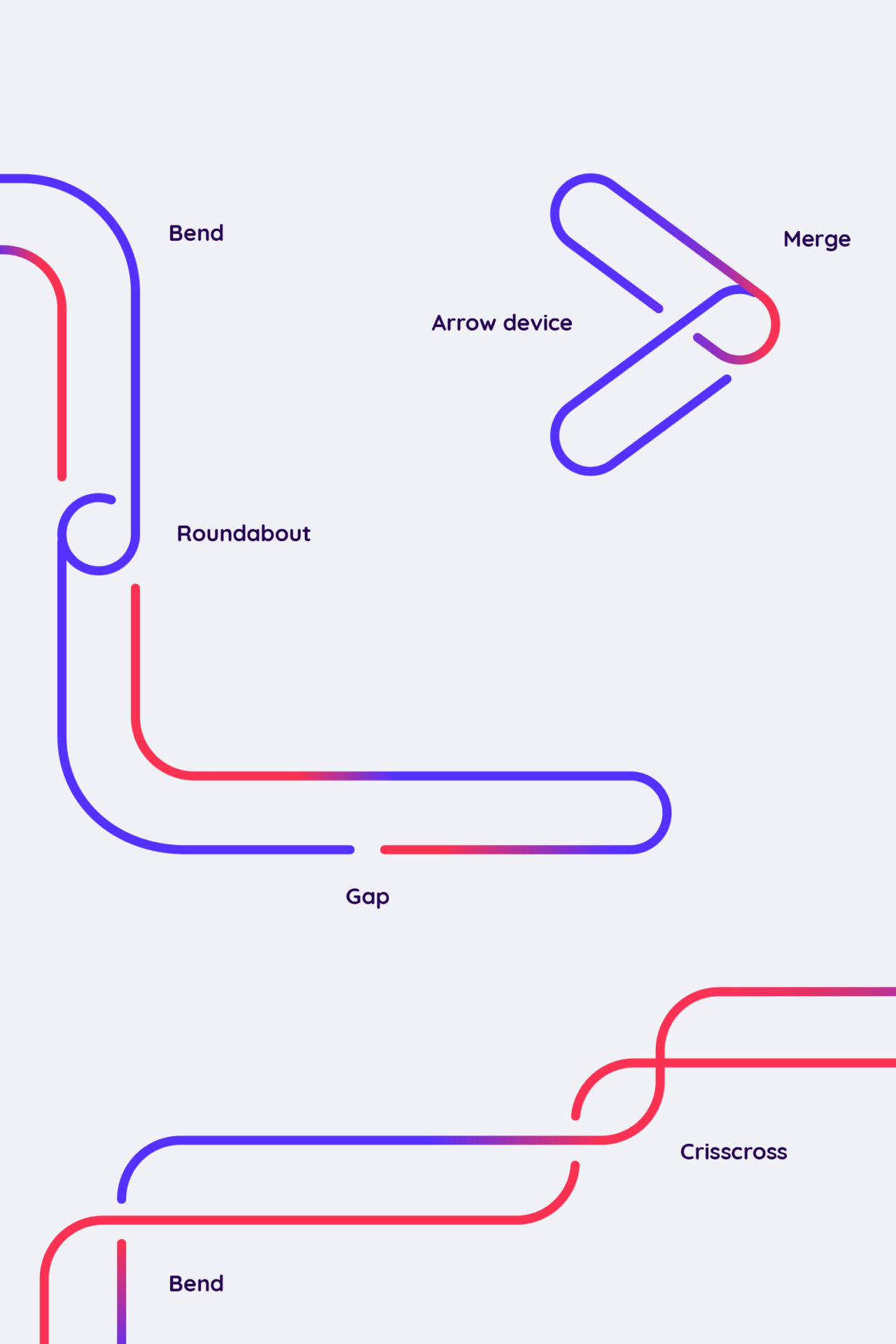
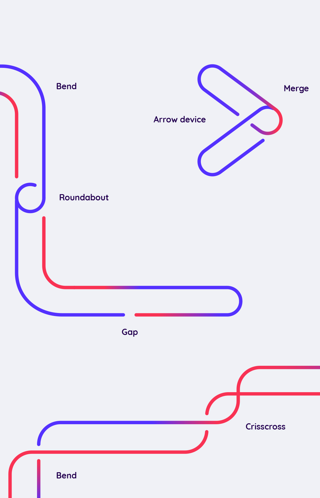
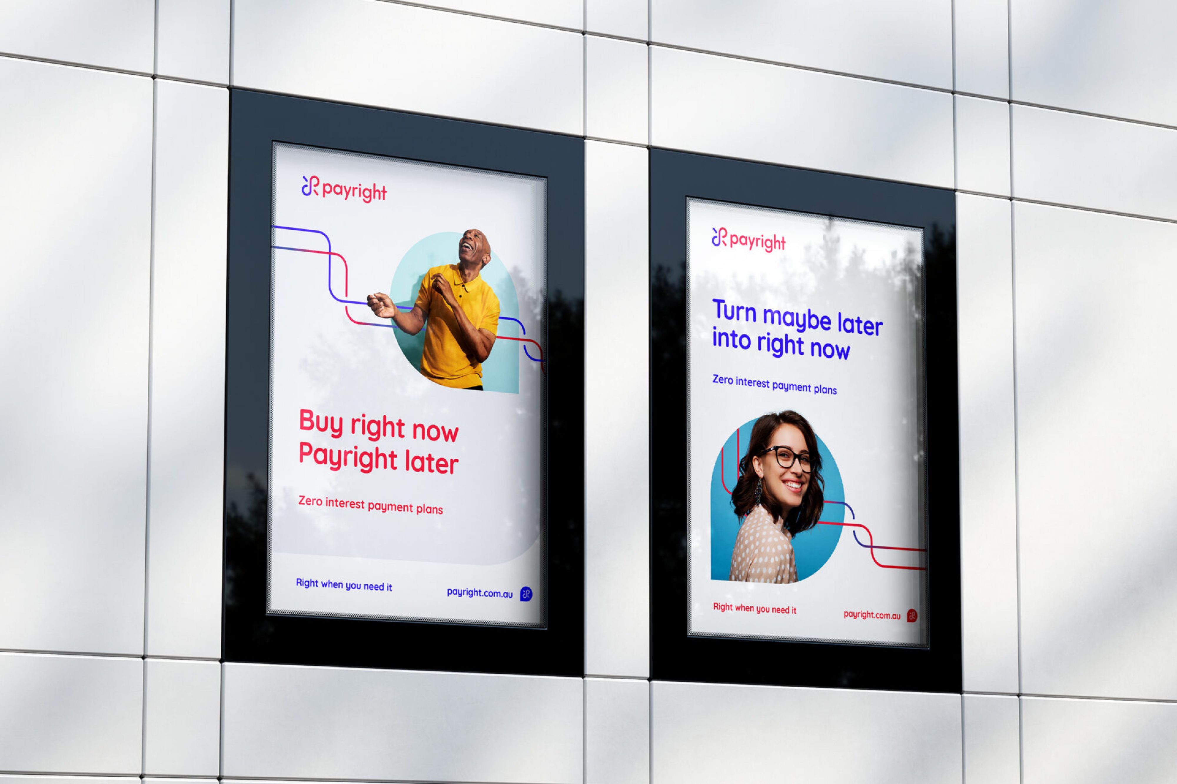
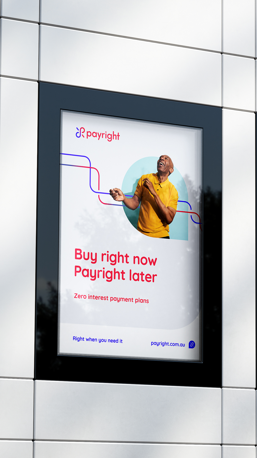
Shapes from the logo guided the presentation of a unique photography style. In addition, the line-drawn nature of the logo lead to the design of a corresponding visual device. Finally, a bold colour palette was arrived at to both encapsulate the brand and further differentiate Payright.
To compliment the design and articulate the essence of our strategy, a comprehensive comms guide was created. In it, a playful, ownable verbal device was mapped out: “turn … into …”. This gave the brand an extensive, engaging and consistent content pool to draw from in the future. These CTA statements could be tailored to each audience and applied in diverse contexts, whether executed as headlines, subheaders or supporting copy.
In addition, a dual tagline was developed, which would change form slightly in order to suit both B2B (merchants) and B2C respectively: “Right where/when you need it”
The Results
Supported by a strong brand from strategy to visual and verbal communications, Payright has gone on to become a multi-award winning platform disrupting their industry.

Let us know how we can help with your next brand or communications challenge
Let us know how we can help with your next brand or communications challenge
"*" indicates required fields