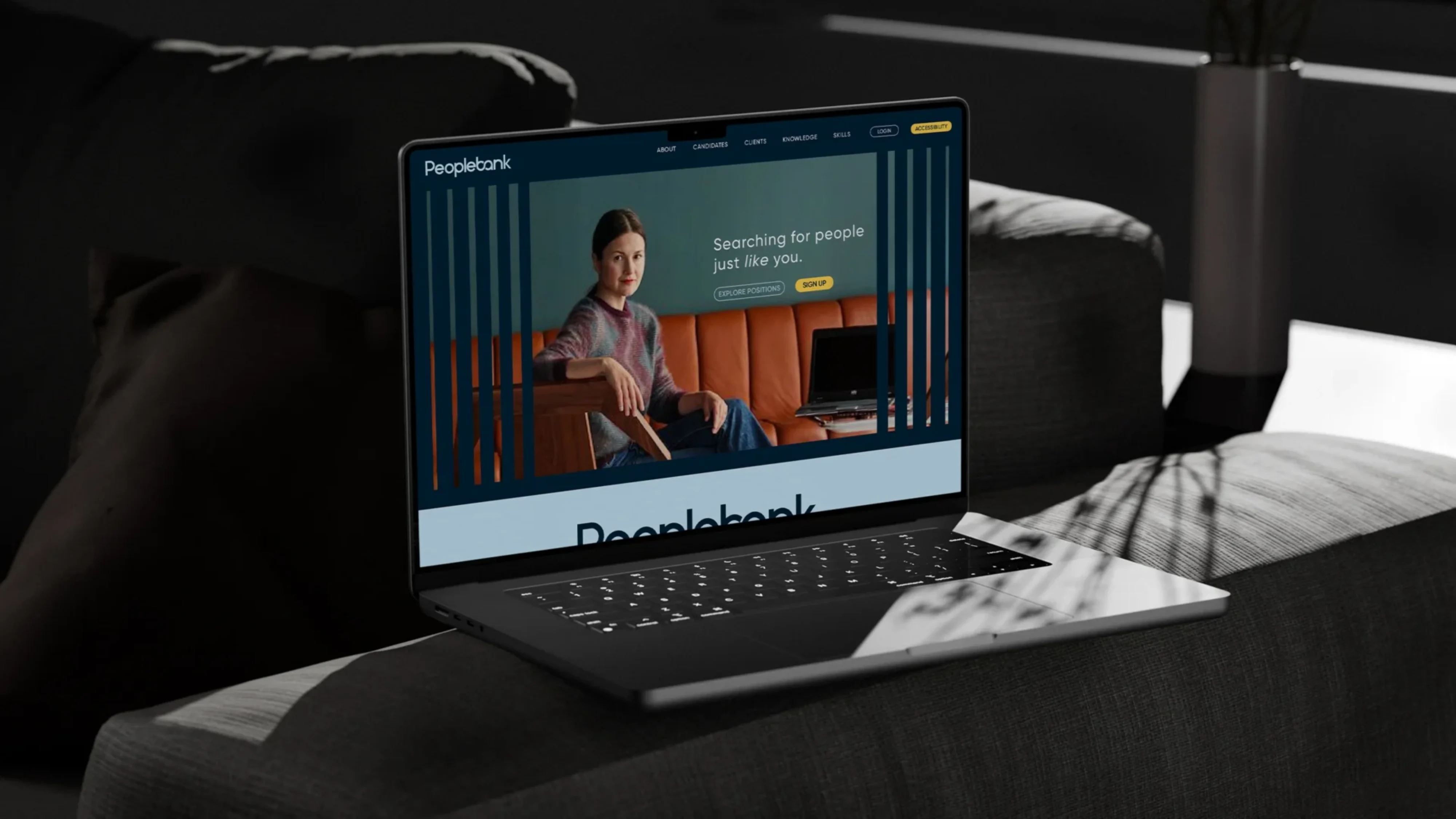
A BRAND FOR PEOPLE JUST LIKE YOU
For over 25 years, RGF Staffing have been trusted to place IT & Digital specialists for some of Asia Pacifics most dynamic and recognised organisations. The company’s continued growth saw an evolution in the traditional IT space from pure recruitment through to deployment and team management under their Peoplebank and Leaders IT brands. While both brands operate within the IT services category, each provides a different offer whilst leveraging complementary capabilities. With the category continuously dynamic change in mind, our task was to review their Peoplebank brand to ensure the separate, yet connectedness of the two offerings.
CLIENT
RGF Staffing: Peoplebank
SECTOR
IT & Digital Recruitment
SERVICES
Brand Strategy, Visual Identity, Logo Design, Brand Identity
Peoplebank recognises the pressure to progress in a rapidly changing world, empowering individuals on their career paths through proven processes that drive continuous growth. Based on thorough research and interviews, we developed a comprehensive strategy that culminated in a brand idea: “People like us”. This resonates with themes of attracting top talent, fostering inclusivity, and cultivating a sense of belonging among experts.
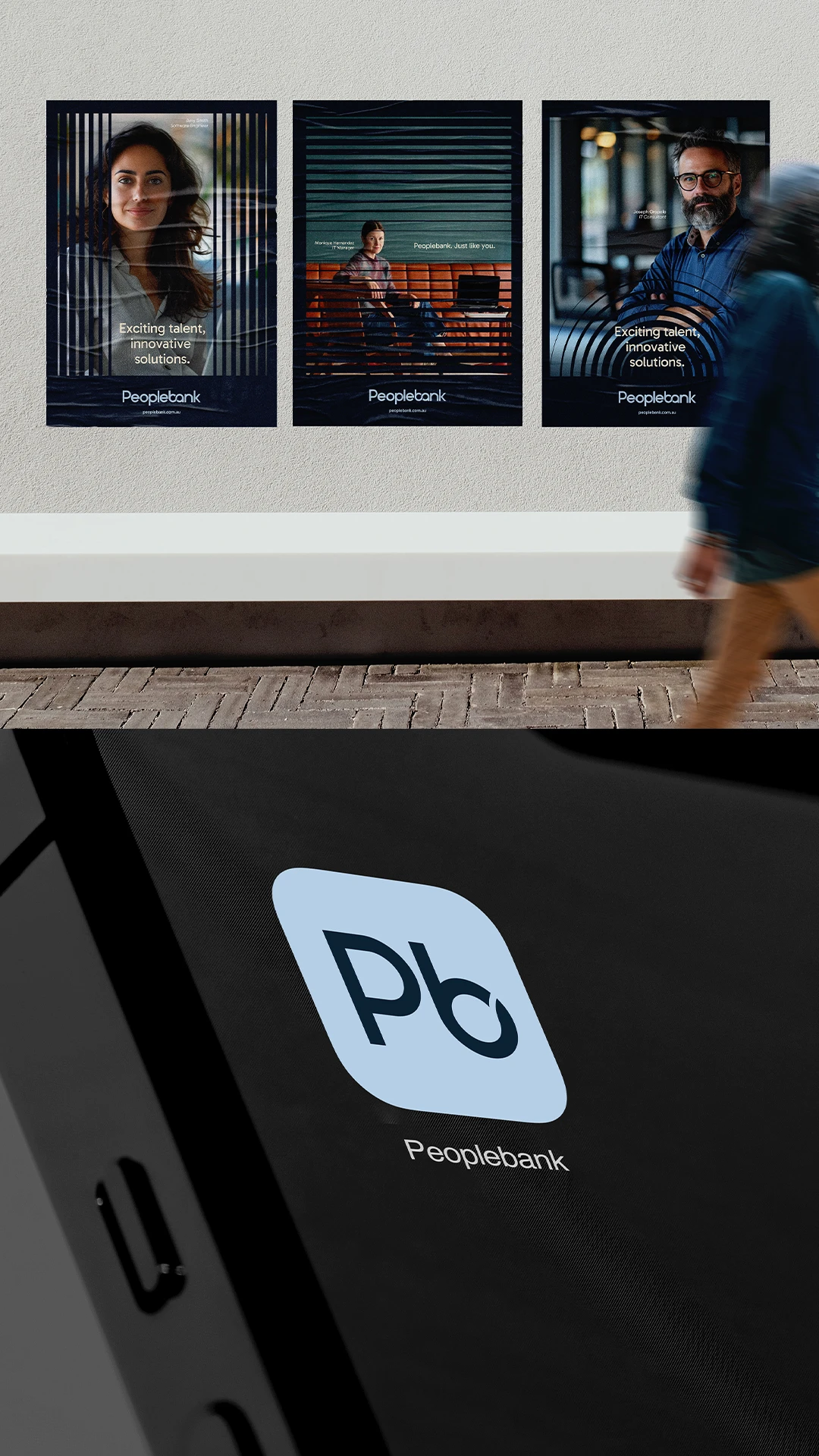
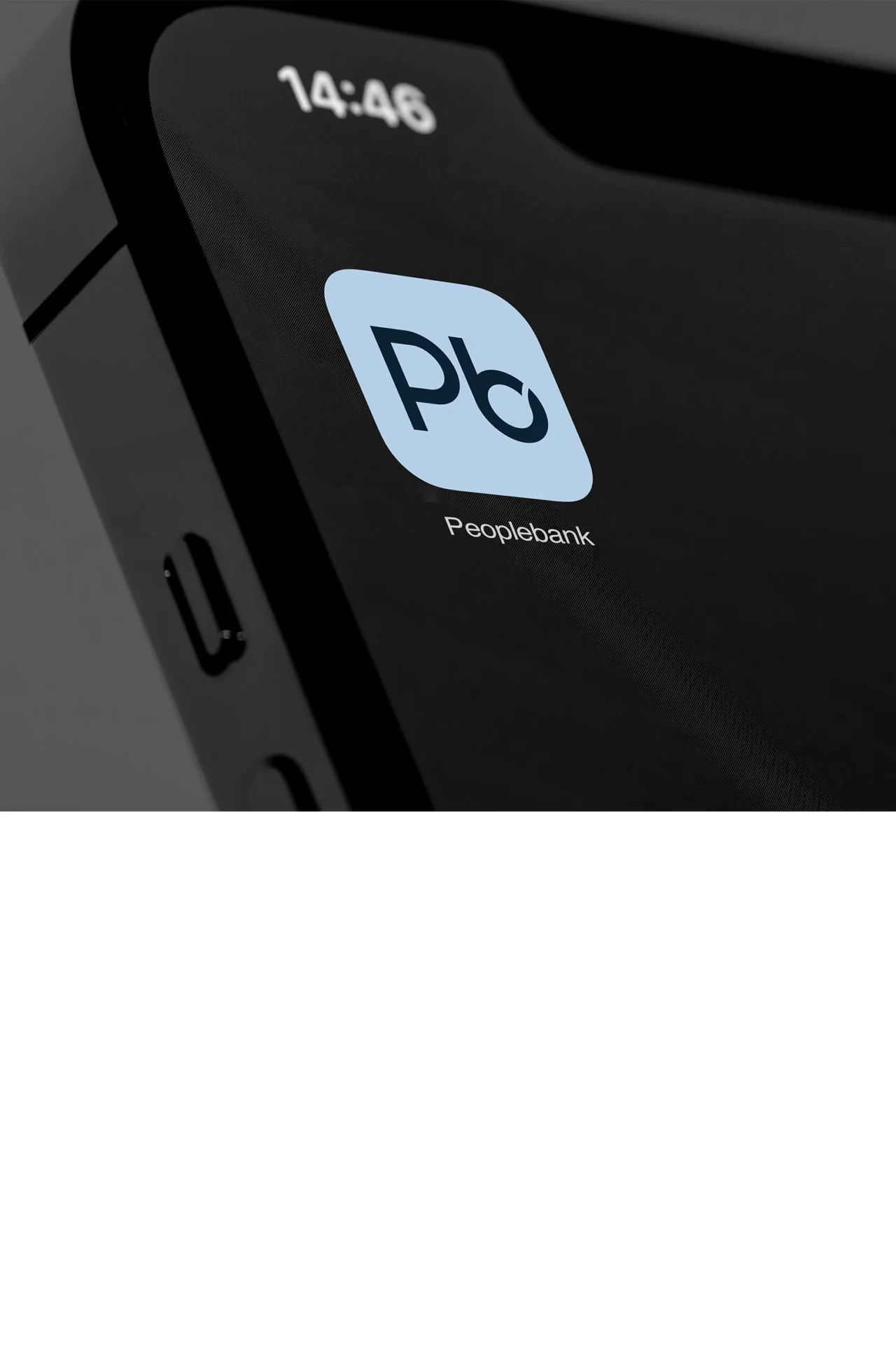
For the wordmark, we used a grounded, approachable and considered typeface. We created a subtle infinity sign icon using the “b” and “a” of “bank”, representing the brands continuous growth, connection and insight, as well as their commitment to the people they assist.
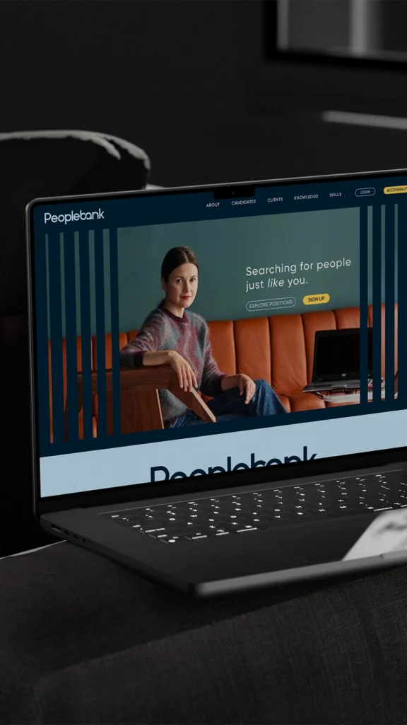
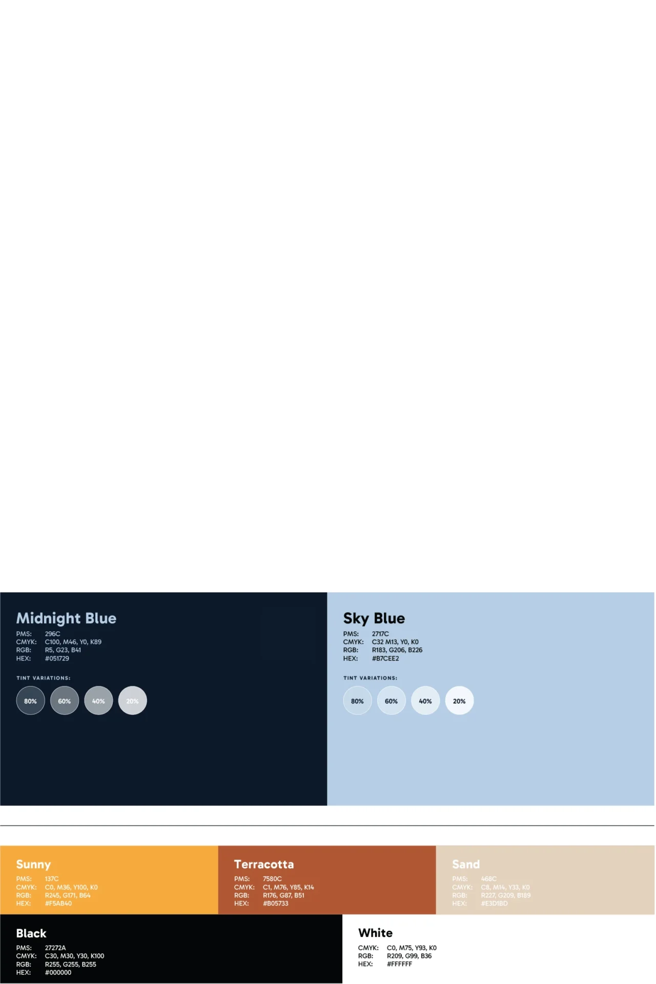
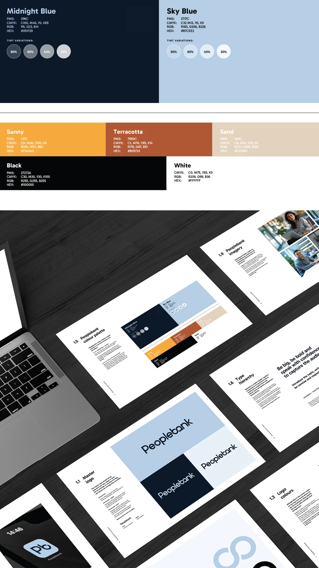
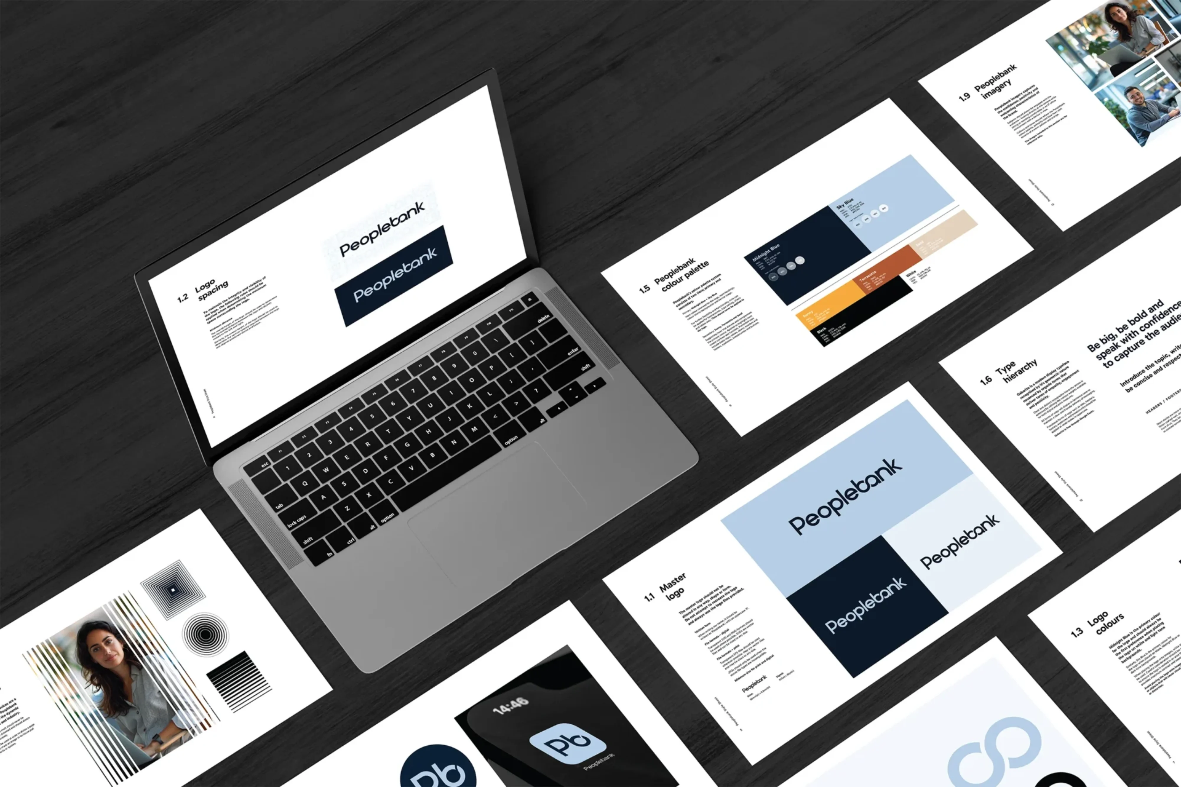
We refreshed and modernised the Peoplebank brand’s visual identity, creating distinct differentiation from the Leaders IT offering. We refined and developed the original blues – a legacy component – introducing a renewed energy that is positive, inspiring, inclusive and welcoming. Warm yellow accents complement the blues, reflecting the brand’s friendly and positive nature. The yellow tones could be used as tertiary colours for visual cues and functionality. Both typography and imagery are designed to be friendly, approachable, and dynamic – qualities that make the brand relatable.
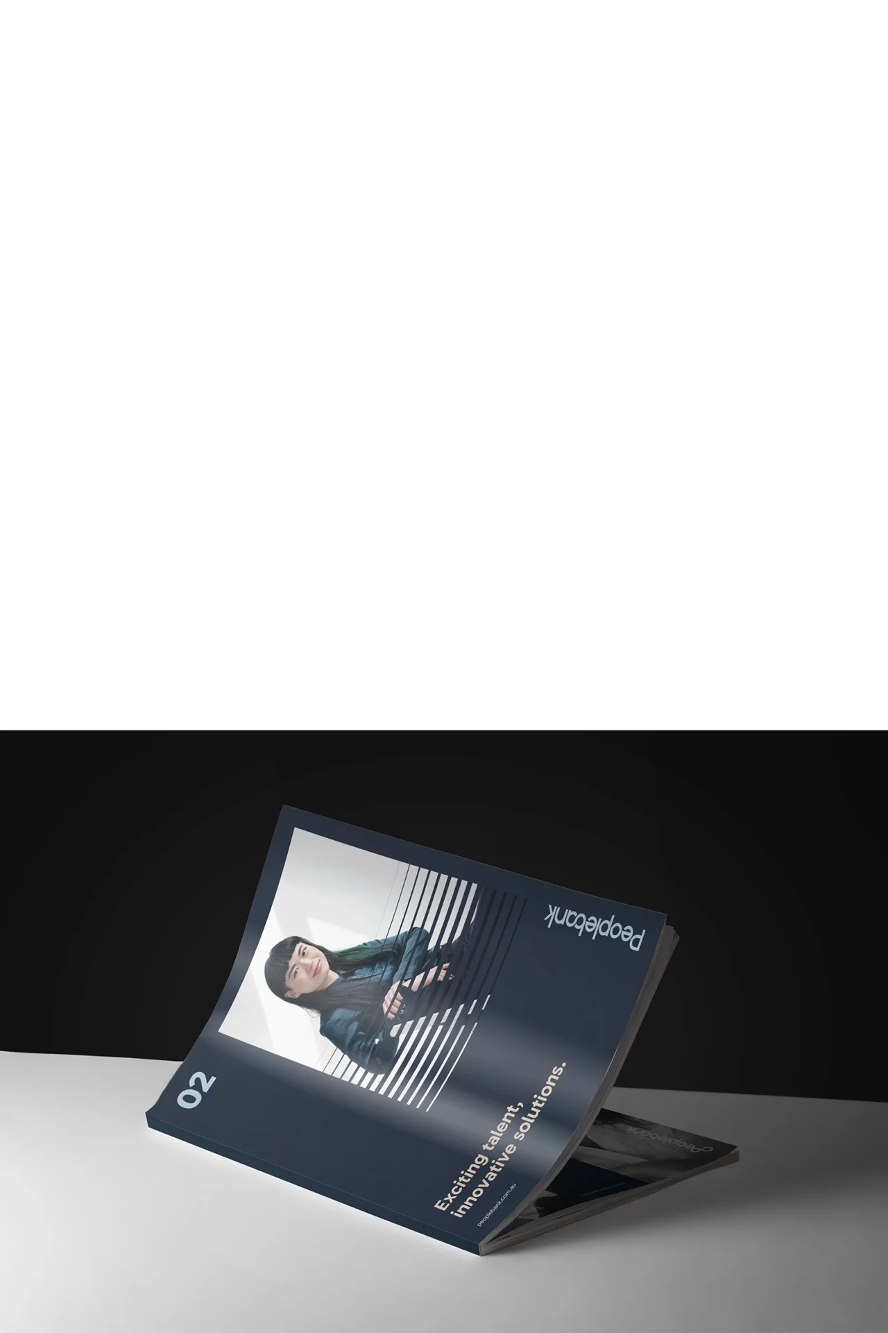
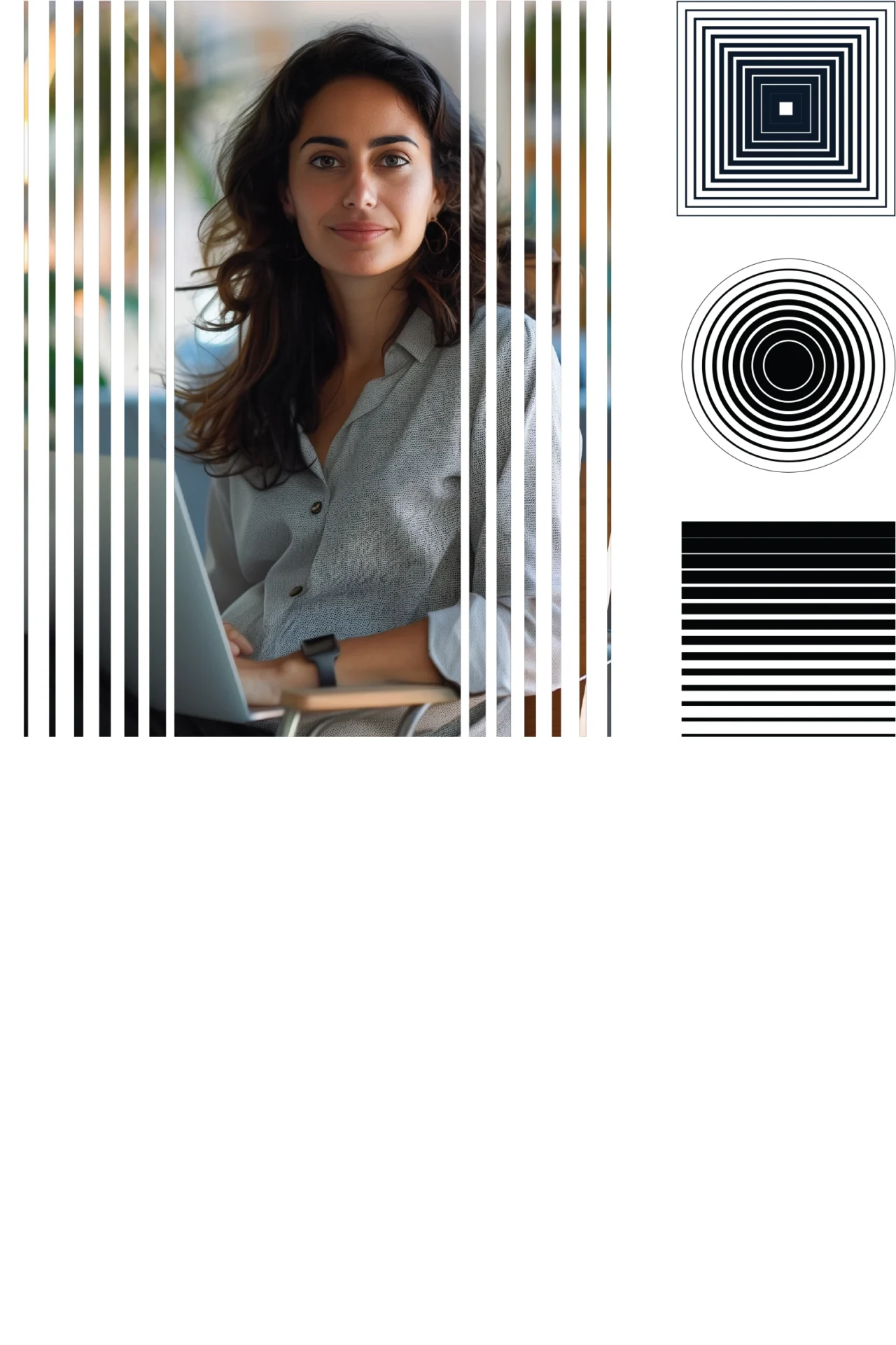
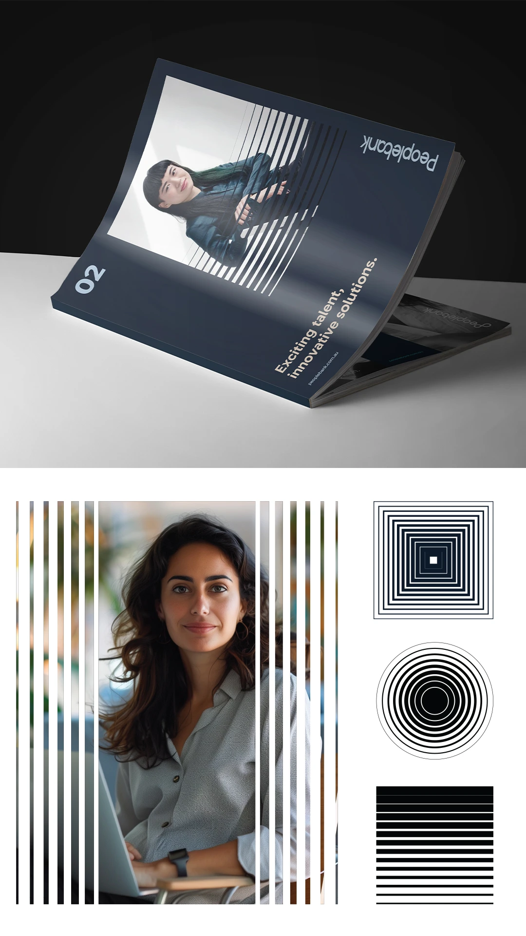
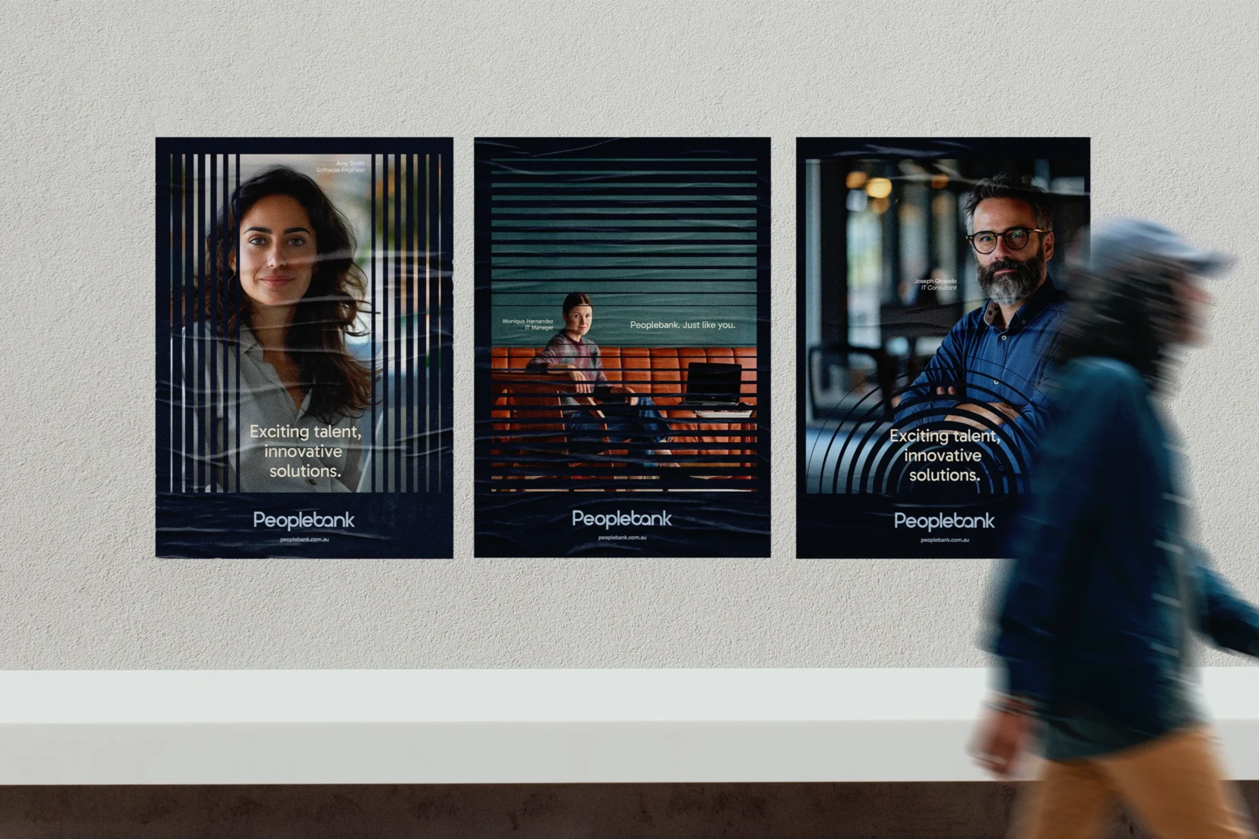
Portraiture, a key feature of the brand was introduced to represent the people/talent the brand stands for. Through direct engagement with the camera, comfortable poses, and warm facial expressions, the confident, positive and welcoming characteristics of the brand are brought to life. Careful consideration was placed into the colours and tones of the image treatment to ensure consistency and cohesion with Peoplebank’s colour palette. Dynamic visual elements are used strategically to enhance imagery to be more engaging. We are proud that the Peoplebank brand design has been recognised as one of the Best Designs by DesignRush.
Let us know how we can help with your next brand or communications challenge
Let us know how we can help with your next brand or communications challenge
"*" indicates required fields