Brand Strategy
Westlab needed to demonstrate their leadership and understanding of the market, while remaining agile and innovative, with product development a key driver of growth.
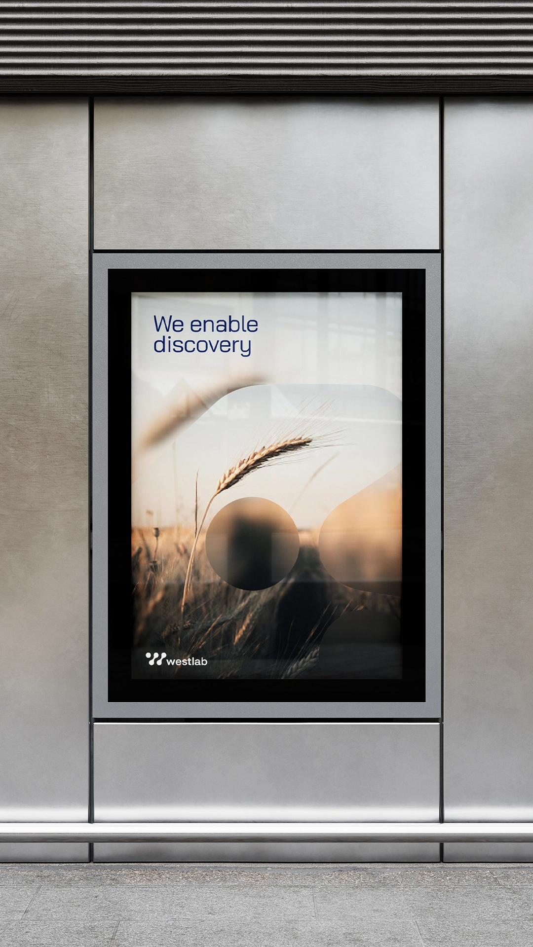
Focused on a golden thread – ‘where there’s discovery, there’s Westlab’, the new strategic direction allows the brand to flex and move into further relevant, territories.
Visual Identity
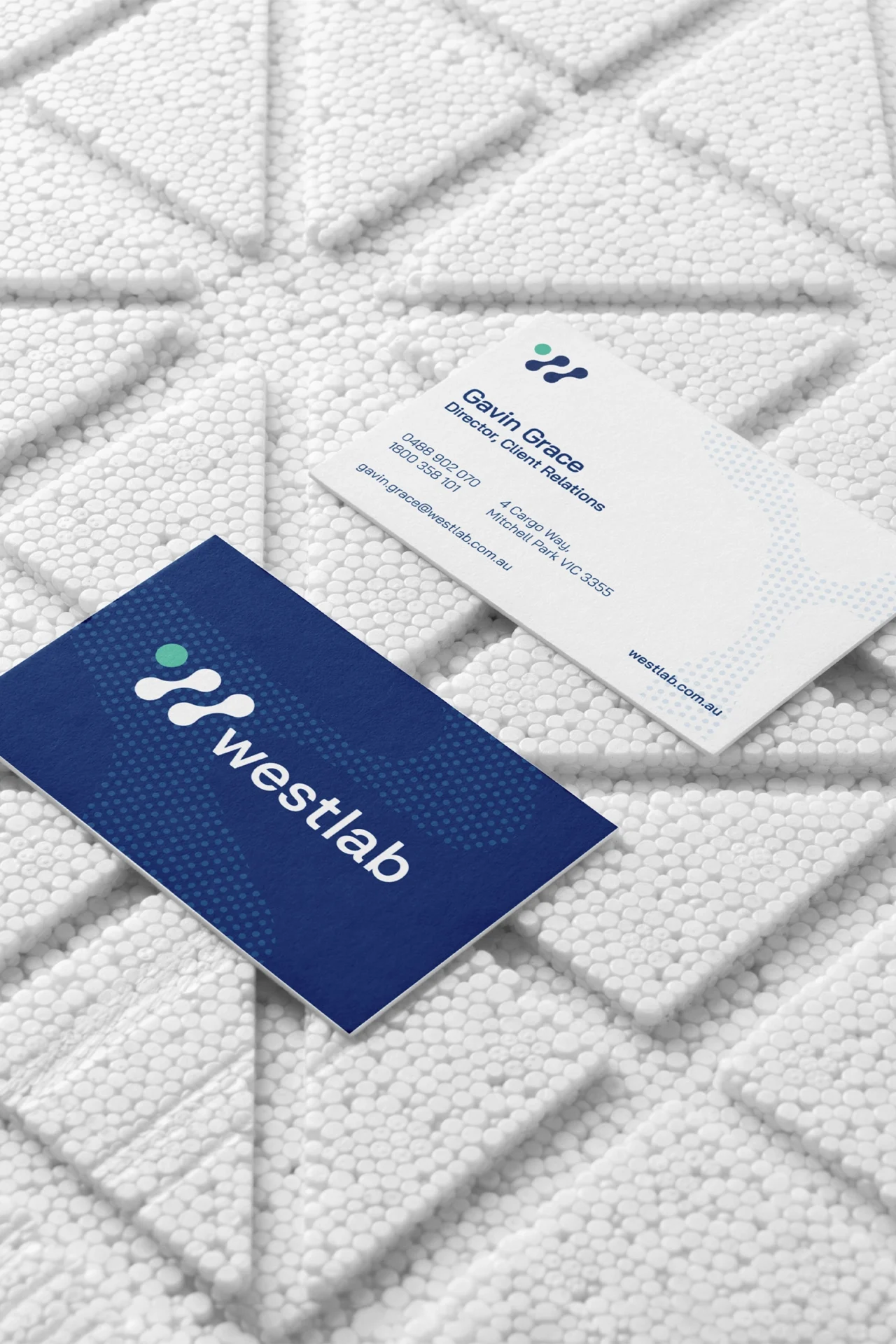
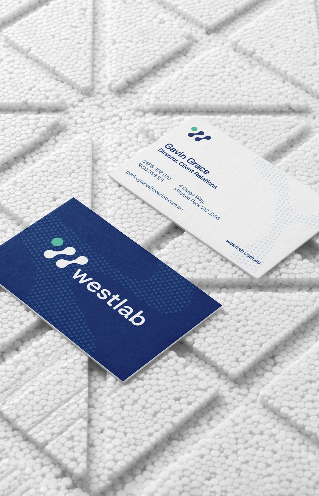
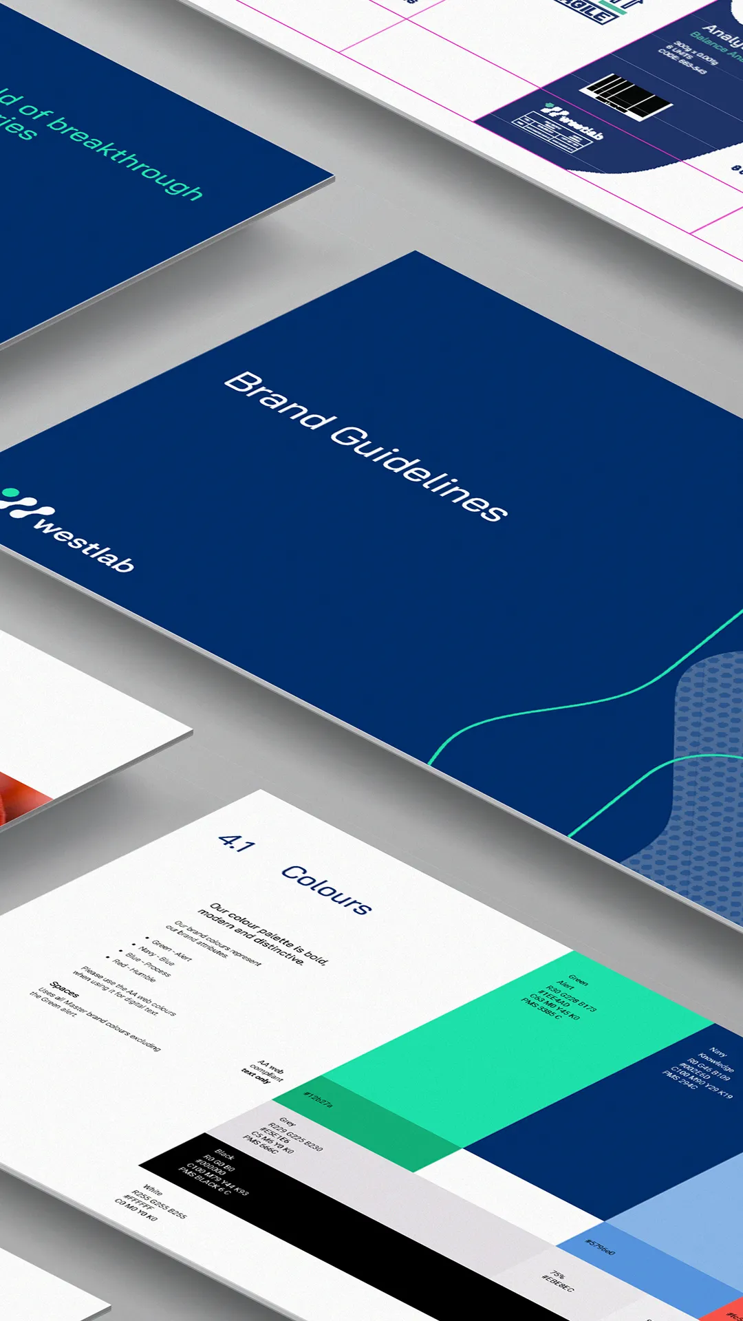
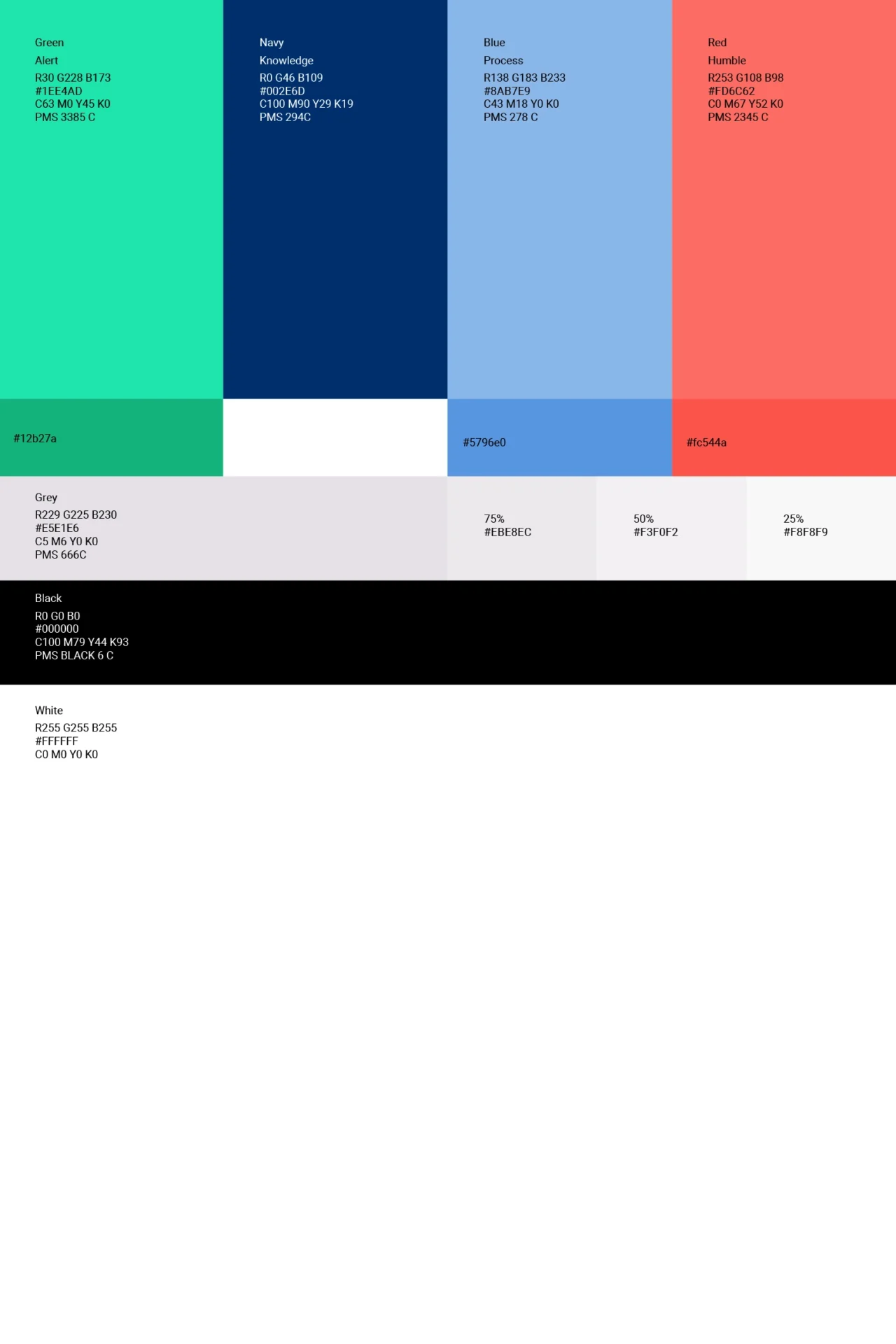
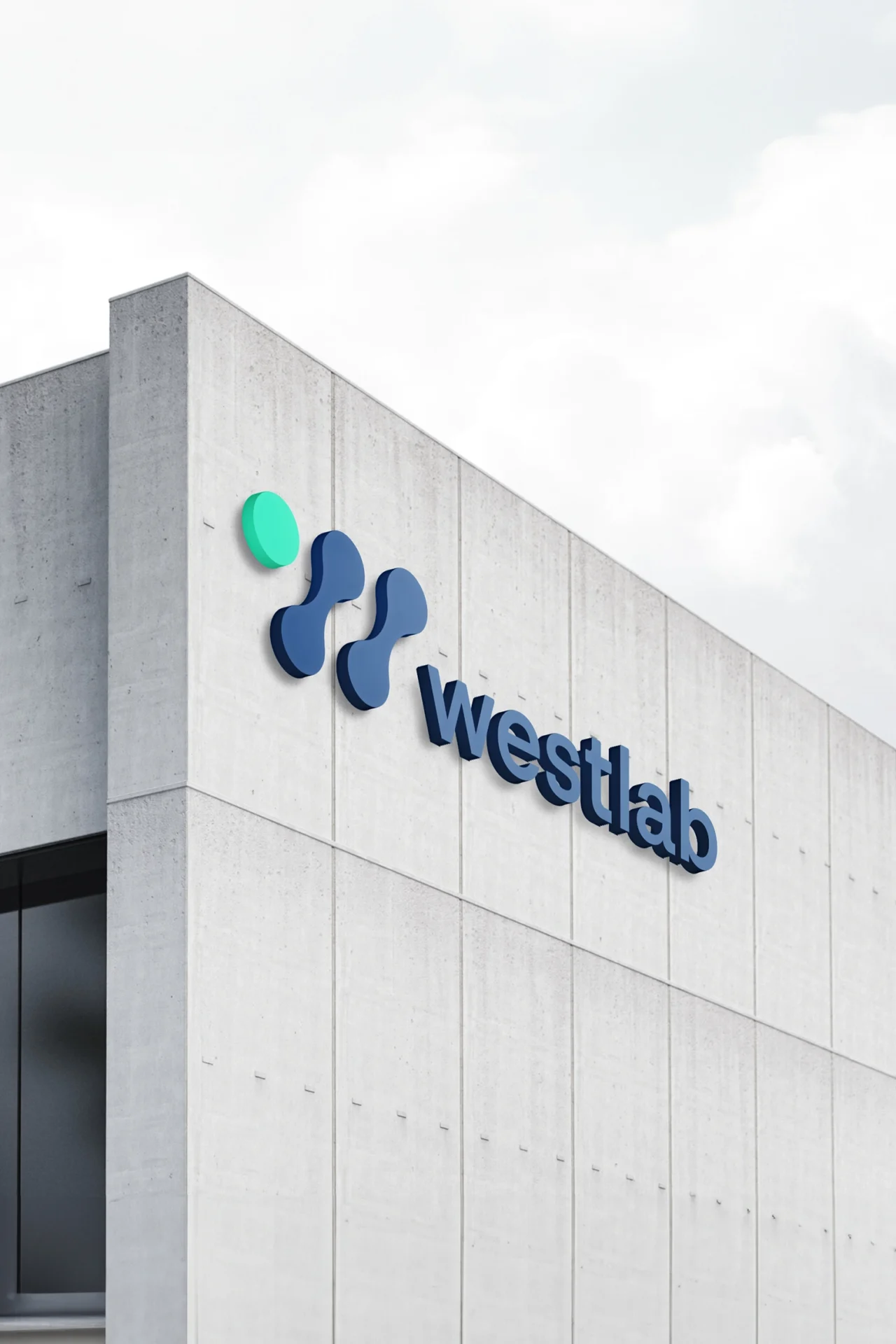
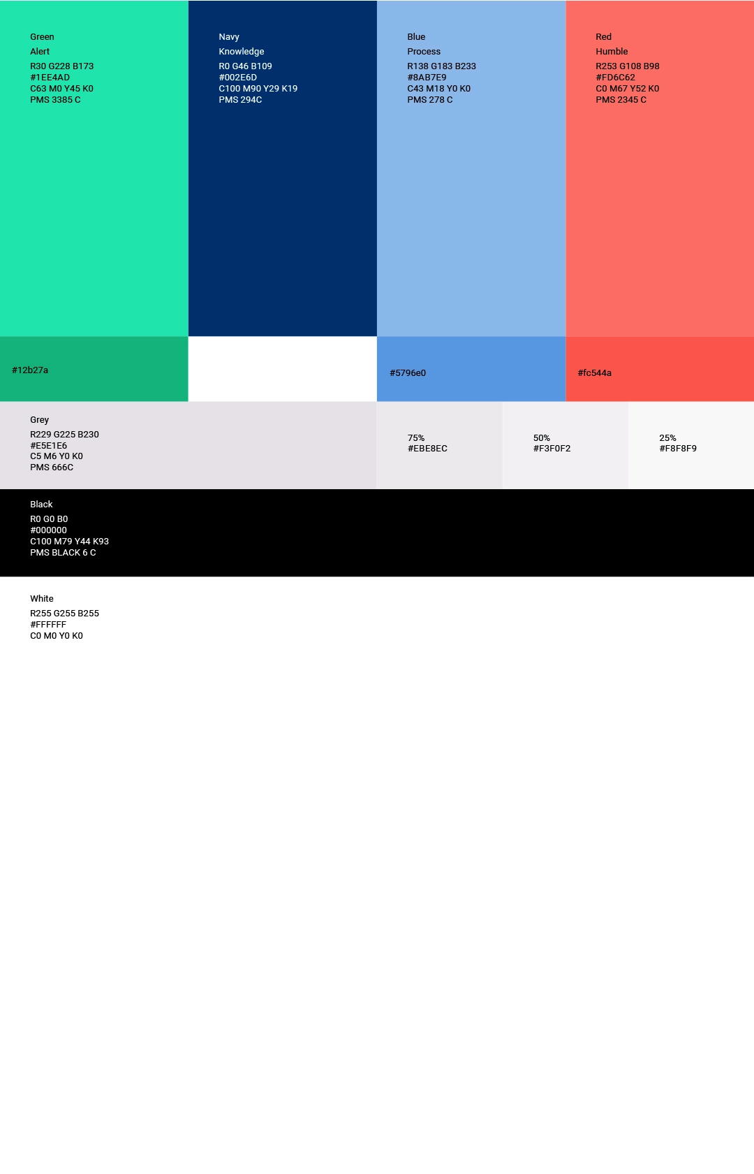
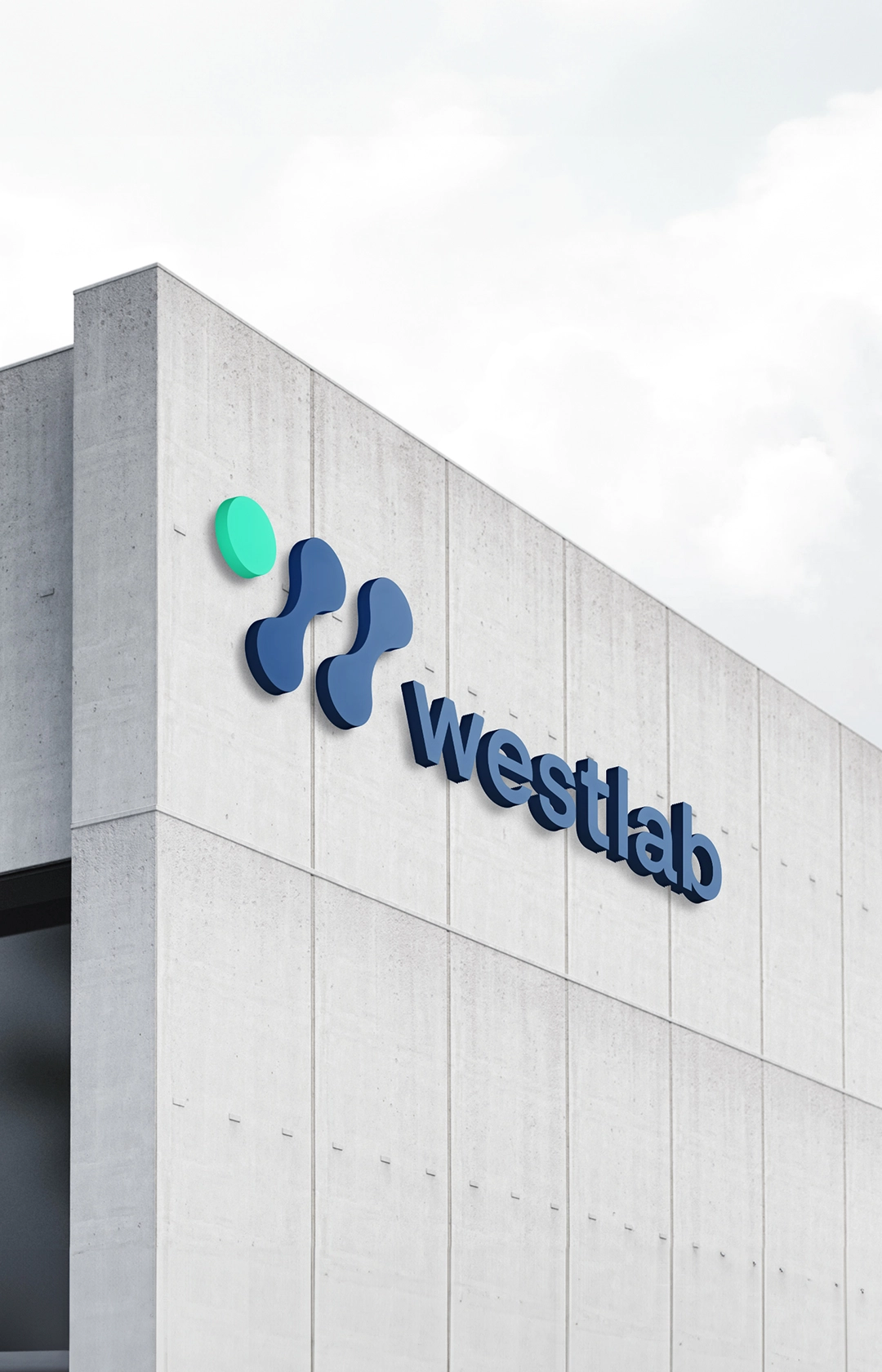
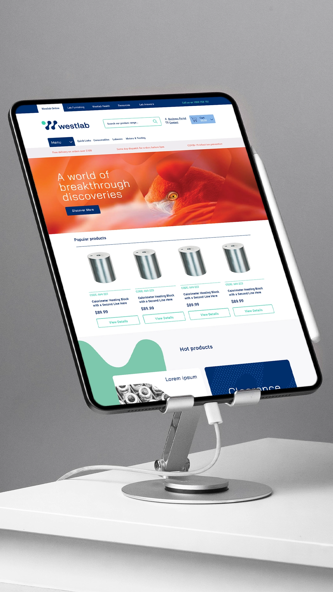
Uberbrand created a new logo, along with an updated typeface and colour palette, all delivering a ‘modern tech’ feel, centred on the concept of endless discovery.
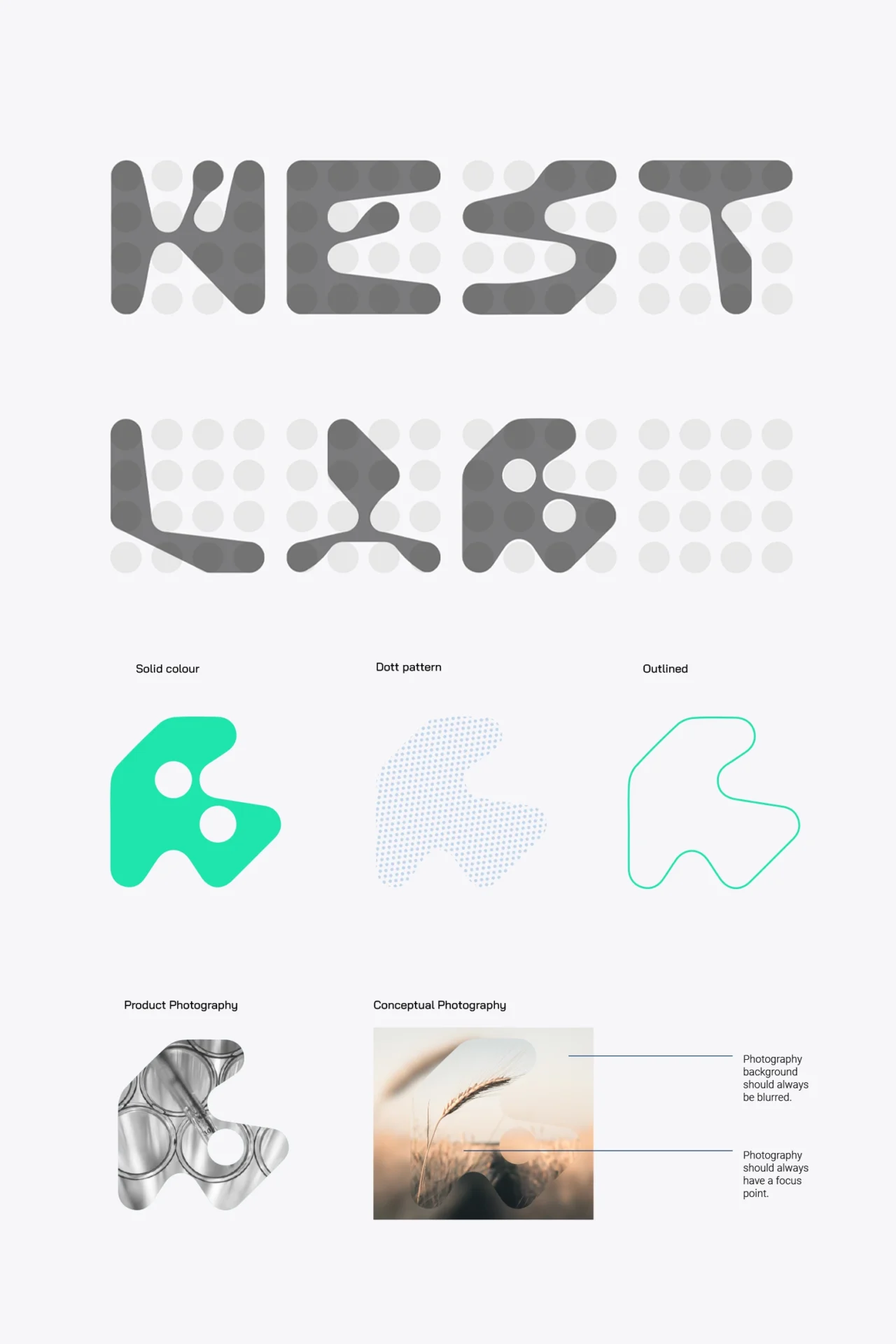
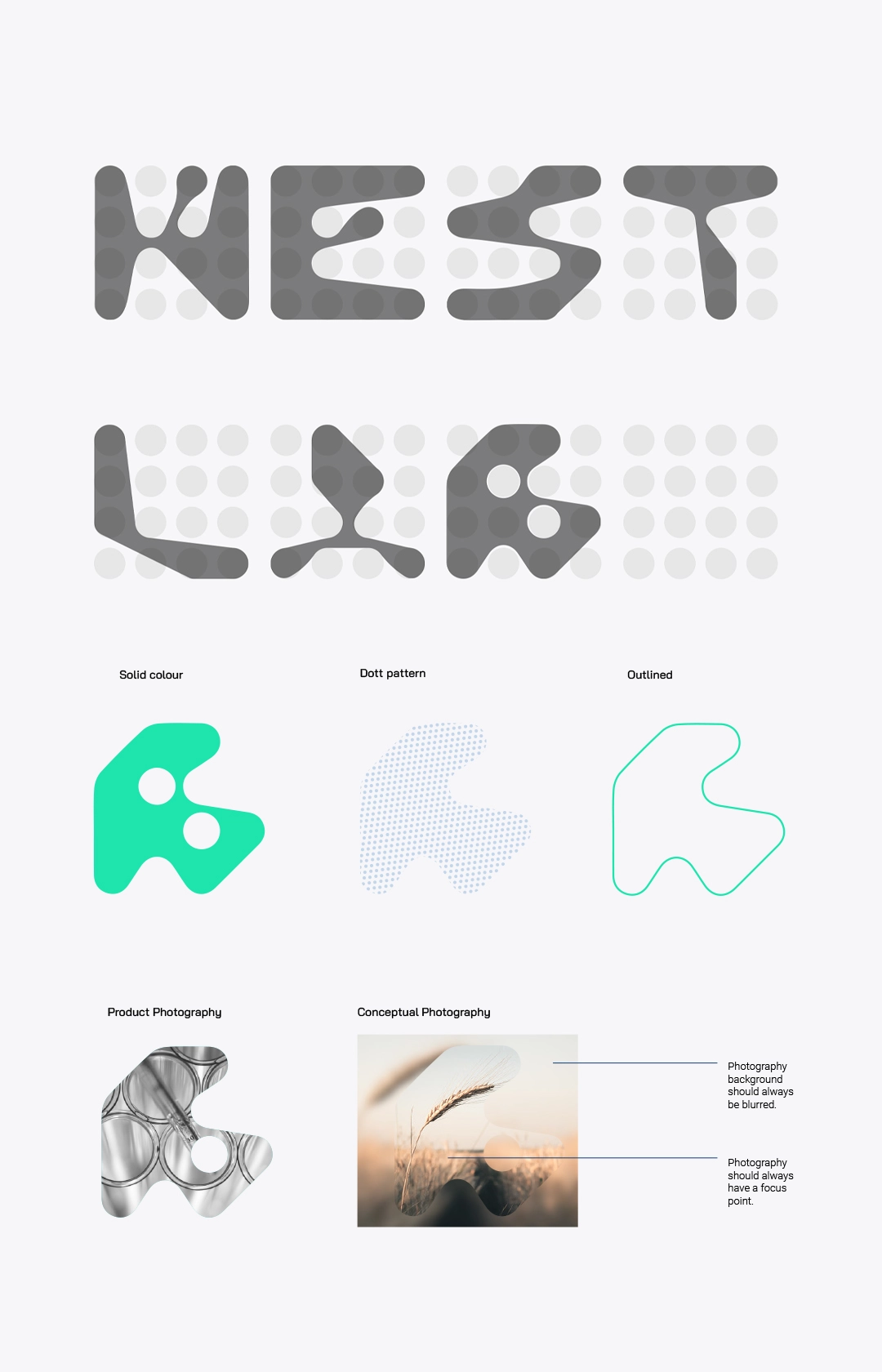
Further graphic elements were developed in the form of seven shapes – formed from the Westlab name, used alongside conceptual and product photography to revel elements, focusing on the idea of discovery.
Verbal Identity
Focusing on the brand essence of ‘energy’, Westlab’s new verbal identity delivers the message of discovery with active, forward-looking language, founded on positivity.
This enables Westlab to speak to discovery in the broader sense, allowing the brand to build relevance across any industry within the scientific field.
Results
Westlab and new sub brand Westlab Spaces, can now approach the market with a more vibrant, innovative and future-focussed face, while retaining their reputation in the market – since 1993.
Taking their hard earned trust and proven reliability into new territories – meeting the mission of Westlab in every discovery.