Anti Design Can Rebellion in Aesthetics Become a Lasting Language
Uberbrand on 19/5/2024
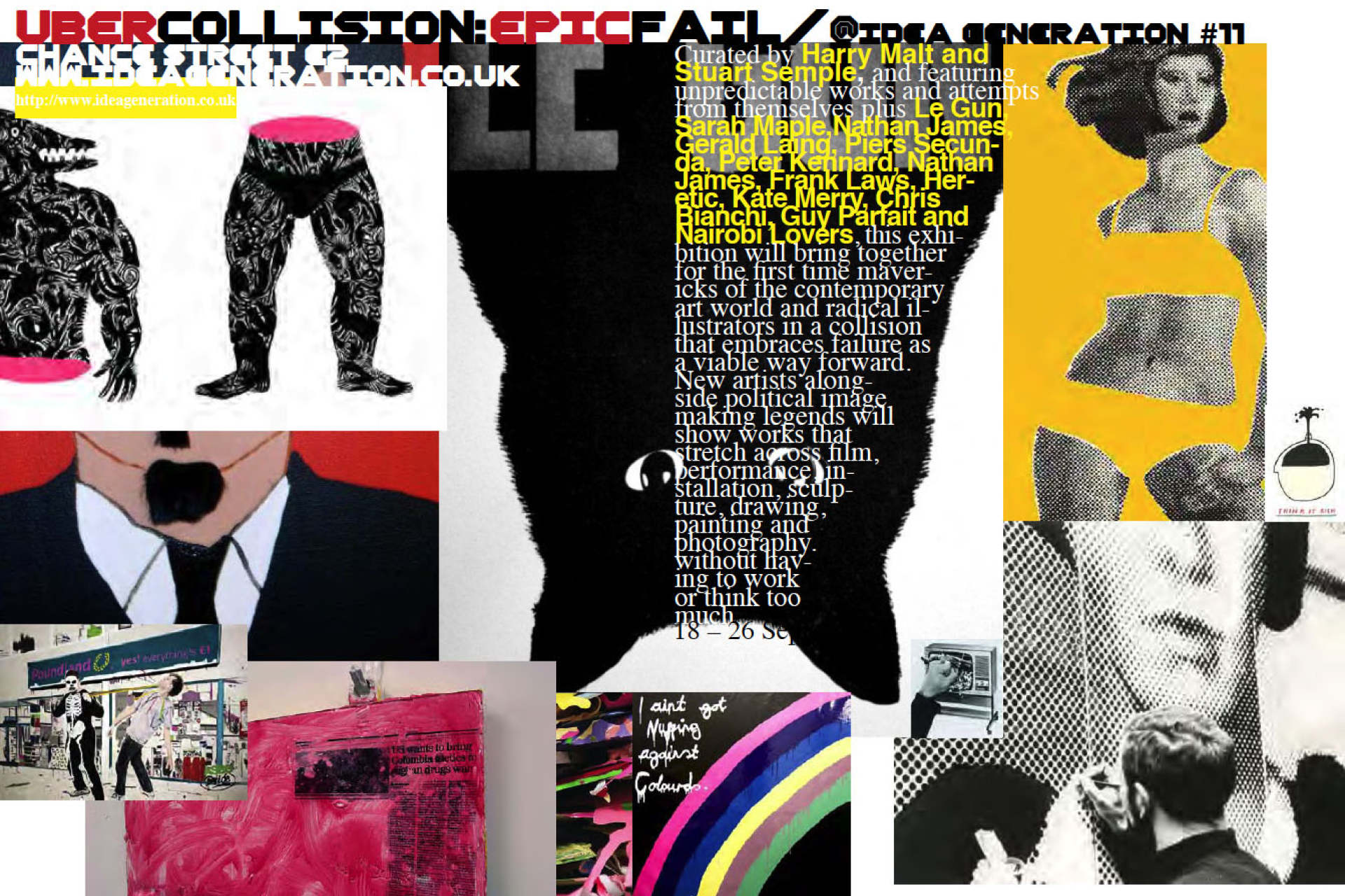
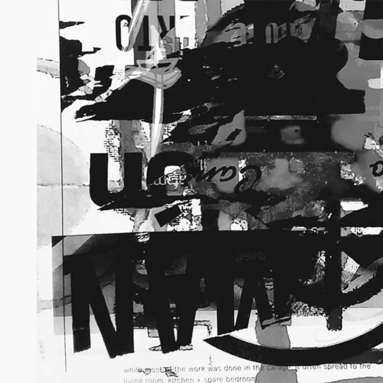
“Anti-design is recognisable through the use of bold flat colors, asymmetric layouts, and unconventional formatting. Other hallmarks include a disregard for traditional hierarchies, experimental typography, and a focus on raw, unfiltered expression.”
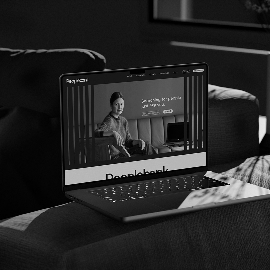
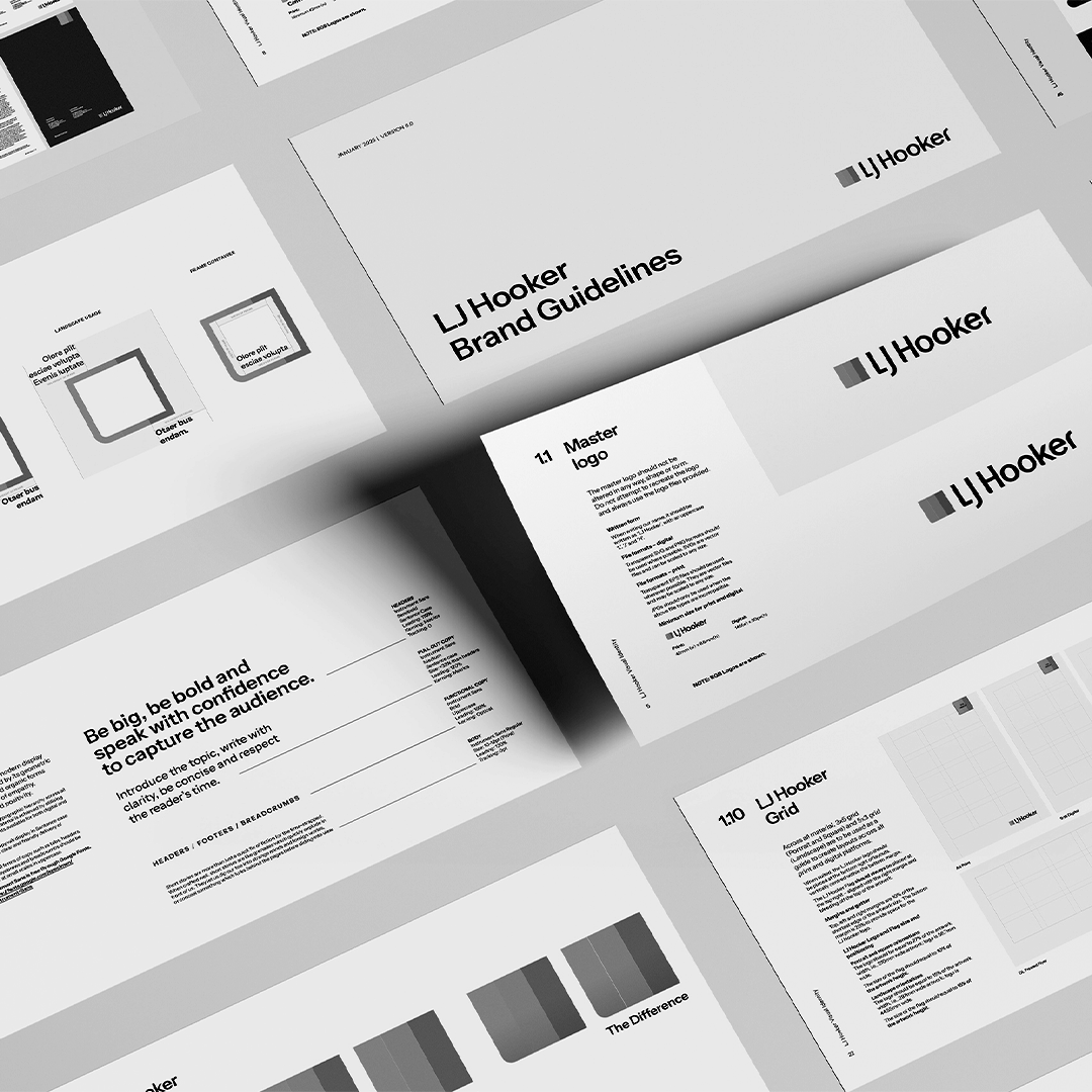
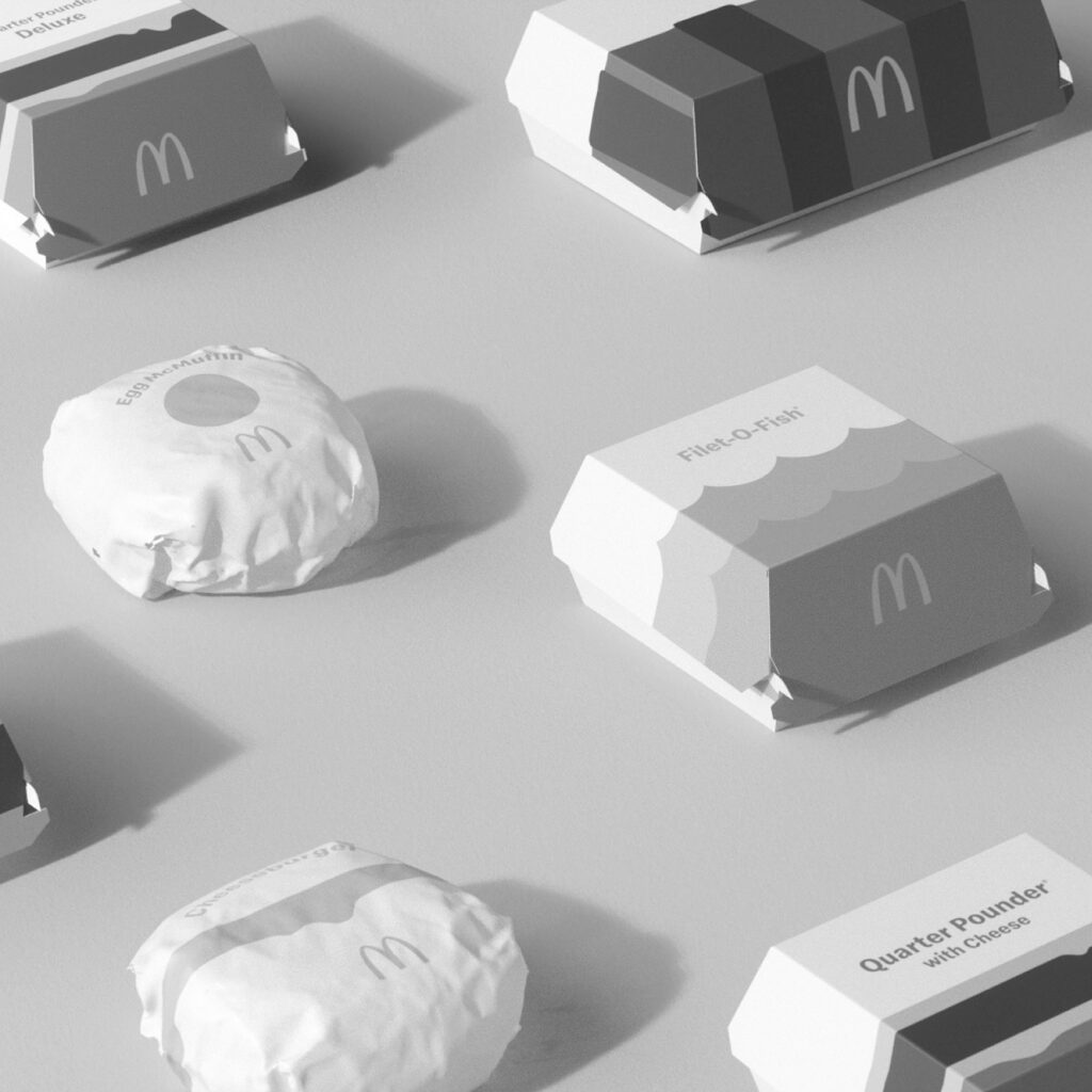
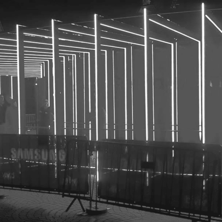
It’s certainly different. It’s alluring because it’s about breaking the mold to capture attention. However, its deviation from traditional principles raises good questions about its longevity and applicability, especially for organisations that require scalable solutions and systems. Conventional Design Follows Traditional Principles. Grounded in symmetry, grids, and structure. We’ve been educated to focus on readability, user experience, and the application of consistent well-defined components, like colour and device. These principles have stood the test of time and offer a level of predictability and scalability that anti-design by definition lacks.
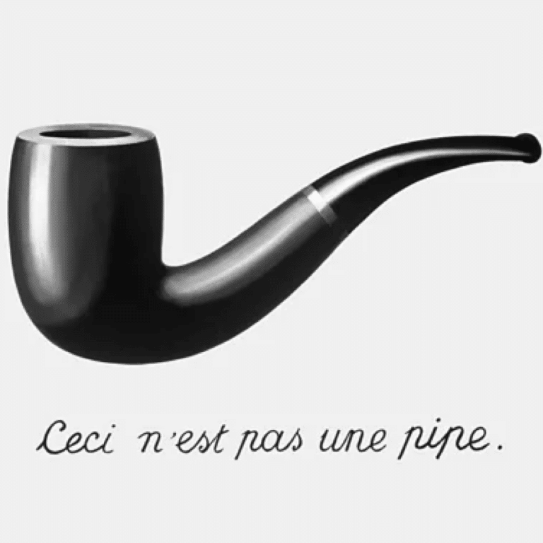
The Intersection: A Sandbox Within a Playground It’s an interesting topic, isn’t it? As creatives, we have a plethora of styles, practices, and schools of thought at our disposal. Think of them as tools in an ever-expanding arsenal. Anti-Design is like the mutt of the design world—you either love it, hate it, or learn to tame it.
Take David Carson, for example. He’s a designer who has dedicated his life to finding the balance between convention and chaos. Through his groundbreaking work in typography, form, and color, #DavidCarson has shown that it’s possible to create compelling, functional designs that also push boundaries and challenge norms. So, while #AntiDesign and #ConventionalDesign may seem like the antithesis of each other, they can coexist. It’s not about blending them into a new form but creating a space where each can exist in its purest form, contributing to a greater whole. It’s not a compromise but a strategic arrangement, a sandbox within a larger playground. And in that sandbox, there’s room for both the structured and the chaotic, the conventional and the anti-design.
While #Ostroy might not be the perfect example of the blending of anti-design and conventional design, they do offer a unique perspective. Their approach is high emotion, artistic, passionate, expressive, and rebellious, which contrasts sharply with the repetitive, mechanical, and precise nature of cycling as a sport. This tension creates a compelling brand identity that’s worth exploring further. With #SXSWSydney just around the corner, the conversation around these evolving design philosophies is more relevant than ever. We’re also playing around with how we can bring concepts of anti-design together in a way that can be scaled and systemized—and I can’t wait to show you. But for now, you’ll have to watch this space…