How Colour and Composition Shape the Soul of a Brand Identity
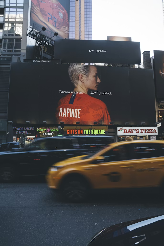
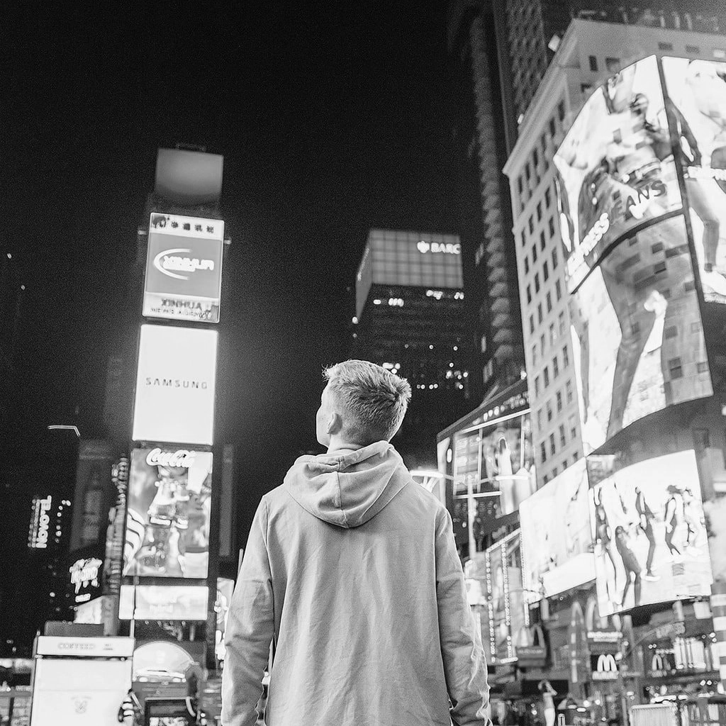
DAN RATNER on 23/01/2025 | Photography by Dan Ratner aka @streetscaping
Recently I was very saddened to hear about David Lynch’s passing.
Reflecting on his legacy, I revisited Blue Velvet, Twin Peaks, and Mulholland Drive. What struck me most was his extraordinary ability to create worlds of uneasiness that would linger in your mind. Images of everyday, but with a sordid underbelly.
His work depended so much on his mastery of visual language—where every colour, shadow, and composition was a critical part of the storytelling. It’s what elevated him from direction to artist.
Mastering Visual Storytelling
"Photo by Rob Sheridan."
Lynch didn’t just use colour and composition to enhance his stories; they were the stories.
Deep blues created a sense of calm, while flashes of violent red disrupted it, signalling danger or desire. Shadows became characters themselves, leaving viewers in a state of perpetual unease.
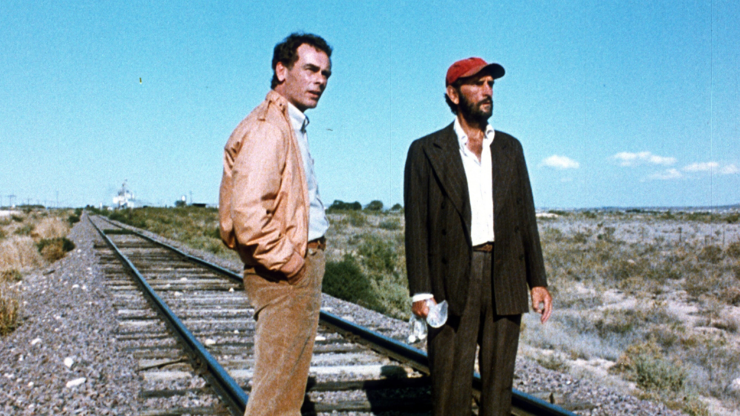
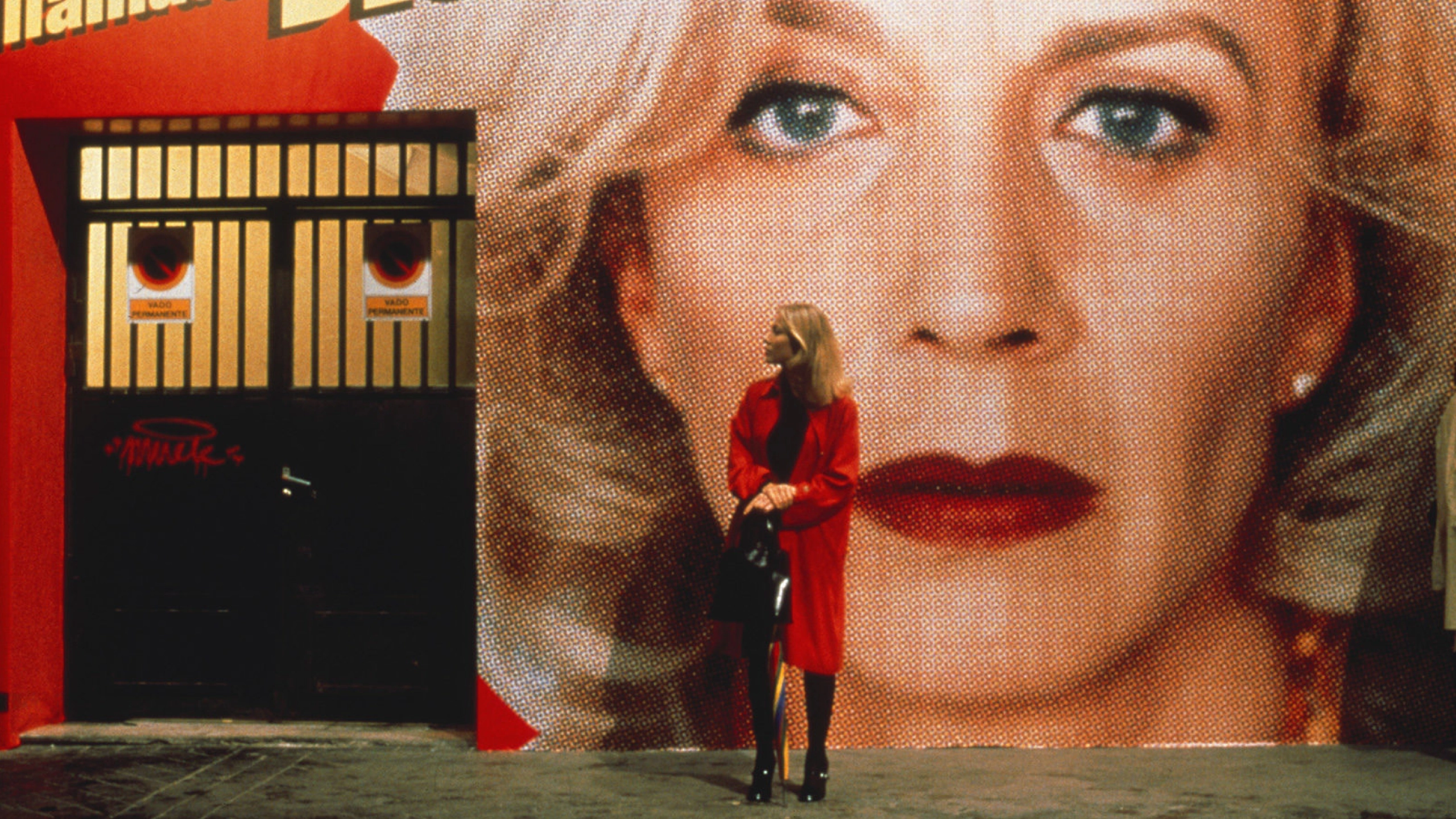
After indulging myself in David Lynch’s, I revisited Wim Wenders’ Paris, Texas. It had been years since I’d last seen it. The vast desert landscapes, the pinks, yellows, and reds, and the expansive negative space spoke volumes.
Wenders, like Lynch, used visual language as an essential part of his storytelling. Every frame is deliberate, as though what was left out was just as important as what was included.
Visual language as an essential part of storytelling.
"Wim Wenders' 'Paris, Texas'."
These reflections led me to connect how we perceive brand image and the parallels between brand identity and masterful storytelling.
A great brand identity is far from a collection of visual components—it’s a carefully composed narrative. Like constructing a film, every typeface, colour choice, graphic device, icon, and photograph needs to work together to tell a cohesive story. To elicit a feeling; the essence of the brand. When approached with the same level of restraint, intention, and care as great filmmaking, the results can be just as emotionally resonant.
So, I thought I’d review some of the great artistic directors and analyse what we might be able to learn and apply in our brand identity work.
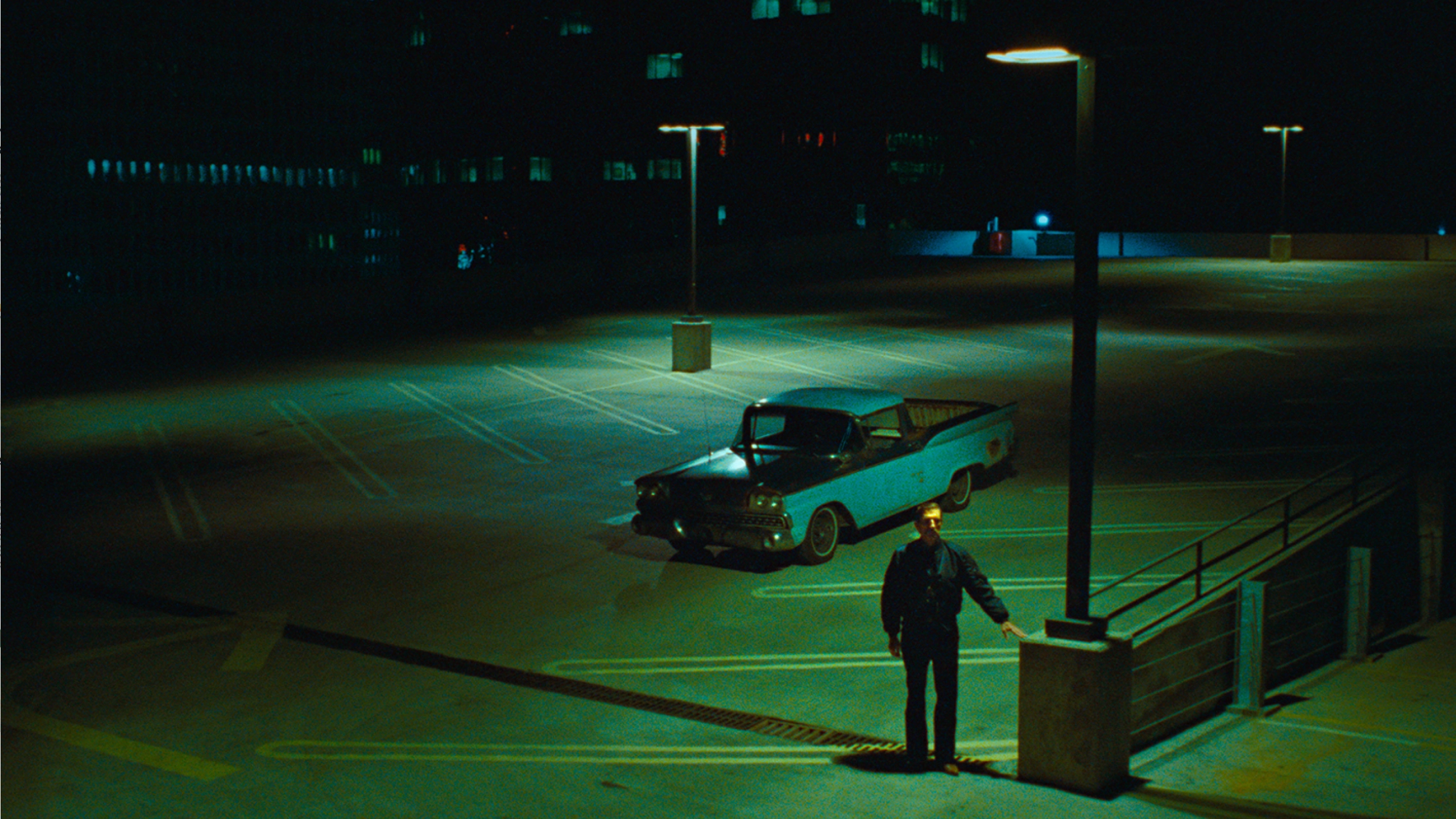
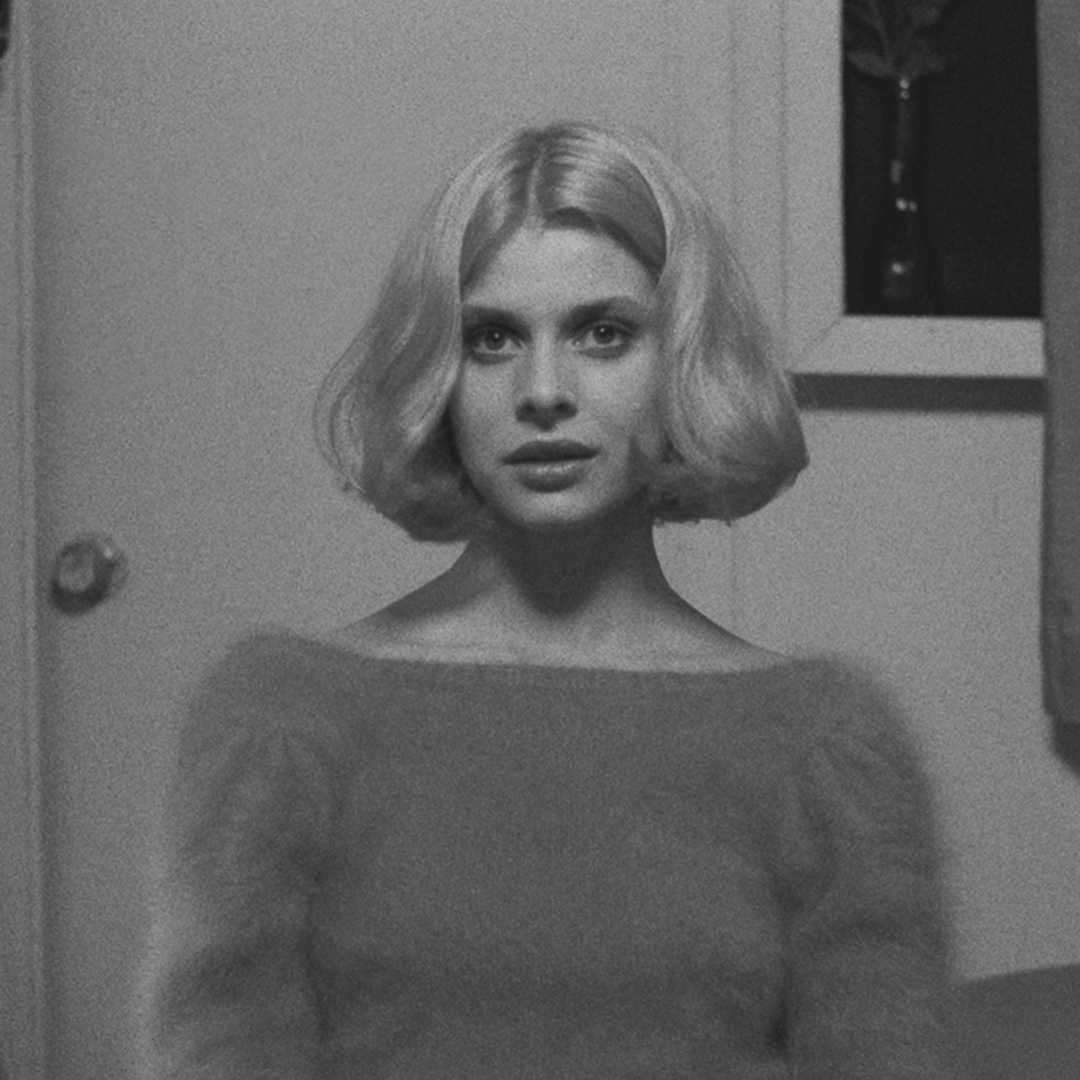
David Lynch: Mystery and Tension in Brand Identity
"David Lynchs' 'Blue Velvet'."
Lynch’s films thrive on contrasts. In his classic, Blue Velvet, lush suburban lawns are drenched in shadowy blues, suggesting calm – but at the same time concealing darkness. Reds appear suddenly and violently, disrupting the scene, evoking heightened emotions of fear or hidden desires. Lynch’s compositions amplify this unease: characters are often framed slightly off-centre or enveloped by darkness, creating a sense of imbalance.
For brands, Lynch’s mastery of contrast offers interesting lessons.
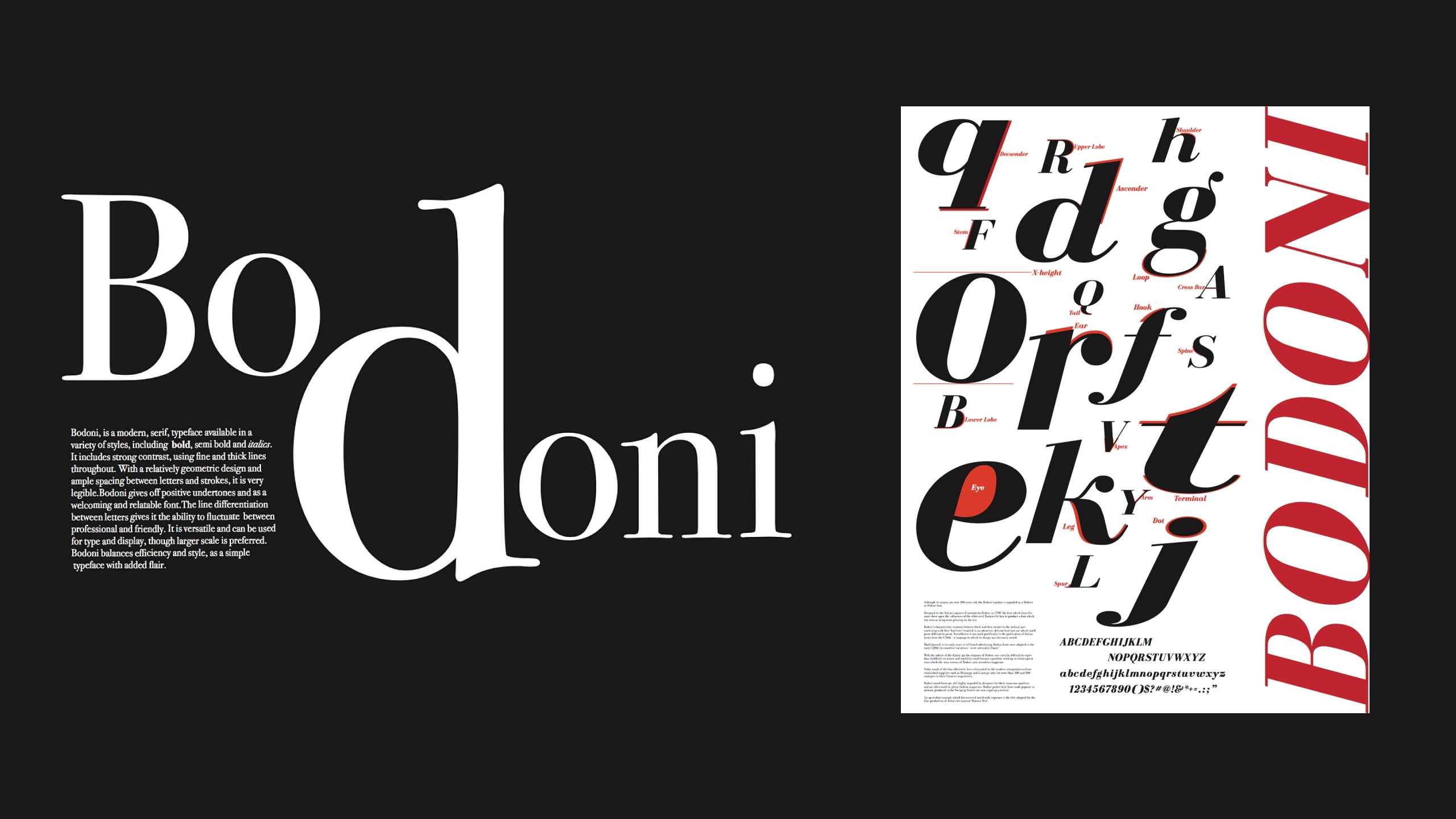
I think of typefaces like Bodoni or Didot. Their stark contrasts between thick and thin strokes evoke tension—refined yet unpredictable. This makes them ideal for brands seeking to balance sophistication with boldness, often seen in high-end luxury packaging and often used for bold advertising campaigns.
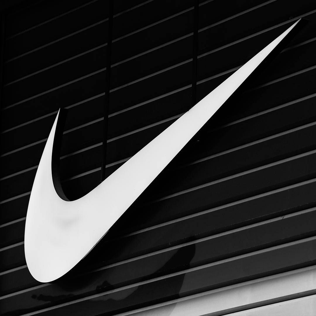
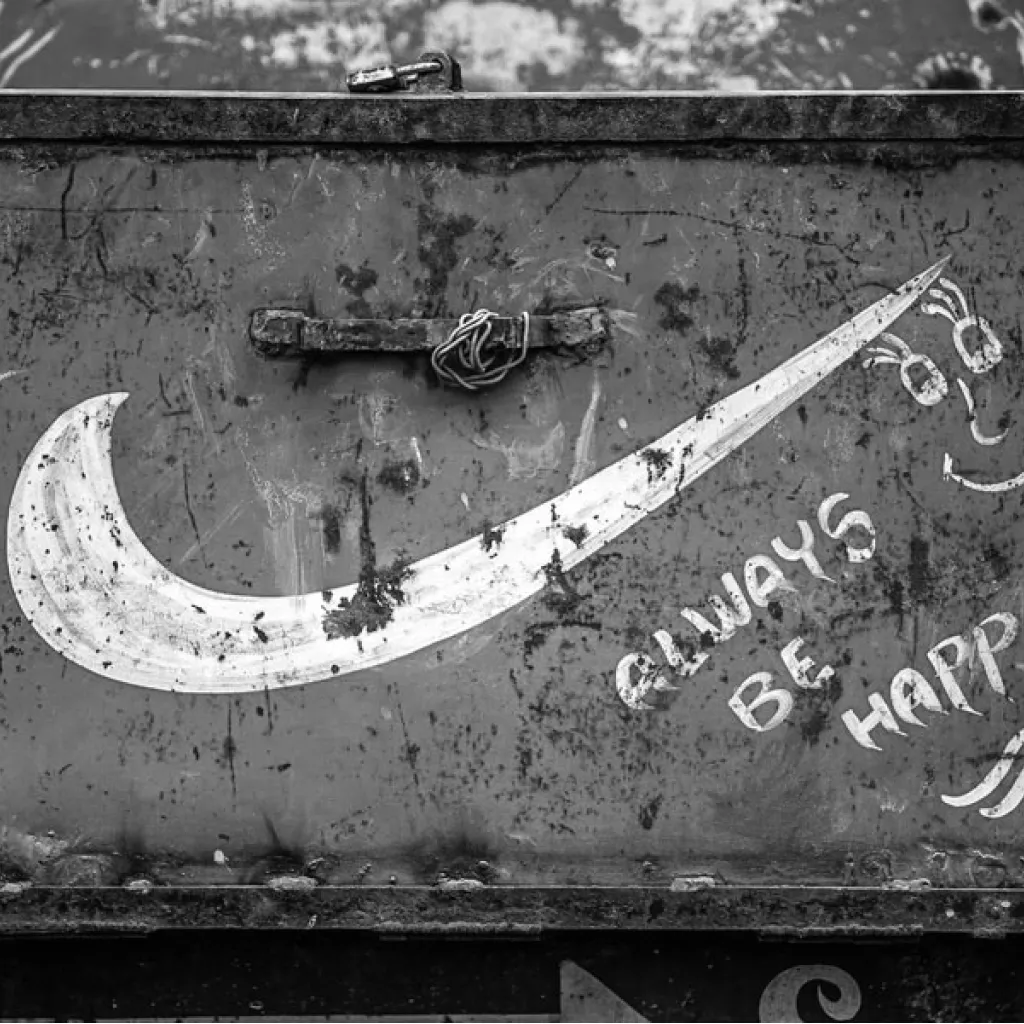
Contrast in branding extends beyond typography. Asymmetrical layouts or the deliberate use of negative space create intrigue and focus. A simple mark, like Nike’s swoosh, relies on clean negative space and bold strokes to draw attention.
Lynch’s lesson is clear: tension works best when it’s intentional, using contrast to create intrigue rather than overwhelm.
This is very important when building a bold and dynamic brand identity. It’s easy to fall into a trap of overwhelming the identity with boldness and losing the opportunity of the subtlety that drives intrigue and increases the emotional interest (and therefore dwell time).
Wim Wenders: The Power of Restraint and Space
"Wim Wenders' 'Paris, Texas'."
Where Lynch thrives on tension, Wenders excels in stillness and balance. In Paris, Texas, empty expanses of desert evoke isolation, longing, and reflection.
Wenders’ wide frames allow the viewer to linger, focusing on subtle details like a neon motel sign glowing in the distance. His muted palette—dusty yellows, soft blues, and pinks—feel nostalgic, inviting the audience to pause and reflect.
In brand identity, restraint is an important consideration, creating similar emotional impact.
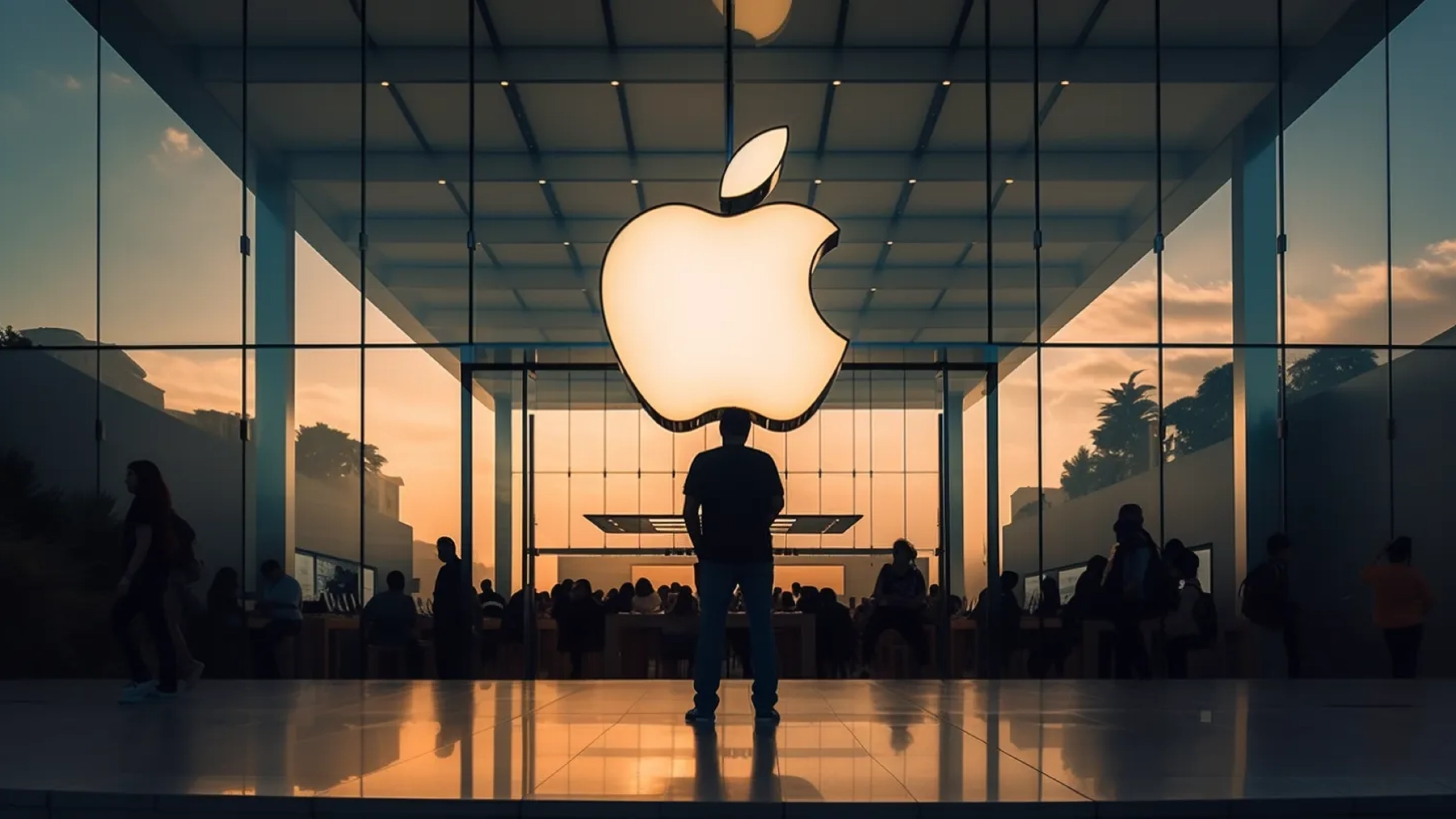
Negative space plays a critical role here. Apple’s minimalist designs, for example, rely on whitespace to guide focus and create a sense of clarity. This isn’t about emptiness, it’s about intention. The clean lines and uncluttered layouts allow the hero of the identity to take centre stage.
Similarly, Patagonia’s use of muted tones and simple typography reinforces its connection to nature and sustainability. By letting the design “breathe,” these brands echo Wenders’ ability to focus attention on what truly matters.
At uberbrand, we approach design with a similar philosophy. Every element, whether it’s the use of whitespace, a subtle colour palette, or restrained typography, is carefully considered to ensure it aligns with the brand’s essence.
Negative space isn’t absence; it’s focus. And focus creates resonance.
Wes Anderson: Harmony and Whimsy in Design
"Wes Andersons' 'Grand Budapest Hotel'."
Wes Anderson’s films are defined by their meticulous symmetry, pastel palettes, and obsessive attention to detail.
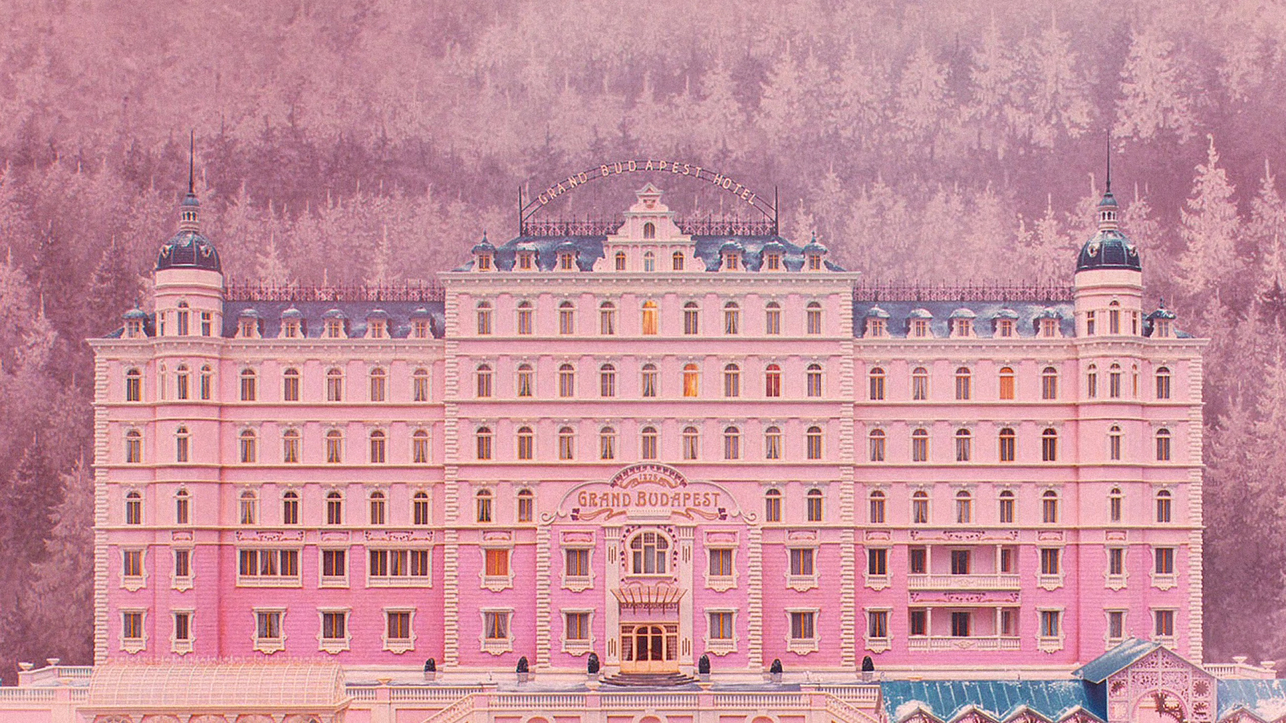
In his absolute classic The Grand Budapest Hotel, the use of pinks, purples, and golds creates a whimsical, yet cohesive, visual world. Anderson’s symmetry provides structure, while his recurring motifs (like the hotel’s iconic façade) build familiarity and trust.
It even flows through to how Anderson names his locations, using the language to invoke the nostalgia – embellishments like the use of the word “grand” are replicated in the visual language.
This attention to harmony and cohesion is invaluable in branding especially in creating a complete brand immersion for greater impact and storytelling.
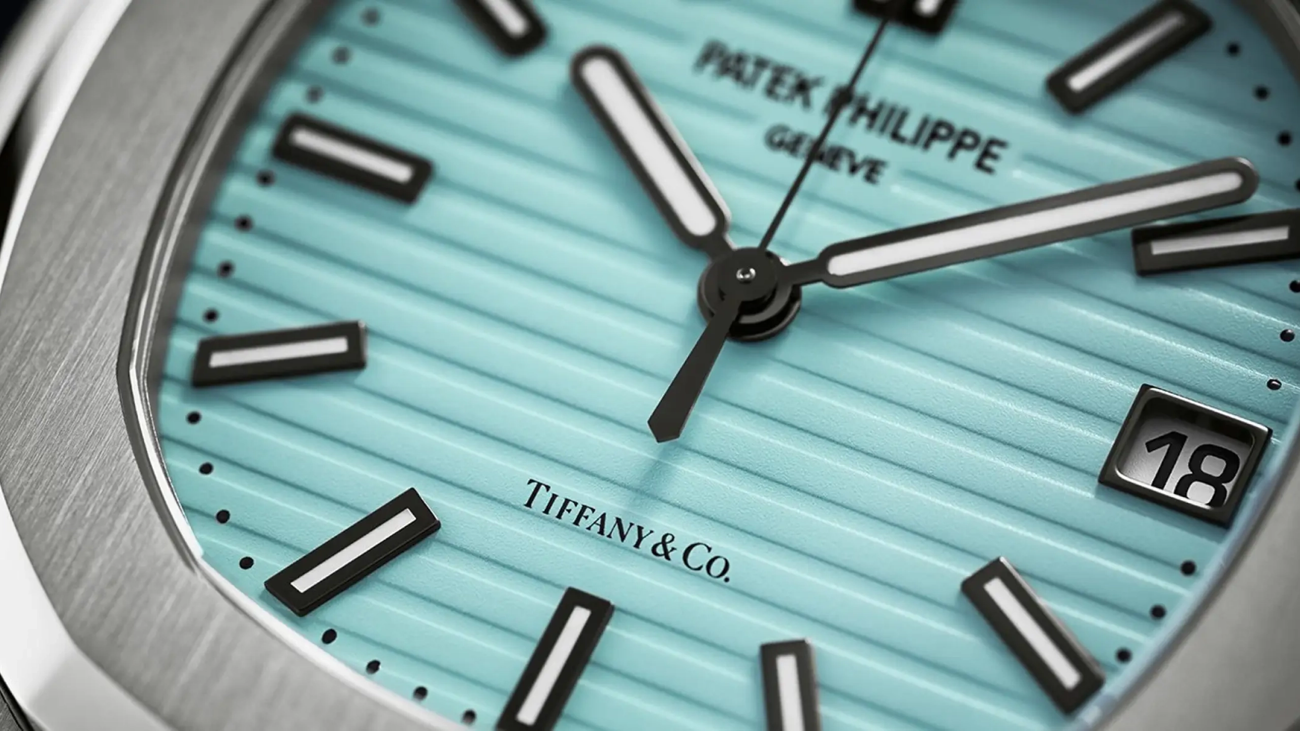
Tiffany & Co.’s custom robin’s egg blue (aka: 1837 Blue), for example, is so much more than a colour; it’s a signature. It appears consistently across packaging, advertising, and even storefronts, creating an unmistakable identity. Häagen-Dazs uses a consistent palette of gold and cream tones to evoke indulgence and luxury. These brands succeed because every visual element feels like part of a larger, carefully curated story.
Anderson’s lesson for brands is clear: consistency builds trust. At uberbrand, we work incredibly hard to build out design systems where every element—logos, typefaces, layouts, and colour palettes, language and even headlines—feel intentional.
Whether it’s a dynamic, playful identity or one that’s understated and refined, harmony across touchpoints creates identities people relate to and can build trust and remember.
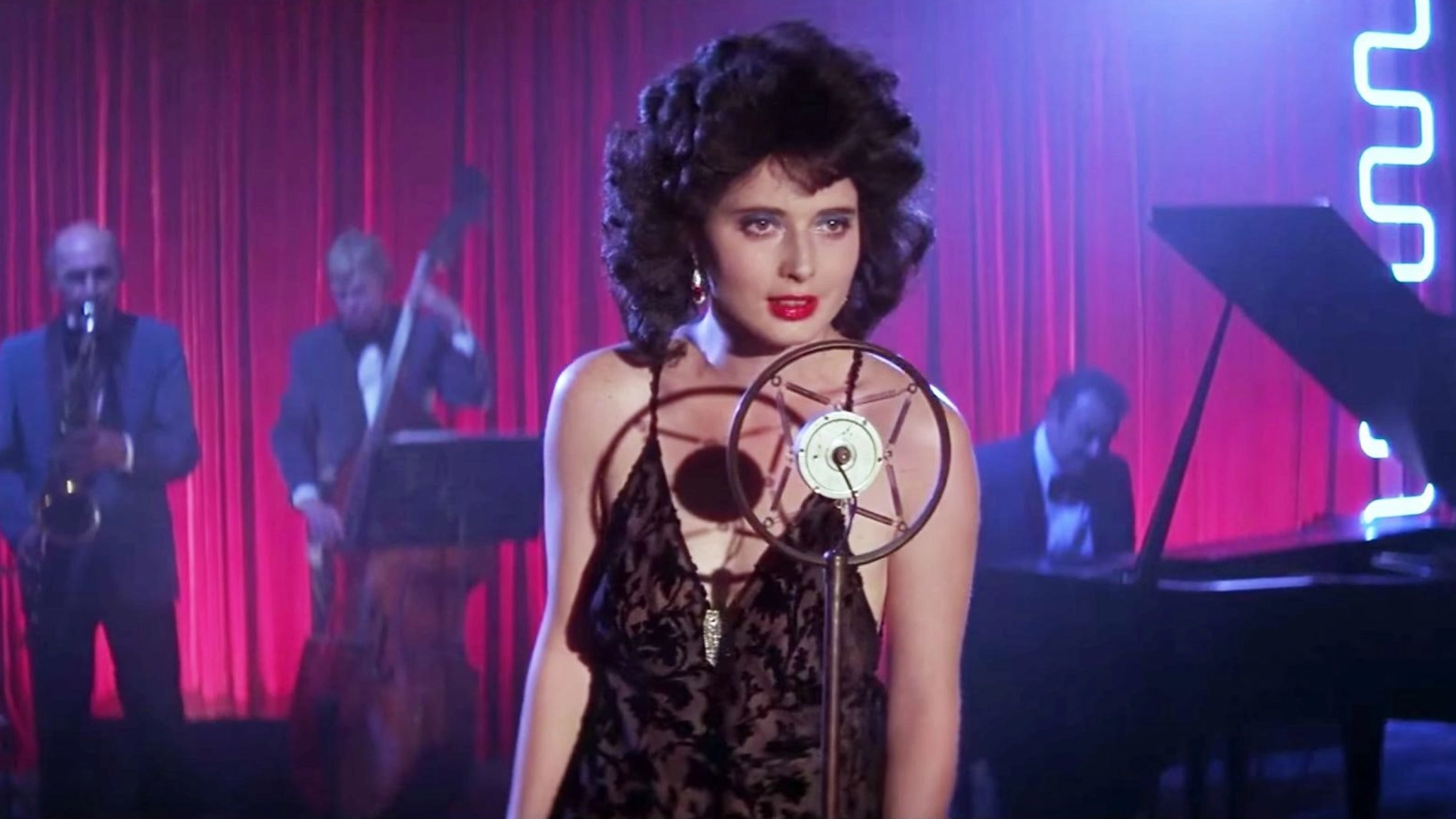
Pedro Almodóvar: Boldness and Drama in Visuals
"Pedro Almodóvars' 'All About my Mother."
If Anderson and Wenders lean toward subtlety, Almodóvar celebrates boldness. His films explode with saturated reds, electric yellows, and vibrant blues.
In Talk to Her and All About My Mother, these colours aren’t just aesthetic – they’re emotional. This is where colour theory really steps us. Red, for example, represents passion, intensity, and vitality. His compositions are dynamic and alive, demanding the viewer’s attention.
For brands, Almodóvar’s boldness serves as a reminder that sometimes embracing vivid, unapologetic choices can create cut through and build emotional meaning, especially when balanced with intention.
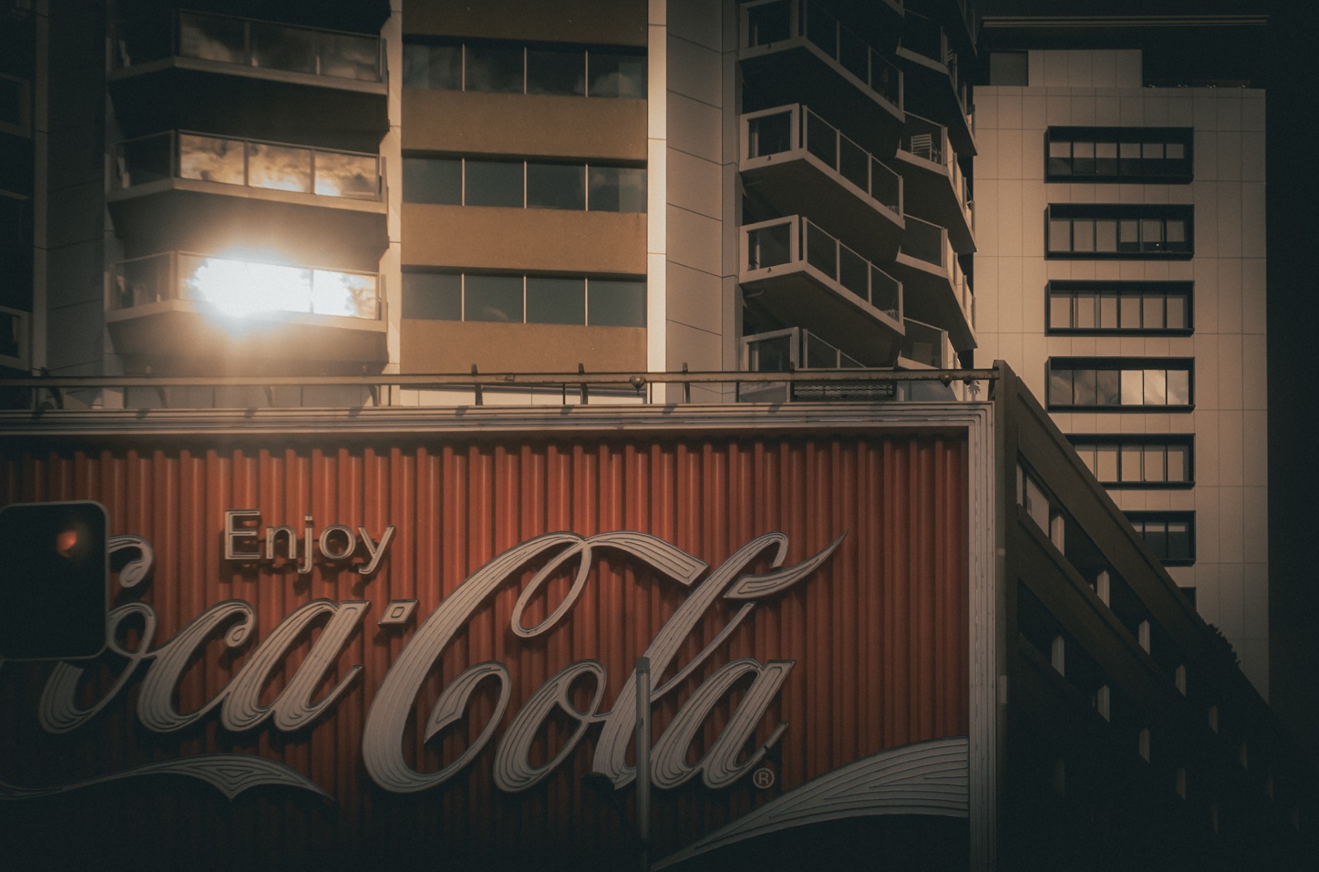
Think about how Coca-Cola’s iconic red draws the eye, but its offset by a clean typography and use of restrained layouts ensures the boldness feels timeless rather than overwhelming.
Similarly, Red Bull uses a striking colour palette in harmony with dynamic photography, reinforcing its high-energy identity.
At uberbrand, the choice of bold and dynamic colour is effective, but more so when they’re aligned to a clear and obvious brand strategy. A vivid colour pallete or dynamic layouts grab attention, but when paired with cohesive design elements, like whitespace or complementary typography, it transforms into something unforgettable.
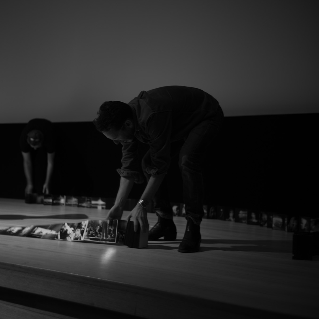
Storytelling Through Brand Identity
Photography by Dan Ratner
I think it can be truly beneficial to review some of the visual styles of these great filmmakers as inspiration points for brand identity development: they show you how every element can contribute to the story. A logo isn’t just a mark; it’s an important part of a larger narrative. Icons, typography and devices are more than visual elements—they’re tools to evoke emotion and communicate purpose.
For example, when we design logos, we focus heavily on composition and balance, using negative space as much as positive space. Whether it’s a bold, dynamic mark or a clean, approachable typeface–every decision is deliberate. By treating every component of the identity as part of a cohesive whole, we ensure that what’s created isn’t just a visual system, but rather a story that connects.
Practical Takeaways for Brands
1. Typography as Personality Fonts set the tone for a brand. Serifs like Garamond evoke tradition, while sans-serifs like Helvetica feel modern and approachable.
2. Colour as Emotion Use colours deliberately to evoke feelings. Muted palettes suggest calm and trust, while bold hues inspire energy and passion.
3. Icons and Marks as Anchors A strong mark (like Nike’s swoosh) can serve as a visual shorthand for a brand’s essence. Its simplicity and clarity make it instantly recognisable and emotionally resonant.
4. Negative Space as Focus Embrace whitespace to guide attention. Like Wenders’ frames, it allows the core message to stand out.
5. Cohesion Across Elements Ensure every component—logo, typography, colour, and layout—feels part of a unified story.
Photography by Dan Ratner
Conclusion
Restraint, consideration, and deliberation. These qualities define both timeless films and enduring brands. David Lynch taught us that contrast creates intrigue. Wim Wenders reminded us of the power of negative space. Wes Anderson proved that harmony builds trust, and Pedro Almodóvar showed us that boldness, when done with purpose, is unforgettable.
In branding, as in film, the best stories aren’t told by accident. They’re composed. Every element—colour, typeface, layout, and imagery—works together to create meaning. When done well, what’s left resonates far beyond the screen or the page.