Strategy
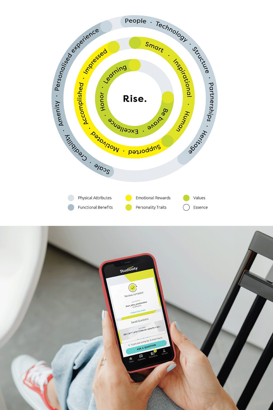
Studiosity empowers students to receive writing feedback and connect with student mentors via live chat when needed. Our research indicated this collaborative approach helps build confidence, stay on track, improve work, and achieve academic goals. We encapsulated this in a simple proposition: “Studiosity is here for you.”
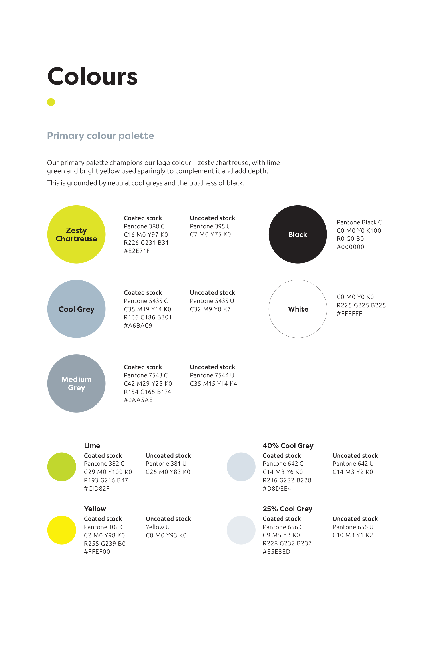
Our primary palette champions a zesty chartreuse, complemented by lime green and bright yellow used sparingly to add depth. Neutral cool greys and bold black ground the palette, providing contrast and stability.
The secondary palette includes vibrant, luminous colours suited for digital use, such as charts, graphs, and graphics. Darker and lighter tints are used sparingly to add dimension to graphic illustrations.
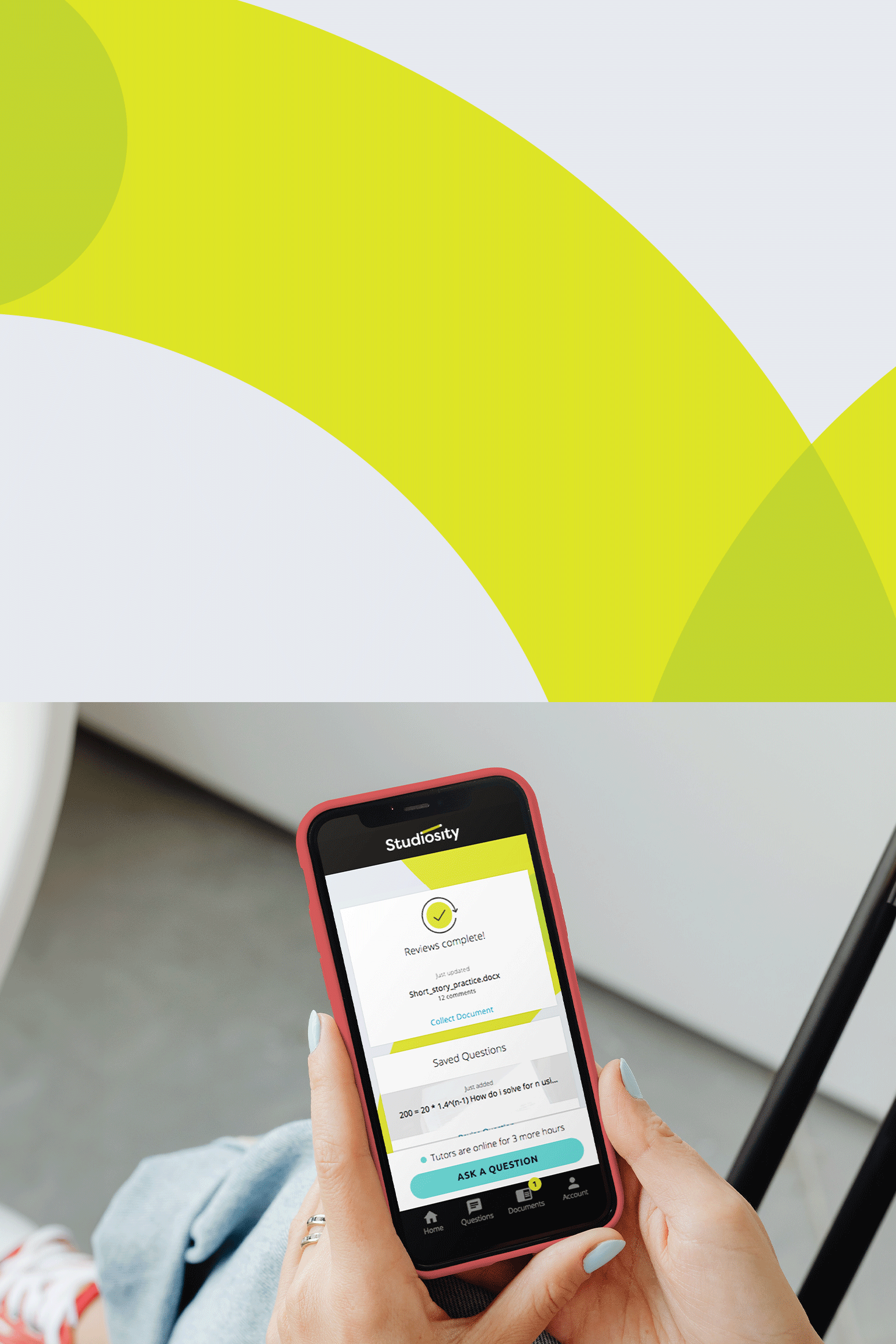
Bright, studio-style photography features genuine people engaging with confidence and a sense of achievement, paired with overhead shots of individuals interacting with technology or props for a sleek, contemporary look.
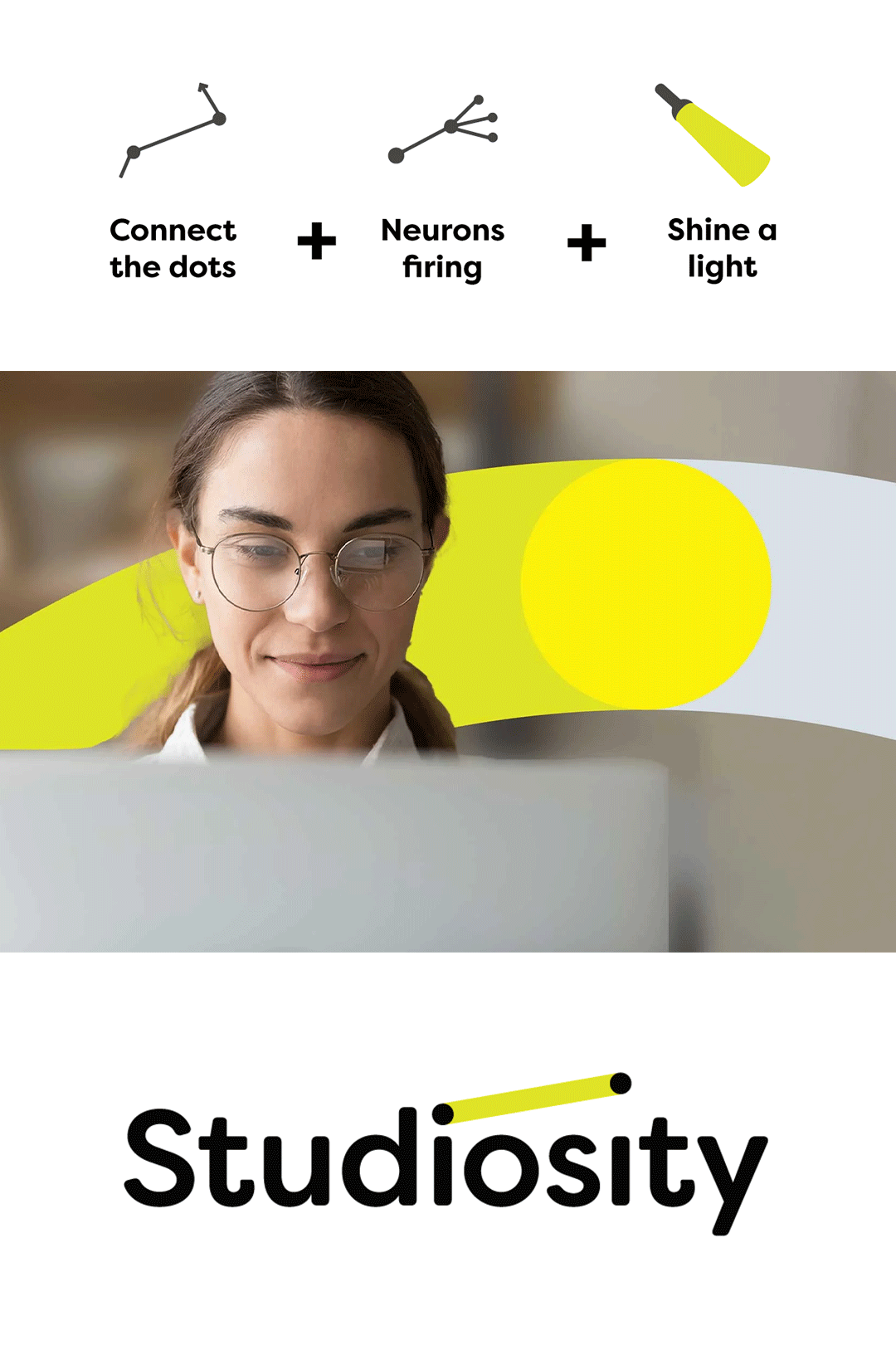
The primary graphic device is a simple line connecting two dots, symbolising movement and connection. When used with text, it highlights key information, serving as a helpful way-finder.
For icons, a clean, line-based style uses a single chartreuse dot to highlight key features, maintaining clarity and simplicity.
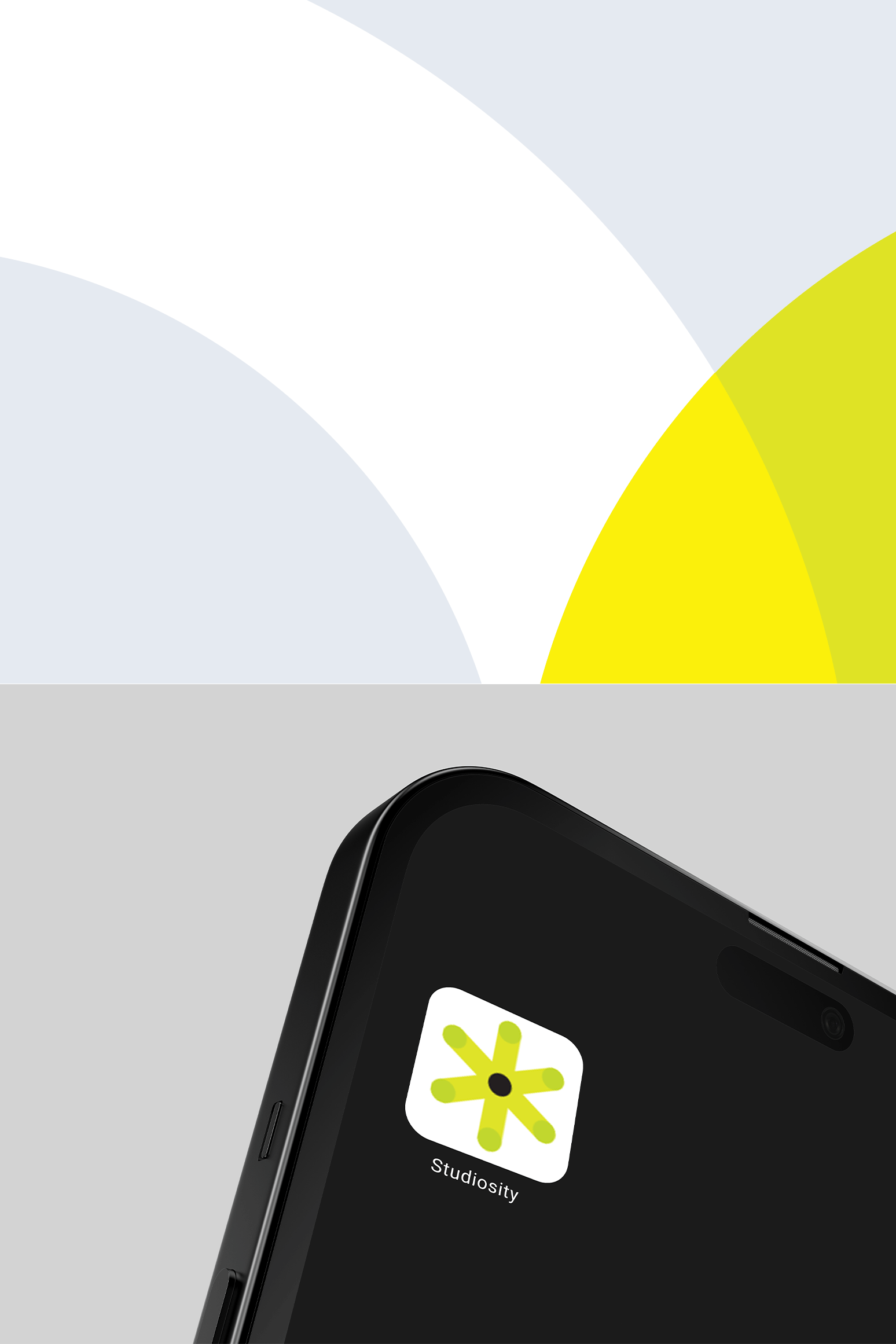
The logo has been thoughtfully designed to tell a meaningful story. The connected dots in the ‘i’s symbolise how we help students join the dots to build ideas and solutions. The second dot is raised to signify upward momentum, performance, and achievement.
Our master logo is designed for use on white or light backgrounds, while a reversed version is available for black or dark backgrounds.
To create awareness around Studiosity and promote their offering, we wrote and produced three 60-second videos. These included a brand story to introduce the service, and then one per target market for students and institutions.
Result
An effective brand identity that translated into three promotional videos.